Do you ever wonder how many brands are getting an ROI out of their Google display ads? It’s about more than just their giant budget. It turns out, there are a few elements most winning display ad examples have in common.
So, how do you go about creating ads that are finger-clicking good? The ones that will bring you leads and fill your inbox? Here are 33 examples, and what we love about each of them.
What do Great Display Ads Have in Common?
There’s a lot of advice out there, but what really matters in a display ad?
Design matters, as does your text and your call to action. You need to have an ad structure that is flexible and responsive, as users will see it on different platforms, but you need some other elements as well.
Think about the four main components each ad should contain. They include:
- Your Logo
- An image or visual representation of your product
- A Value Proposition
- A call to action
That’s it. Of course, the two most important things, the ones that change all the time, are your value proposition and your call to action. They should stand out the most from your ad. If your logo dwarfs your value proposition or you have a vague call to action, your ad will be horribly ineffective. Worse, if your value proposition fails to stand out because of poor color choices or the font is hard to read, readers will scroll right past it.
The idea is to do a few key things:
- Get your target audience to stop scrolling.
- Engage them with a stellar value proposition.
- Hook them into the click with a compelling call to action.
One of the best ways to produce great ads is to study great ads. It’s important to know what steps you need to take and to study your competitors and other ads that perform well.
But enough theory, let’s jump in and put 33 great ad examples under the microscope.
#1 Amazon Display Ad Example
You’d expect the e-retail giant to have great ads for their products, and they do, but what about when Amazon goes on a hiring spree? With large parts of its warehouses automated and rumors of demanding workloads and less than perfect working conditions, their ads need to overcome some serious pain points.

Amazon hiring ad for their new warehouse in Salt Lake City
With this ad, they do just that. One of the biggest pain points for workers in the infrastructure industry is the money they make, and while Amazon may be demanding of its employees, they do pay well above the national average. The Call to Action is also a subtle invitation to join their team, implying a team-based, pleasant work environment.
#2 Etrade Display Ad Example
Etrade takes a similar tack, in that their value proposition immediately addresses one of the biggest pain points of app-based investing and electronic trading. That pain point is the feeling that without extensive research, you’re alone in this investing game. “Let’s start investing together” sets their app apart from the competition.

A compelling value proposition addressing pain points right away.
This ad also features a great color choice. What does green imply? It often represents money, and this is a cooling, calming green mixed with blue, which also brings with it a mood of safety and security.
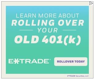
An adaptive ad with a compelling call to action.
This second Etrade ad leads with the same color palette and also has adapted to a different viewing size. It is set apart by a call to action that mirrors the value proposition and the pain point addressed: the ever worrisome rolling over a 401(k) from a previous employer before you forget it ever existed.
#3 Adobe Display Ad Example
Both ads in this set appeal to different audiences, but with a similar message. The first appeals to business teams, offering group plans that will not only save the business money but tells them exactly what the product offers. The second appeals to individuals who engage in similar projects.
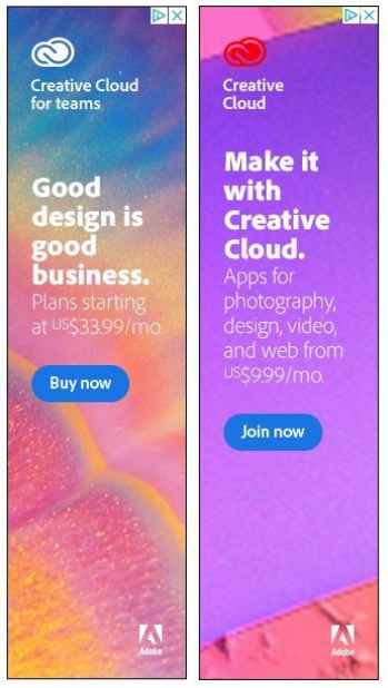
Two ads, appealing to similar Adobe audiences.
Both ads include pricing. The reason is that Adobe is often seen as a premium product, one that is unaffordable for a small business or a freelancer. A common pain point is immediately addressed, letting the viewer know they do have reasonable options through the subscription option. Besides, the design itself is appealing, illustrating to the viewer what Adobe software is capable of, and making this ad set click-worthy indeed.
#4 Audible Display Ad Example
Audiobooks are all the rage, and for book lovers, a subscription-like service that lets them listen to their heart’s content is ideal. Audible offers three books a month: one audiobook of any kind and two audible originals. The coupon immediately offers the book listener a discount, one designed to get them hooked on the service.

The discount offer inspires the click through for audiobook listeners.
A part of the appeal of the ad is the illustration of a popular book, one the potential subscriber wants to read anyway, one by a famous name.
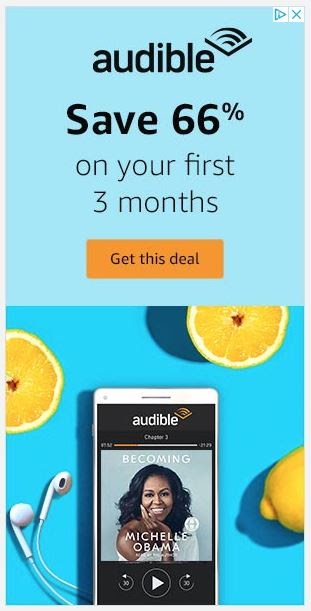
The ad resizes well for mobile devices.
Note how well the ad works in different sizes and formats for mobile, a sidebar ad, or display on another device. This adaptability is essential for a finger-clicking good ad.
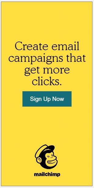
#5 MailChimp Display Ad Example
Billed as an all-in-one marketing platform, MailChimp has expanded their offerings well beyond email campaigns. This value proposition quickly does two things: it lets the reader know a different product Mailchimp offers, and that the service is vested in growing your business. The branding is spot on with Mailchimp colors and their logo.
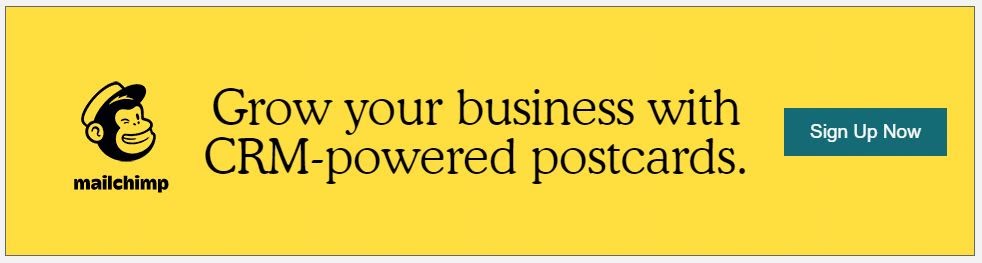
An ad featuring physical marketing products offered by Mailchimp.
The call to action button stands out from the background text, with no monkeying around when it comes to clicking through to this offer.
An adaptive ad with a similar theme.
Yes, Mailchimp still offers their traditional email campaigns, the place that things started for them, and this ad shows how easily the one above will adapt to multiple devices. This ad set also follows the K.I.S.S. rule very well. They are simple yet elegant, inspiring a response.
#6 Invoca Display Ad Example
This school-yard value proposition appeals to those who receive inbound calls with a simple challenge. Who doesn’t want to school their competition? The image illustrates the frustration of not being able to attribute calls to a specific campaign or gather usable data from them.

A compelling ad with a school-yard appeal.
Of course, the implication is that if you don’t get started now, your competition will, and nobody wants to be the one getting schooled. The simple “Get Started” implies an immediate solution to a common pain point, making this ad from Invoca very click-worthy indeed.
#7 Gusto Display Ad Example
Gusto offers a great value proposition with a simple statistic that illustrates a high satisfaction rate. At the same time, their call to action offers a no-obligation free trial. Not only is the HR software that also claims to save companies 50% of the time they spend on payroll well-loved by their customers, but they offer you a chance to try it for yourself.

A great value proposition with a strong offer in the call to action.
Another illustration of keeping things simple, the value proposition and the call to action are brief and straightforward, and though the company logo is present for branding, it takes a backseat to the message presented.
#8 Twilio SendGrid Display Ad Example
The email system is complex. Recipients try to protect their privacy and filter junk email to a unique folder where they don’t need to look at it. You don’t want your communications to land there, and you want them to reach inboxes fast.
Twilio’s SendGrid product is one of the most appealing to businesses who struggle with email templates, integration, automation, and development. This ad offers a quick solution to one of the most common email pain points.

A simple solution to a common pain point.
What’s missing here? A call to action button would be a big help to converting clients, but Twilio is content to rely on the rest of their ad to do the work for them, and even minus the typical CTA, it’s quite effective at earning clicks and generating leads.
#9 Staples Display Ad Example
Staples is a well-known brand, and nearly anyone in business knows who they are, but how do they get customers to choose them over the competition in this crowded arena? Simple. An offer they can’t refuse: huge savings on their next order of $50 or more.

A simple offer to entice customers to shop with them.
Branding is right on with the typical Staples red and white, and their logo doesn’t overpower. The call to action could be more prominent, inspiring users to click this ad like they do an empty stapler while trying to remember where they put the extra ones to refill it.
#10 Fender Display Ad Example
Not only does Fender offer some great high-end guitars, but they also offer some solid beginner package deals. The way to get people to buy better guitars? Teaching them how to play, and the Fender Play app does just that. Sure, it will cost you, but way less than an in-person seminar with Tom Morello. The CTA of a free trial offer removes the cost barrier for someone just starting out.

Who doesn’t want to learn to play guitar?
A simple design, this ad could be better with a stronger value proposition, but the branding and red color scheme that says “stop and look at this” works extremely well to inspire future Stratocaster shredders to click through.
#11 LensCrafters Display Ad Example
Anyone who wears glasses will tell you of the pain of switching from your regular lenses to sunglasses and back again when you go from indoors to outside, and this ad offers a great illustration and a solution. Their logo takes a backseat to the logo of the product they are selling, letting customers know right away what is being featured.

An ad with a great transition in the middle to emphasize the product offered.
The call to action is brilliant. It encourages an in-person visit, where other products and services can be offered to the ideal customer. The simple ad also promises new technology for those who might have tried transitions before and found them wanting when the slow change of the lenses kept them in the dark or blinded by the light. The viewer is sure to see their way to clicking on this ad.
#12 Ridge Display Ad Example
Bulky leather wallets lead to chiropractor visits, but they also leave your new chip cards vulnerable to clever hacking thieves. This wallet promises to address one literal pain point and one security one all in a single slim package, appealing to men everywhere.
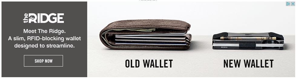
A simple ad featuring the weaknesses of the competition.
The reason this ad is so appealing? It contrasts itself with the competition, giving the viewer a visual comparison they want to act on. The viewer is moved to click, pull out their old, bulky wallet for the last time, and order this streamlined version by this well-done ad.
#13 Hampton Display Ad Example
The biggest pain point when booking a hotel? The price. That feeds users inclination to use hotel and travel sites that result in fees to the hotel chain. How do you sell direct to the customer and bring them to your own site? Put the potential price right upfront.

This ad addresses a common pain point right away.
The beauty of this particular ad is how Hampton uses its branding even on the CTA button, the same frame as the logo surrounding a “book now” button using brand colors as well. If the hotel chain is going to draw the viewer away from comparison shopping, this clickable offer is a great way to do it.
#14 Brita Display Ad Example
We waste a lot of water bottles every year, and Brita is trying to change that. The filter bottle pictured is elegant and simple and offers brand consistency with the promise of great-tasting, filtered water. In the age where reusable bottles have become the norm rather than the exception, Brita’s call to action promises options to fit your taste.
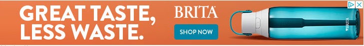
A great value proposition tied to a good cause.
A few things to note: first, the value proposition is tied to a cause: reducing waste. This is something nearly everyone wants to get behind. Second, note the color selection of the bottle. While Brita has a variety of options, they chose one the color of fresh, great-tasting, filtered water. Brilliant.
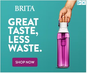
Same ad, different size and color.
All that about color to say that different colors appeal to different people, and this ad adapts well to a different size and platform, while the eye-catching color and urgent call to action inspire viewers to stop their own waste with the simple click of a mouse or tap of their finger.
#15 Fixit Mobile Display Ad Example
One of the most frustrating parts about a broken cell phone, whether that is a screen or other damage, is that with some warranty programs you have to send it off and wait for a repair or replacement. With still others, you may have to book an appointment and wait for hours just to get a diagnostic.
Fixit Mobile addresses many of these pain points right up front with a checklist and a photo of a common problem: a cracked screen.
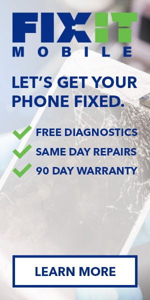
A great problem and solution illustration.
The other great part about this ad? The addressing of another pain point with the offer of a 90-day warranty. There’s nothing more frustrating than having to pay to fix something twice. The Learn more button reminds users that while technology is advancing, you still have to bring your phone in to get it fixed. We can’t do it remotely, yet.
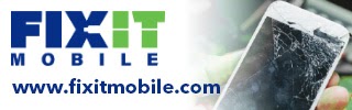
Great adaptation to a smaller space.
The smaller space for this ad simplifies it even more. The problem is still pictured, the solution illustrated by the name of the company, and the call to action is simply the website where a solution will be found.
#16 Chase Display Ad Example
Chase packs a lot of great information in this display ad. First, a promise of a $200 bonus and no annual fee appeals to all kinds of credit card users, including those who want to transfer balances and more. The second stroke of genius is the name of the card itself, Freedom Unlimited.

A lot of information in a small display ad.
The viewer can make a few implications from this ad right away. It’s a cashback card that is always earning them something; there is no annual fee, a common drawback to such cards; and there is some kind of bonus involved. The green color on the call to action button gives a green light to click and learn more.

Another information-packed ad from Chase.
Another similar ad from chase offers similar features in a bonus and no annual fee, but this time geared toward business rather than individual customers. The illustration of the busy chef makes this ad clickilicious to the busy business owner.
#17 PayPal Display Ad Example
PayPal is big in the area of small business payments, and offering customers options when it comes to paying invoices or checking out when buying products. A trusted name, this ad addresses the ability to offer customers even more payment options, a struggle for micro-retailers and small shops.
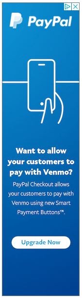
Promised options are highlighted in this value proposition.
PayPal business offers several premium options, and this promise of a simple solution inspires their users to upgrade, and those using other services to switch. The ad uses consistent PayPal branding and familiar, eye-catching colors to inspire a click that will lead to an easier click for your customer.
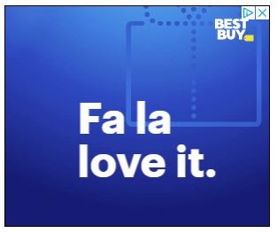
#18 Best Buy Display Ad Example
When it comes to online shopping, especially for computers, comparison shopping on price alone is common. This ad addresses that pain point a couple of different ways.
- The model and price are right upfront.
- There’s a compelling hero photo.
- The call to action includes a price match guarantee.
Many users would rather buy from a trusted retailer, and would rather go with a price match deal rather than paying a lower price at a less trusted site. Best Buy plays well on this inclination.

Upfront pricing and a matching promise make this ad compelling.
The typical blue and yellow branding tell the viewer who this ad represents right away. And as with other ads, the “Shop Now” button implies other options also covered by the price match guarantee, making this ad truly click-worthy.
A simple holiday click-inspiring ad.
Since Best Buy is so recognizable, this simple ad inspires a click for holiday gifts the user knows their family will love. After all, who doesn’t love a gift from Best Buy? Relying on brand loyalty to earn the click, Best Buy nails it with this one.
#19 CES Display Ad Example
CES rivals the greatest show on earth, with demos of the latest and future tech every year in Vegas and they illustrate that in this simple ad containing a robot, gaming, and sound. If that isn’t enough to entice the user, the value proposition of huge registration savings will.
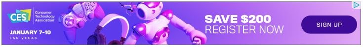
A compelling value proposition combined with great graphics.
Despite the simplicity of the ad, there’s also a lot of information in this small space, including dates and the location of the show, making the user want to visit the show where they’ll learn about the click-free future of AR ads.
#20 Express Clothing Display Ad Example
From this ad we get a sense of a lot of things: we can see the style of clothing offered with a hero photo, new styles are promised, and the timing of the sale is right in the heading: Cyber Monday.
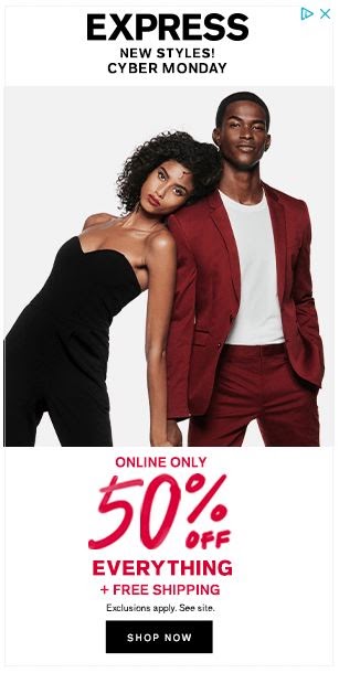
Fantastic Cyber Monday value proposition that is simply click-inspiring.
The ad doesn’t stop with a great heading though. The value proposition it offers a click-licious deal that is hard for any online shopper to dismiss without a click look first.
#21 Castle of Chaos Display Ad Example
While you may not think of Utah as a really scary place, it is home to one of the nation’s top haunted houses, and this hall of horror has become a mecca for tourists looking for a Halloween treat that’s a little darker than a Snickers Midnight. Castle of Chaos’ ad offers a value proposition with a sense of urgency and a compelling call to action consistent with the branding.
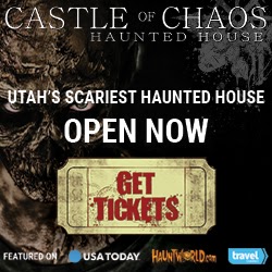
This ad is designed to get a scary number of clicks.
The ad also offers some simple social proof of where the attraction has been featured, giving it more credibility when it comes to heart-attack inducing horror.

This attraction ad features scary rankings too.
If you weren’t scared before, this banner ad should help. People travel a long way to get this scared, and this value proposition tells you why you should visit if running for your life is your idea of a great workout.
#22 Xfinity Display Ad Example
Life without WiFi, at least to most people, is a desolate wasteland of boredom and frustration. On top of that in the world of streaming television and music, reliable internet is often the lifeblood of any household. As Xfinity says, it does power our lives.
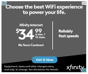
Information packed plus a transparent value proposition.
This ad does address some serious pain points right away, including the fearsome contract required for some deals, and the additional scare of being locked into an unreliable provider. For someone searching for a new internet provider, the “Get it Now” button inspires urgency and an immediate click to get the best deal possible.
#23 Samsung Display Ad Example
Mobile computing is all the rage today, and Samsung is an industry leader, but with competition like the Microsoft Surface and iPad Pro, they have to stand out. This ad helps them do just that with their appeal to creatives, the typically competition loyal customer base.
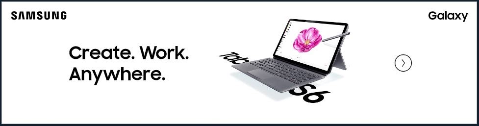
A beautiful click-worthy ad appealing to creatives.
Not only is this ad brand-specific with a great hero photo, but it also clearly illustrates the product offered for a click-inspiring ad that is both elegant and simple.
#24 Liberty Mutual Insurance Display Ad Example
Want to inspire a click? Get a mascot. At least that is what formerly fairly conservative insurer Liberty Mutual is betting on. From ads where a well-paid actor is facing the camera in a very serious conversation, they’ve transitioned to Doug and LiMu to talk customization.

Doug and LiMu are designed to inspire clicks.
The insurer addresses the main pain points we all often feel right upfront. First, customers often feel they are paying for unnecessary features and things they don’t need. Second, they feel they are paying too much. The company is trying to stay in the clickable game by transitioning from the serious insurance dad talk to a goofier take, and so far it’s working well for them.
#25 Pods Display Ad Example
No, these aren’t the pods we’re concerned about the children of Millenials munching down on, but they are a great moving or storage solution for a lot of households. While everyone likes new digs, no one equally digs the actual task of moving or relishes movers handling your precious items only to find them broken or worse, not find them at all. Worse is having to move things twice, once into storage and once into your new house.
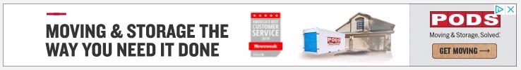
Addressing the literal pain of moving.
This ad addresses those points right away with the value proposition that offers a solution to both on the mover’s terms, making this ad a click magnet for those who hate the multiple backaches and additional ibuprofen use involved with multiple moves and storage headaches.
#26 Disney + Display Ad Example
Entering the streaming wars, Disney+ knew they had their hands full, but owning some of “the best stories in the world” gives them an edge they intended to use. A great value proposition is followed by a Call to Action that offers the user a chance to check things out for free.
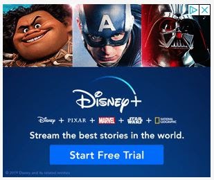
The value proposition that offers a new home for entertainment.
With a ton of subscribers right off the bat, Disney+ seems to be off to a great clickable start with their new offering.
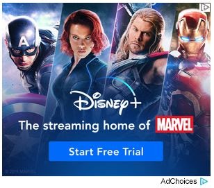
We Marvel at the simplicity of this ad.
This ad appeals to yet another audience: the Marvel universe loyalist. Since Disney owns this content, its app will be the only place you can stream it going forward. This means a built-in fan base will click through this ad, one that is as solid as Iron Man.
#27 Shopify Display Ad Example
Shopify is a huge player in the e-retail website space, and the simplicity of its system is one reason why. But they offer more than just websites now, and as an online sales platform, they offer several tools vital to business success. This ad touts that ability in the value proposition and promotes clicks with the offer of a free trial.
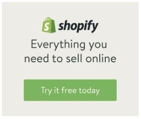
Simple, branded, and click-gathering.
A recognizable brand at this point, Shopify doesn’t need a bunch of fancy language to inspire a click, but they do need something to lure users away from other platforms who may even have tried them before they had the features they do now, and simple offers like this do the trick.

Compact and effective.
Again, even this small ad promises more than just a website, but a suite of tools to build a business. This Value proposition inspires curiosity that leads to click-throughs and leads.
#28 Google Nest Display Ad Example
One of the hallmarks of a good display ad is a sense of urgency, and one of the best ways to get responses is through a limited time offer like this one. The Buy Now CTA adds to that sense of urgency, and the illustration of the regular price shows the potential cost of not clicking.
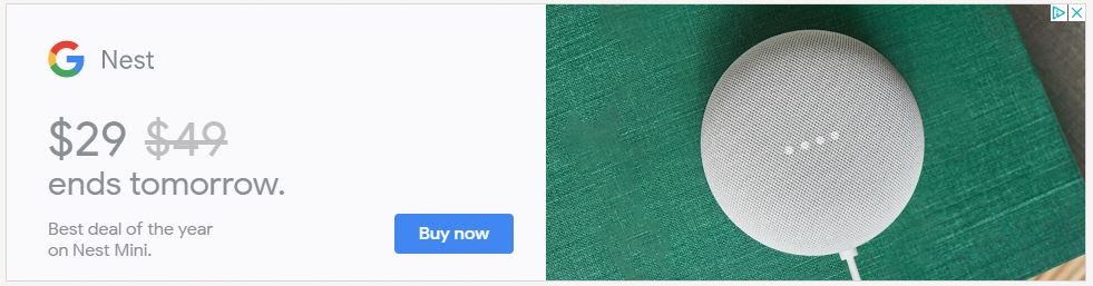
A sense of urgency inspires the click.
The final piece that motivates the buyer is the simple text, “Best Deal of the year on Nest Mini.” In other words, not only will you have to pay regular price if you wait too long, but it might be a whole year before this offer comes around again.
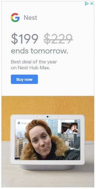
In this ad, the offer motivates the click.
The simplicity of this ad, along with the trusted Google branding makes it in the topmost clickable on our list.
#29 Microsoft Surface Display Ad Example
Ah, the colors, the subtle blending of the product with the background that signifies the integration of this device into your life would win a click anyway, but the offer of a discount of something new is a huge enticement. Consistent branding, pretty design, and a simple ad make this click-worthy ad stand out.

A great offer on something new in a simple design.
Think about Microsoft’s competition for just a moment, and try to remember the last time Tim Cook announced a new anything that was on sale right away. This is a simple way for Microsoft to earn those clicks and win leads.
#30 ChordBuddy Display Ad Example
The only patented guitar learning tool, ChordBuddy emerged from Shark Tank to be an instant hit. So it’s no surprise that they also have some fantastic display remarketing ads. These beautiful ads are used to lure cart abandoners back to their site.
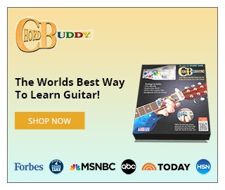
Look at all that social proof ?
ChordBuddy uses the logos of well-known publications and channels where they’ve been featured to inspire clicks. These logos help to build trust and just might give visitors that extra nudge they need to click through and make a purchase.
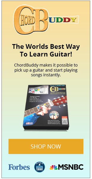
Who doesn’t want to play songs instantly?
This larger ad uses the extra room to insert some mighty strong copy and really sell you on buying a ChordBuddy.
#31 Purple Mattress Display Ad Example
Purple is a popular mattress and for good reason, but at the upper end of the cost scale, people often lose sleep waiting for a deal. This ad gives them the rest and comfort they need both before and after the sale. The gift image shows the potential unselfish uses for this deal, and the sense of urgency by the timing of the offer speaks volumes.

No one will lose sleep over clicking this ad.
Capitalizing on Cyber Monday and the click-happy shoppers online, this ad offers a relaxing gift alternative and a deal that isn’t alarming. That earns it a spot in our clickable ad list.

A gift for the rest.
Adaptable, this version of the purple ad shows a hero photo sure to soften the shopping blow when it’s time to nap off the holiday feast. It’s finger-clicking good for sure.
#32 FinalStraw Display Ad Example
Using a value proposition that is pure humor gold, this final straw ad embraces the trend in reusable suckware that is rooted in environmental responsibility, and firmly ensures its eventual induction into the sucking technology hall of fame.
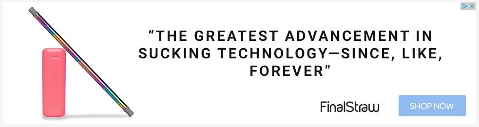
This ad is great for one that literally sucks.
Using a little bit of humor and a little bit of testimonial all in one, this value proposition earns a click just for its cleverness and timely message.
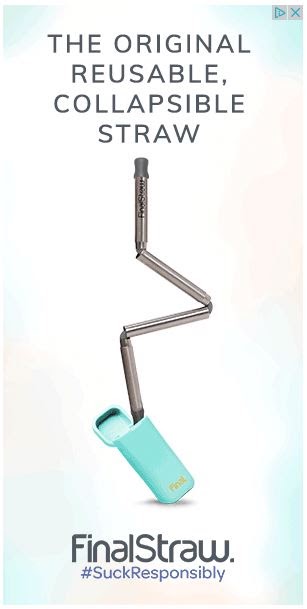
Sucking technology that doesn’t just suck.
Reusable, collapsible, and easily pocket portable, this responsive ad builds on the humor of the previous one with the addition of its own hashtag. This display ad sucked us right into clicking on it.
#33 Beam Display Ad Example
A clear, concise, and simple ad, Beam makes a great case for its benefits package with this simple value proposition. Insurance is one of the slowest adopters when it comes to innovation, so the promise of both simplicity and speed combined with innovation has the average benefits administrator smiling ear to ear.
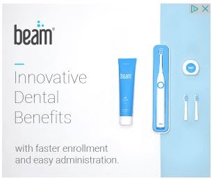
Complete dental benefits, including the often neglected floss.
No matter the size of the company, a halitosis free workplace with shiny, white smiles is a happier one, and Beam promises to deliver the ability to create just that. Companies often spend too much on HR and benefits administration, including time shopping around. Any promised time savings and simplicity make this ad clickable indeed.
Wrap Up On Display Ad Examples
Note the common elements of these clickable delights. All of them address pain points, and many address one of the most common: cost.
But most importantly, the design grabs the attention of the internet user and causes them to stop, take another look, and click through. These ads are undeniably finger-clicking good!
Did we miss some? What are your favorite display ads, and why do they appeal to you? Let us know in the comments below.

Luke Heinecke
Founder/CEO
Luke is in love with all things digital marketing. He’s obsessed with PPC, landing page design, and conversion rate optimization. Luke claims he “doesn’t even lift,” but he looks more like a professional bodybuilder than a PPC nerd. He says all he needs is a pair of glasses to fix that. We’ll let you be the judge.
Leave us a comment.
Subscribe to our blog
Subscribe to our blog
Get weekly PPC & CRO advice sent straight to your inbox.