According to research by Wordstream, the average website has about a 2% conversion rate. But the average conversion rate for a landing page is about 10%.
That pretty much sums up why you should be using landing pages as a part of your marketing and advertising efforts.
But what is a product landing page?
How do you create one that converts like clockwork?
That’s what we’re talking about here.
What is a product landing page?
In online marketing, a product landing page is a page built to promote and sell just one specific product, to the exclusion of all else.
While a website allows people to browse and peruse, a product landing page doesn’t. Instead, product landing pages focus solely on persuading and converting visitors.
There’s usually no main navigation on a landing page, only one CTA, and all sales copy talks about a single product.
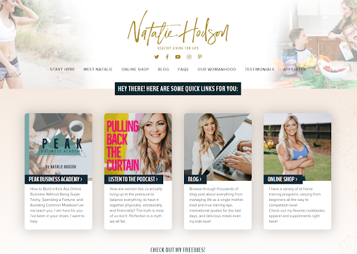
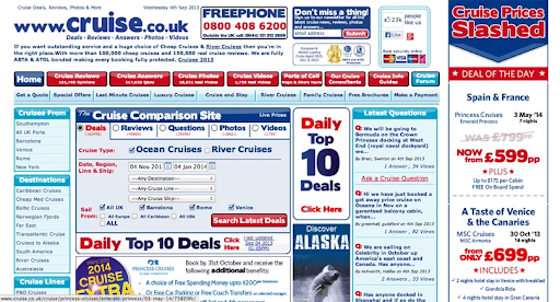
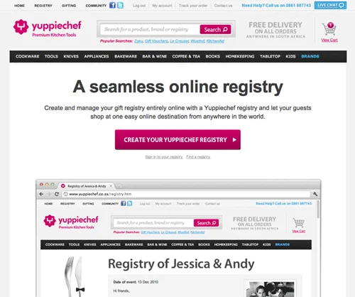
This is a website…
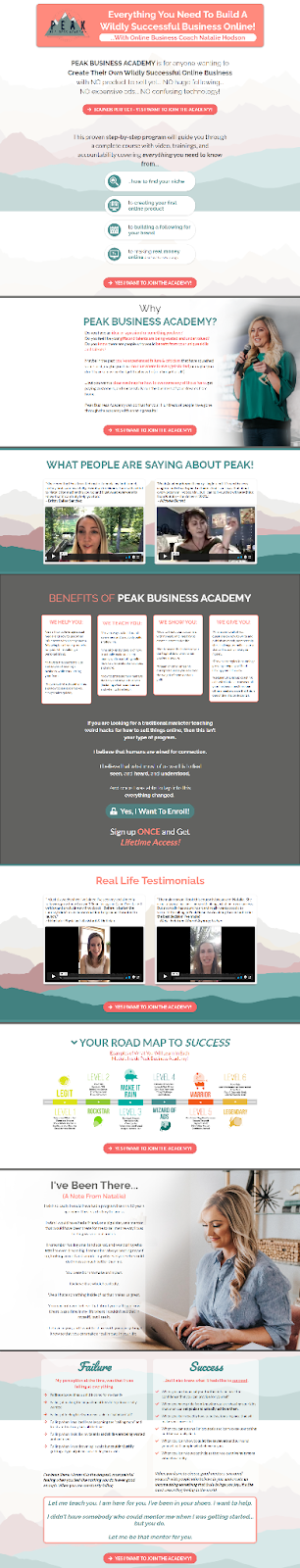
This is a product landing page from the same website…
To be clear, a product landing page is not the same as a product page on an e-commerce site .
E-commerce product pages usually look something like this:
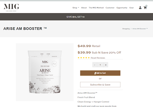
Notice how I can still easily navigate away, and there’s very minimal copy?
That’s the difference.
This is why you should use product landing pages when driving paid traffic (for instance, Google or Facebook ads) instead of product pages or your homepage.
You’ll get a much better conversion rate with the landing page.
And how do you build one that converts well?
We’ll give you some tips below and show you 10 examples of great product landing pages.
But hold on just a moment.
There’s one more thing you should know before we move on:
A product landing page can sell any type of product.
That is, product landing pages aren’t just for e-commerce.
You can use product landing pages to sell courses, memberships, physical products, services, software, coaching, consulting, or pretty much anything else.
They’re extremely versatile, and they’ll work no matter what you’re trying to sell.
Got it?
Cool.
Then we’re off to the races.
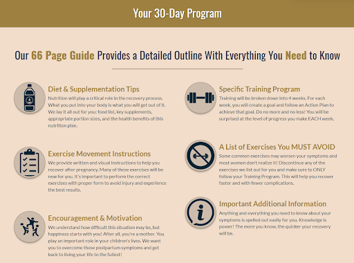
The Best Product Landing Page Template (Steal It)
Let’s start with the good stuff.
Before we dive into the design, the tips, or the examples, we wanted to give you a product landing pages template that you can steal and use.
This will give you the basic flow and outline to be successful — of course, you’ll still want to make adjustments based on your product and your brand style.
[Product Name]
This is a short description of why the product is awesome.
[PROFESSIONAL IMAGE OF PRODUCT]
[TESTIMONIAL]
[CTA]
——- ABOVE THE FOLD ——-
FEATURE 1 WITH PRODUCT IMAGE
This is a description of the first feature and why your audience cares. This should be about one paragraph.
FEATURE 2 WITH PRODUCT IMAGE
This is a description of the second feature and why your audience cares. This should be about one paragraph.
FEATURE 3 WITH PRODUCT IMAGE
This is a description of the third feature and why your audience cares. This should be about one paragraph.
[CTA]
*Note: for every one offer, use one CTA. For this page, use the same call to action every time.
[MORE TESTIMONIALS]
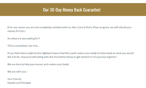
[RISK REVERSAL -e.g., Our 30-Day Money Back Guarantee!]
Your ‘risk reversal’ is a brief note that minimizes the visitor’s risk in purchasing. Because of your guarantee, they can sit back, relax, and enjoy your product.
[CTA]
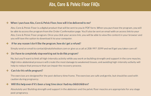
[FAQ]
This is a list of the most frequently asked questions with compelling answers to those questions.
[CTA]
The Basics of Designing Product Landing Pages
What makes the design of a product landing page pop?
More importantly, what makes the design compelling ?
Three things.
1. Professional
I don’t mean that your images, design, and photography need a tie and top hat. They don’t even need to feel “formal.”
Simply, they should be done by professional designers and photographers .
See below.
According to Smart Insights , 18% of people abandon their cart during checkout because they don’t trust the site with their credit card information.
What do you think causes that?
Well, a few things.
But to start, your images, graphics, and web design. These elements are huge in building trust and rapport with new website visitors.
Make yourself look like the real deal, and people will think you’re the real deal.
2. Fast Load Speed
One of the main reasons people leave a website — myself included — is because it doesn’t load within a few seconds.
We’re used to fast load speeds, so we don’t tolerate turtle-paced landing pages.
Check out how quickly abandonment increases as load time increases:
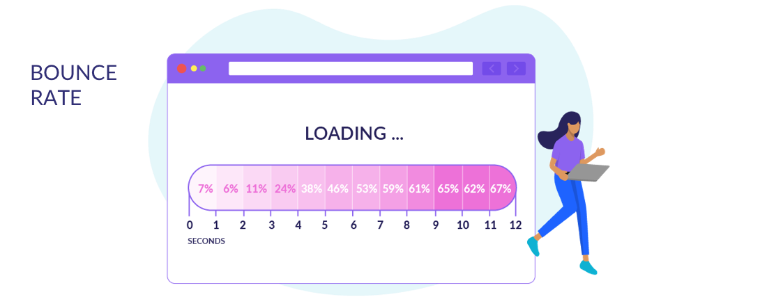
Your landing page and images should be professional and beautiful, but they should also load within 1-3 seconds. If they don’t, you’re going to lose a lot of traffic.
3. On-Brand
Using a signature color can increase brand awareness by up to 80% ( according to Oberlo ).
But color isn’t the only thing you should care about when it comes to branding — your logo, font, and image styles are just as important.
You want people to recognize your brand everywhere they go. That includes your product landing pages.
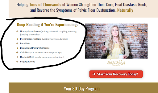
5 Tips For Building High-Converting Product Landing Pages
Now we’re going to share some tips for building high-converting product landing pages.
These tips work consistently across thousands of online entrepreneurs in various niches. Reference them, and you’ll be well on your way to sky-high conversion rates.
1. Make People Curious
Why do people read fiction books?
It seems crazy. A fiction book is just black ink on a page. But for some reason, those letters and words make us smile, laugh, and even cry. Their stories are compelling and meaningful to us.
One reason for this is human curiosity.
People love to be curious. Even more, people love to have their curiosity fulfilled.
It feels good.
And you can leverage that on your product landing page.
In the headline or subtitle, ask a burning question that your target market has on its mind. Or make a big promise that leaves space for explanation.
Russell Brunson loves to do this on his landing pages.
Check out his Traffic Secrets landing page …
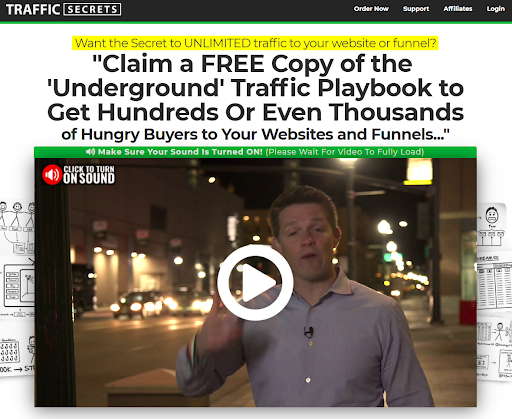
Notice how his question at the top will pique the curiosity of just about any online entrepreneur or marketer?
You can say the same for the headline, which makes a compelling promise. The video and subsequent copy expound on that promise and serve up the details that the reader now wants.
This is how you draw people into a product landing page — especially when we’re talking about people who’ve never heard of or purchased from your brand before.
Curiosity is powerful. Use it.
2. Use High-Quality Images
As discussed earlier, high-quality images are critical for designing a product landing page.
Think about it.
Would you be more likely to buy from a landing page that looked like this:
Or one that looks like this:
That’s an extreme comparison.
But the point is, design matters.
Stick to professional images, keep it simple where possible, and hire an awesome landing page designer.
In addition, make sure your load speed remains fast as lightning, and keep everything consistent with your brand image.
3. Write Compelling Copy
The words on the page.
This is often the toughest part of creating a product landing page.
Writing is hard enough as it is — when you’re trying to persuade someone to take action…
But hear me out.
Writing persuasive copy is not as complicated as you might think it is.
Why?
Because dozens of excellent copywriters have already compiled their expertise for you–anyone can write great copy if they practice using these formulas.
Consider The Brain Audit by Sean D’Souza.
In that book, D’Souza outlines the following structure…
- The Problem — Start by briefly addressing your target market’s problem. You can do this in the advertisement, which drives traffic, or at the top of the landing page.
- The Solution & Trigger — Now, introduce the solution with a few sentences. Try to build some curiosity by making the reader think, “Wait. How do you do this?”
- The How-To — Share more about your solution and how you will help the visitor!
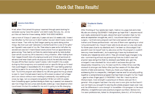
- The Testimonial — Share lots of testimonials to prove that your system works.
- The Risk Reversal — Put the risk on your own two shoulders with a money-back guarantee or other assurance.
- The Objections — Now address the objections that your target market will likely have. Bombard them with clear answers to their most burning questions.
Our recommendation?
Follow that structure as closely as you can, and you’ll be well on your way to success.
4. Remove Main Navigation
This tip is simple.
But important.
Remove the main navigation from your product landing pages — the whole point of your landing page is for the person to convert. You don’t want them to navigate away from the journey you’re trying to take them on.
Still not convinced?
Consider one of VWOs A/B tests where they looked at the impact of main navigation on a landing page.
With main navigation – 3% conversion rate
Without main navigation – 6% conversion rate
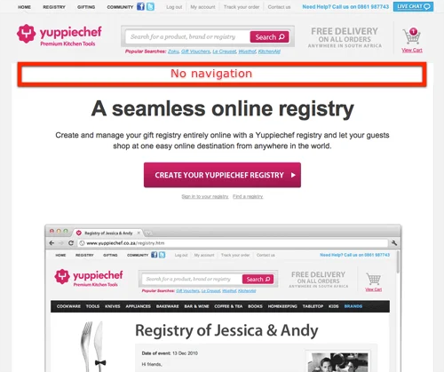
That’s a 100% increase for the page without navigation.
Just get rid of it!
5. Remember That Less is More
It might be tempting to write a lot of copy to try and make your landing page as persuasive as possible.
And sometimes that’s necessary — if, for example, you’re selling a non-physical product to cold traffic, you might want a lot of sales copy.
But more often than not, less is more.
If you’ve got great product photos, testimonials, and professional designers… flaunt it.
Check out the landing page for my freelancing website:
It’s compelling in its simplicity, which was the goal.
Sometimes when you spend a lot of time talking, people start to think that you’re trying too hard.
It’s often better to let testimonials and awesome product photos do the talking for you.
10 Examples of High-Converting Product Landing Pages
We just gave you five tips for building great product landing pages.
But the truth is that every product landing page is different — how you build it depends on the product you’re selling and the brand you’ve established.
Below you’ll find 10 different examples of high-converting product landing pages from several different industries: e-commerce, coaching/consulting, fitness, SaaS, freelancing services, and more.
Find the one that best fits the style you’re trying to go for and study it.
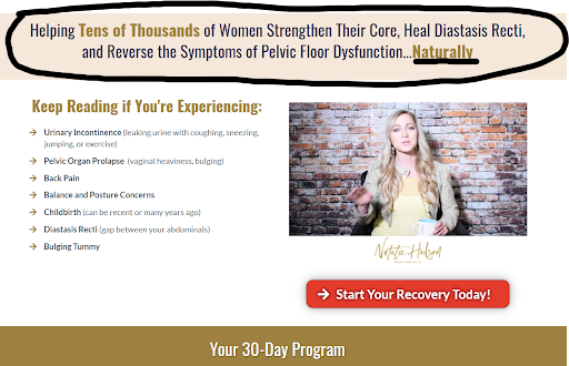
1. Apple Watch
If you’ve got a great product, let it talk for you.
That’s something that Apple has never been afraid to do. In fact, their product landing page for Apple Watch is so long that I didn’t want to screenshot the entire thing. I just took a snippet from the top.
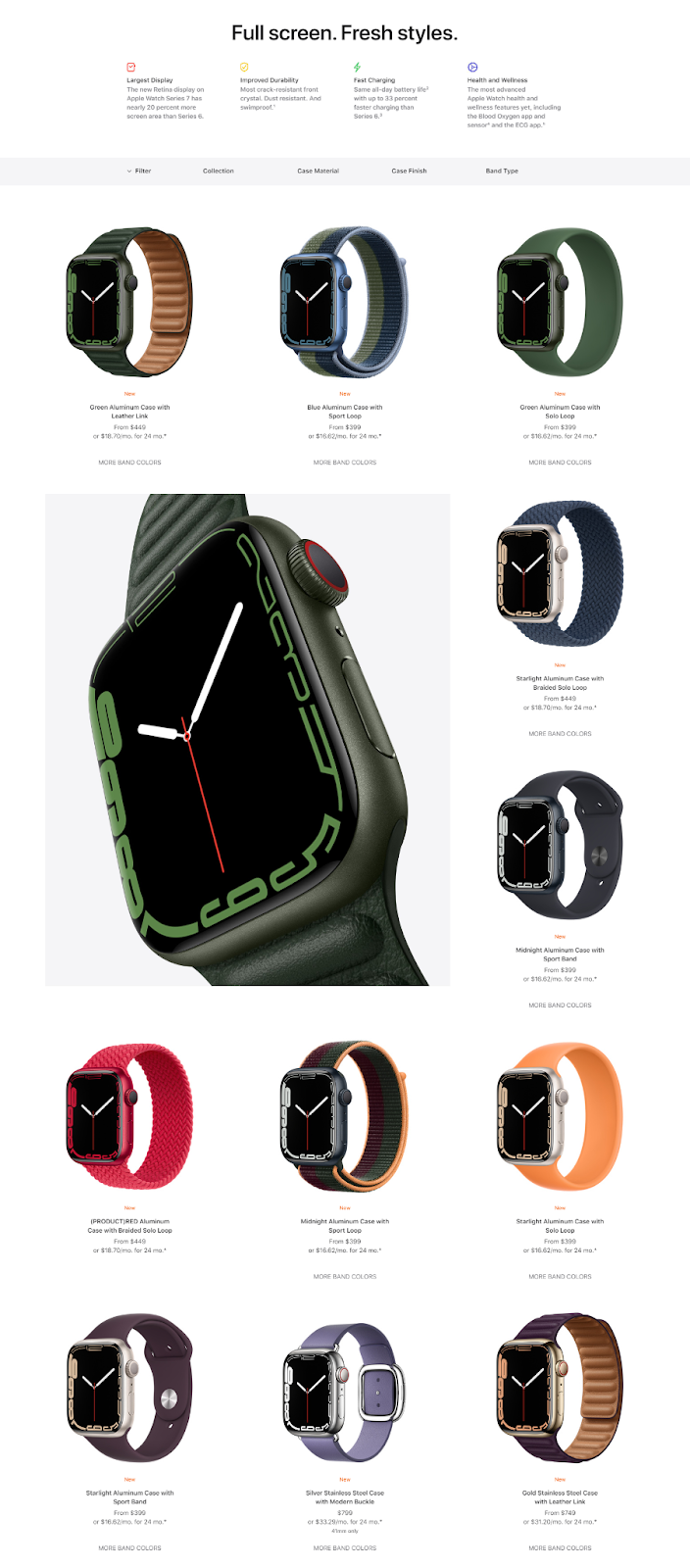
The page includes tons of examples of the different watch builds. It also has some copy about its large display, excellent durability, fast charging, and health and wellness metric reporting.
2. Ryan Dossey
Ryan Dossey is a real estate investing coach. And his landing page is nothing short of excellent–concise, compelling, and well-designed.
What little copy is on the page builds curiosity and credibility. Since the resource he’s offering is free, it’s all that’s needed.
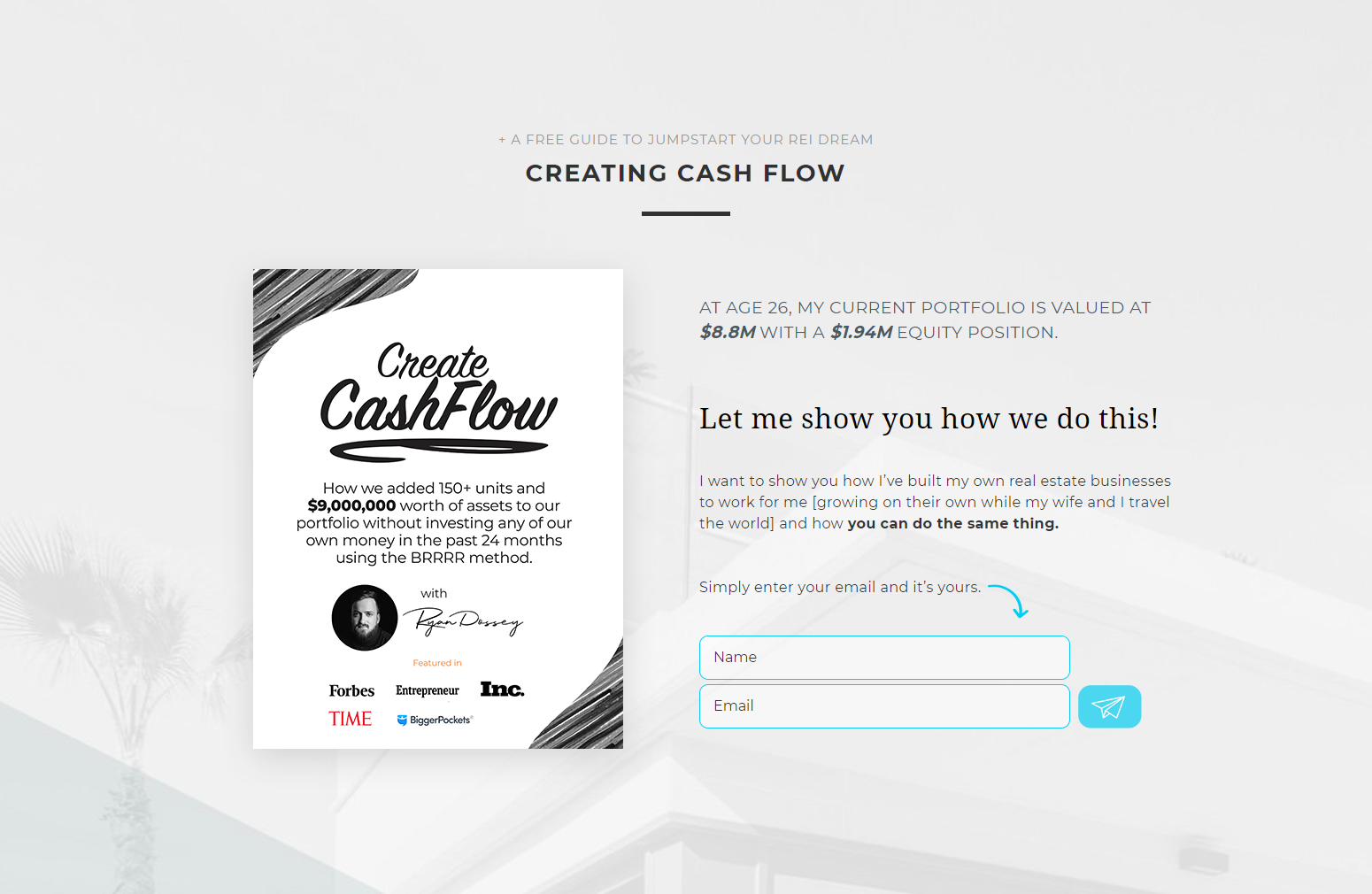
And sure enough, this page converts like crazy for him and drives lots of leads for his business.
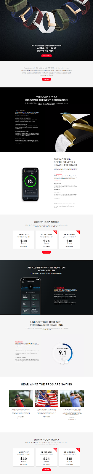
3. WHOOP
WHOOP makes intelligent wristbands for athletes and high-performing individuals.
These wristbands report far more health metrics than an Apple Watch or a FitBit. They even measure physical stress with a metric called “Strain.” The wristband doesn’t have a clock face — the metrics are only viewable via the WHOOP app.
Because the product is unique, WHOOP has to do a bit more explaining than other fitness trackers in the market. That translates to slightly more copy on the landing page.
Read it for yourself.
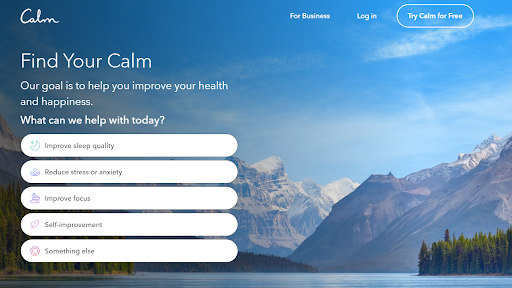
4. Calm
Calm is a meditation and mindfulness app. It helps people improve their sleep, decrease anxiety and depression, and improve productivity.
Calm’s landing page meets the visitor where they are by asking what they need help with.
Answer the question, and they take you to a new page that asks more questions so Calm can “personalize your experience.”
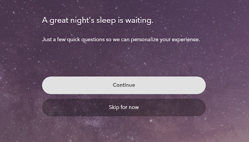
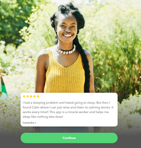
Halfway through the questions, they show a testimonial relating to the specific problem you’re trying to solve.
And after a few more questions about your preferences as well as one more personalized testimonial, they’ll ask for you to create an account.
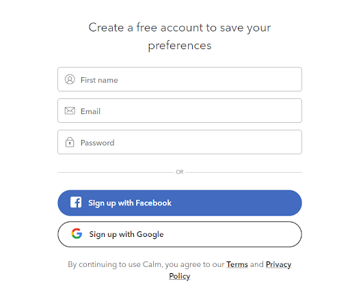
This landing page flow is super effective in the way it personalizes the experience and makes use of social proof via testimonials.
We advise that if you design your page with lots of steps or form fields, you plan to test it. Your particular audience may react differently than Calm ’s.
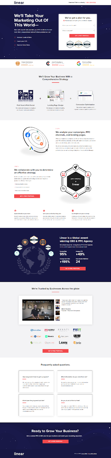
5. Linear
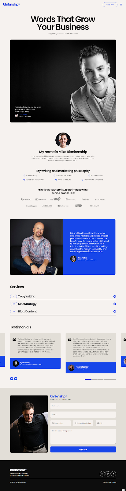
We might be biased, but our very own landing page performs really well.
We start with big promises and a CTA above the fold.
Then we dive into more detail as the viewer scrolls:
- Credibility badges
- An explanation of how we grow businesses through online advertising
- Some compelling metrics from our clients
- Testimonials
- A list of brands we’ve worked with
- And frequently asked questions
This is a great landing page format if you’re trying to get clients for a service-based business.
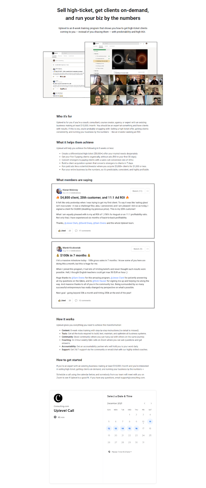
6. Consulting.com
Consulting.com helps people build successful coaching and consulting businesses. And their landing page is an excellent example of why you don’t always need perfect visuals (so long as you’re not selling a physical product). Their landing page relies on copy… and it’s dead-simple.
They just lay it out in the following structure:
- Who it’s for
- What it helps them achieve
- What members are saying
- How it works
- How to get started
- Calendar to book a call
That’s it.
Take inspiration if you sell courses and often overthink your product landing pages. Keep it simple, answer the same questions they answer, and you’ll be well on your way to a higher conversion rate.
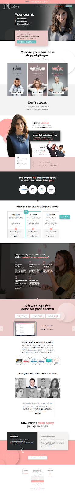
7. Michal Eisikowitz
Michal Eisikowitz is a copywriter with an excellent and compelling website — perhaps the best I’ve seen in the copywriting world.
As you scroll, you can’t help but get the feeling that you’re working with someone hard-working, results-driven, and expert.
Also notice her laser-focus on her customer .
For example, the landing page headline speaks directly to what “You Want.”
Then, the page identifies the main problems her customer personas face and how she solves those problems directly.
If anything, her page is a reminder that it’s time for your landing page to get specific on your customer’s problems and the transformation your product offers them.
Take a look.
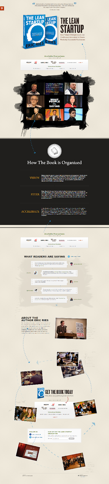
8. The Lean Startup
Beyond being sold on Amazon, The Lean Startup by Eric Ries has an excellent product landing page.
A testimonial at the top, followed by a book image, description, and more testimonials from some of the biggest names in entrepreneurship make this page remarkably compelling.
It’s also cool how the arrows on the page tell you where to look next (try to make your landing page easily navigable too).
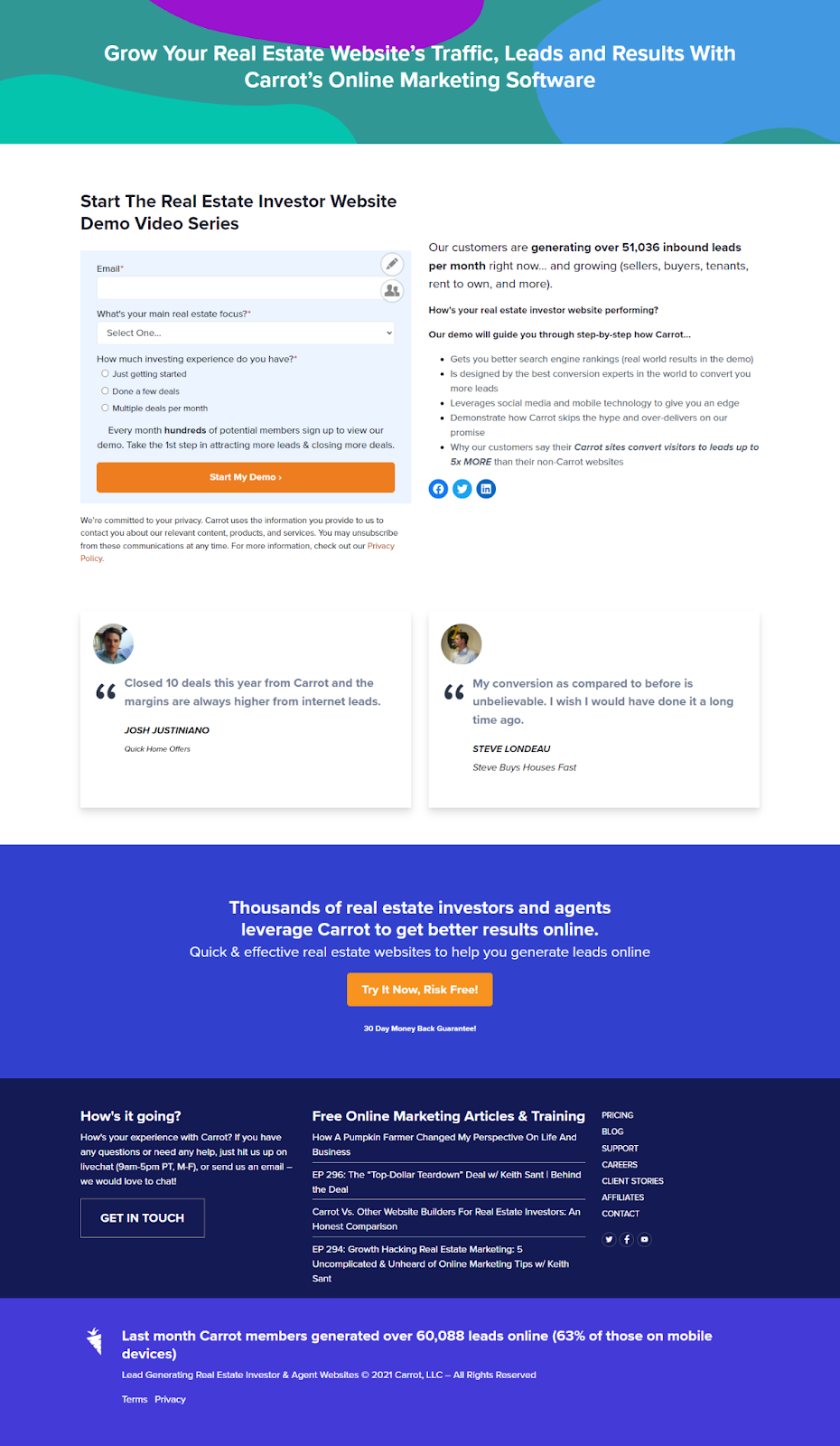
9. Carrot
Carrot is a website builder for real estate investors. And the landing page for their InvestorCarrot demo is very simple.
Opt-in form + social proof + testimonials = precision and persuasion.
Here it is.
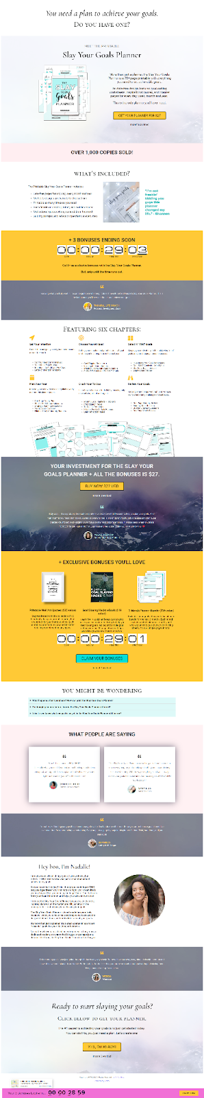
10. It’s All You Boo
The site, It’s All You Boo , is dedicated to its readers’ personal development. And the landing page for its “Slay Your Goals Planner” is excellent (and has resulted in over 1,000+ copies sold)
What’s great about this landing page is that it has all of the persuasive elements for just a $27 product — testimonials, bonuses, a countdown timer, details on what’s inside, FAQs, and more.
Final Thoughts on Product Landing Pages
Product landing pages are powerful.
Because they’re focused on selling just one product , they are more concise, persuasive, and often have a higher conversion rate.
If you’re spending money to drive traffic, you should be driving that traffic to a product landing page (vs. just a basic product page on your website).
You’ve got the tips. You’ve seen the examples.
Now it’s time to design your own.
Off you go!

Leave us a comment.
Subscribe to our blog
Subscribe to our blog
Get weekly PPC & CRO advice sent straight to your inbox.