Landing page trends are always changing.
Today’s brilliant case study result is tomorrow’s debunked theory.
But what makes landing page design so interesting is that you never really know what’s going to work until you try it.
It’s just an educated guess until you collect the data, and you never know if you’re just a guess or two away from a big win.
On that note, check out these 35 landing page trends worth testing out yourself.
Landing Page Trend #1: Short & Sweet
Some products or services need a long-winded pitch and require you to cross every “t” and dot every “i”.
Others just need a short and sweet pitch that clearly and simply communicates the value offered.
A good rule of thumb is that simple, low-investment offers don’t need a long-winded sales pitch and tend to benefit from a short, simple landing page.
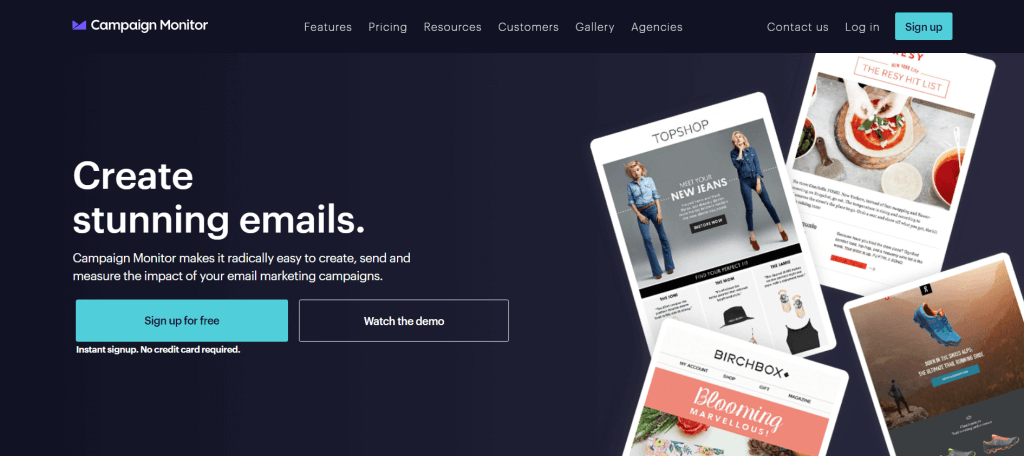
For example, this short landing page doesn’t need to be longer, because you either want the free download or you don’t. Adding another 1,000 words is very unlikely to move the needle on someone being motivated to give their email address.
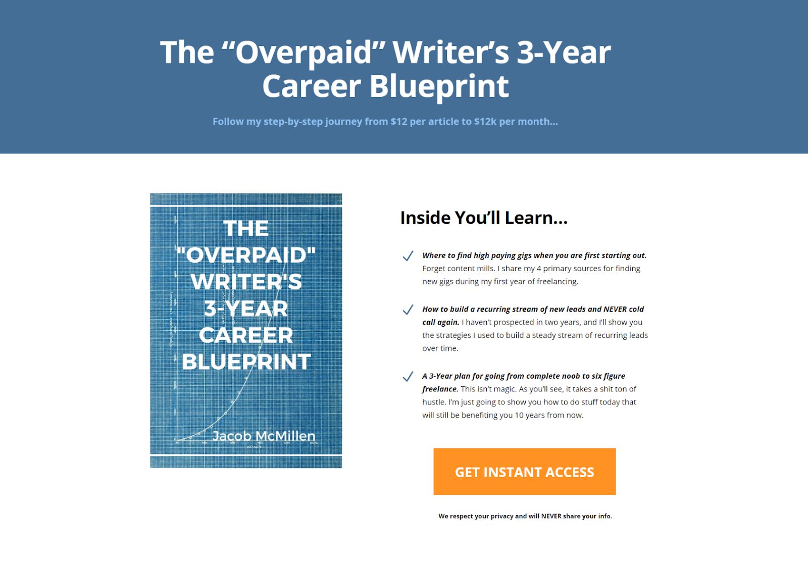
Short and sweet landing pages are best for lead magnets
This page is short and sweet, but it’s not wimpy. It has a strong call-to-action and builds a lot of anticipation, even with limited copy.
Landing Page Trend #2: Bigger & Better
In contrast to the short and sweet page, sometimes bigger and better really is… better.
Some pitches really require the whole song and dance. You have to hit ‘em with that on-point value proposition, go deep into the pain points, cover all the benefits, show your past successes, explain how it all works, and so on and so forth.
Take this landing page by Nusii for example:
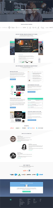
It’s super long and gives visitors a ton of reasons to use their software.
Nusii does a great job of creating social proof, highlighting customer testimonials, and showcasing everything their software has to offer.
A good rule of thumb is that higher price points typically require longer nurturing periods and a longer, more intricate landing page pitch. If you are asking someone for a bigger investment, you typically need to make a more thorough argument with more supporting evidence and more social proof.
Just like you probably don’t need a long page if you are only asking for an email address, you probably do need a big ol’ chonker of a page if you are asking someone to commit a notable amount of time or money.

Now that’s what I call a big ol’ chonker
Keep in mind that even if you have a high priced product or service, longer landing pages won’t necessarily be the best option for you. The only way to know what will work best is to test.
Landing Page Trend #3: Two Column Formatting
Landing pages are all about space, and where you put things can have a large impact on how visitors will interact with the page.
One trend, primarily for desktop landing pages, is to arrange information in two columns. This can be used for the overall page format itself or more specifically, for the forms displayed on your landing page.
On the plus side, this allows you to present multiple things at once. It can also help reduce uncertainty for users about what’s next when compared to scrolling down a single column.
Switching to a two-column form increased this page’s conversions by 57%.
On the negative side, two columns can distract from the information you are trying to present in any one of the columns. And since we want our landing page to have a linear narrative, two-column formatting can sometimes create variability in how people read through the page, hurting that linear narrative.
As a final concern, two-column formatting isn’t compatible with mobile browsing.
Landing Page Trend #4: Mobile-First Design
Smartphone and tablet browsing accounts for more than half of all internet traffic. For years, businesses keeping up with mobile browsing behavior tried to keep their landing pages mobile “friendly”. What this means in practice is that they were designed for desktop users first. The parts that didn’t translate well to mobile were then tweaked.
Over the last 5 years, it’s become increasingly common to design a landing page for mobile-first and worry about the desktop experience after the fact.
Instapage has an awesome mobile landing page
This is partially due to the increasing share of mobile traffic, but it’s also due to the fact that mobile-first design doesn’t typically create problems for desktop users, while the reverse isn’t usually true.
Landing Page Trend #5: No Navigation
When someone arrives on your landing page, you want them to engage with the page and convert. You typically don’t want them to leave your pitch and go browsing around your site.
This is why it’s becoming increasingly common to remove navigation options from key landing pages. By eliminating the navigation bars and menus, you can reduce distraction and limit the visitor’s options to either engaging with your page or leaving.
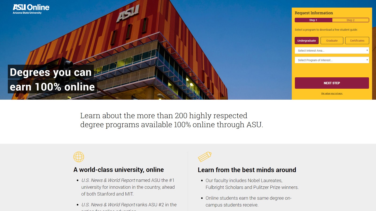
Take this landing page by ASU online for example, it doesn’t have a top navigation menu.
Leaving might sound like a bad option, but if the visitor doesn’t resonate with your landing page value proposition, they probably aren’t a good fit for your products or services anyway.
Landing Page Trend #6: Intro Video
When it comes to converting visitors, videos are really, really, really, really effective.
Intro videos, in particular, are useful for certain landing pages. After all, there is only so much you can say in writing above the fold. When people first land on your page, you need to hook them in quick, and if your value is a bit complex to explain, an intro video can help you really nail your elevator pitch without requiring the visitor to scroll.
Styku is a great example of intro video in action.
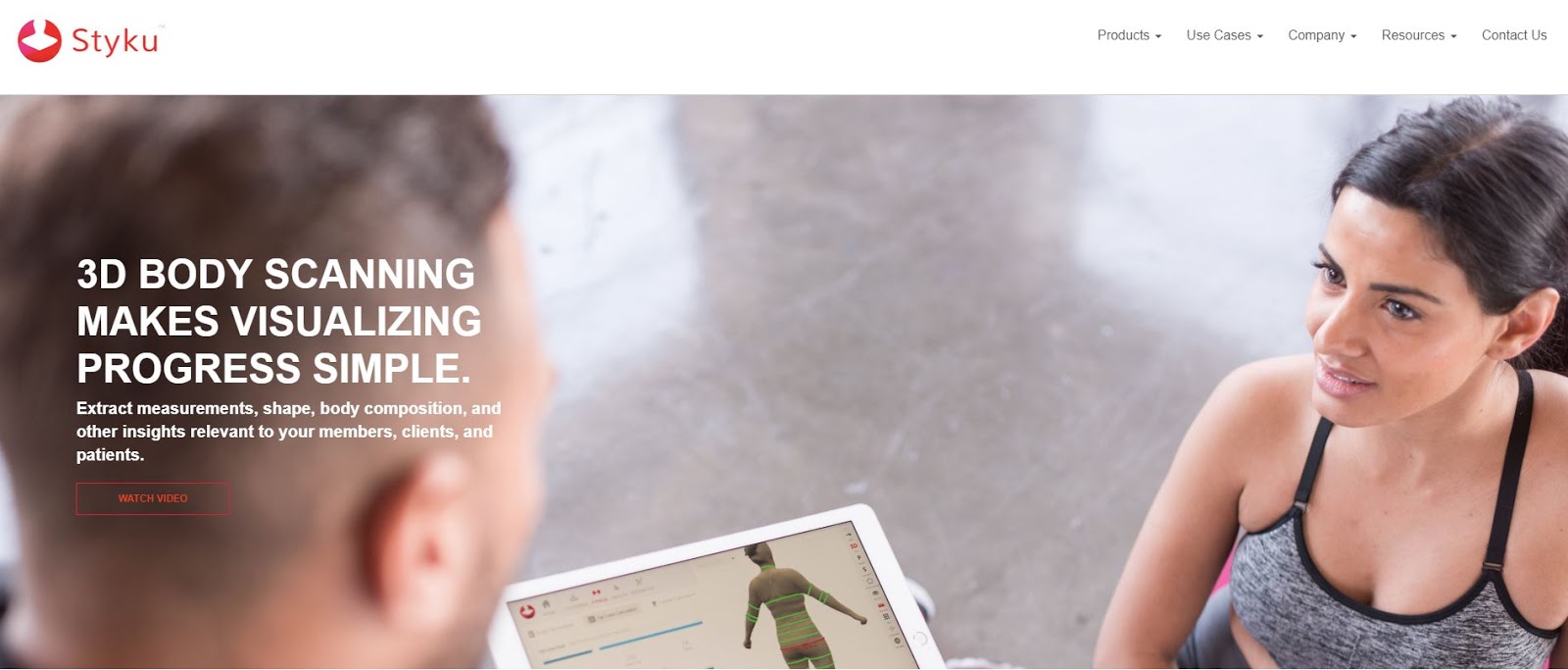
Visitors can click to watch an intro video before scrolling through the rest of the page.
It also acts as a differentiator in a competitive market and can add a personal touch to your brand. If you have the time and resources to put together an intro video, it’s worth doing.
Landing Page Trend #7: Autoplay Video
Autoplay videos have all the benefits of regular videos with the added bonus that you aren’t relying on the visitor to begin playback. It simply begins playing when the page loads, immediately delivering your message.
A great example of this is the landing page for Summus Laser:
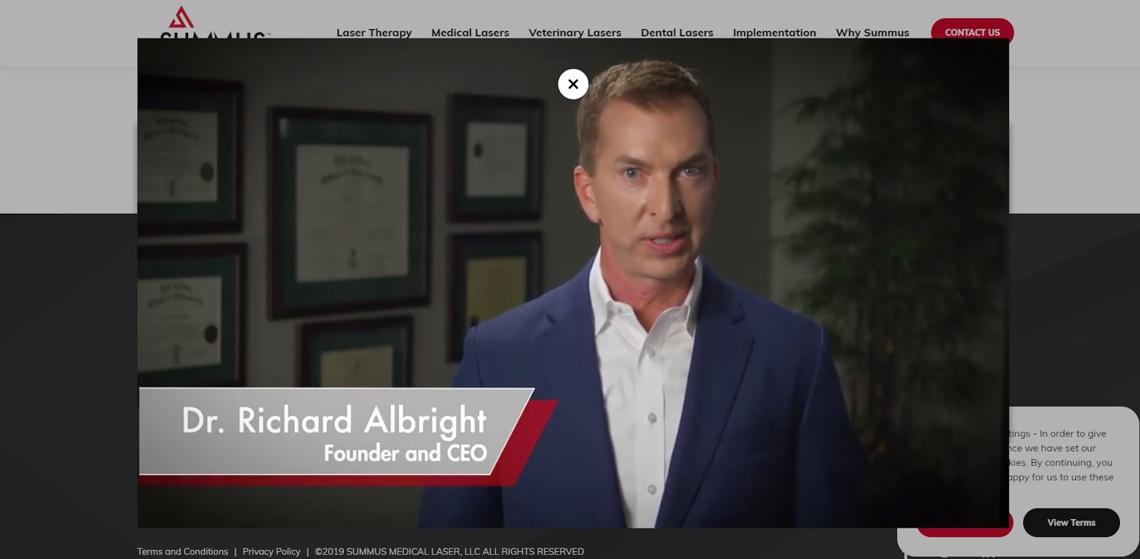
Summus Laser uses an intro video to explain their products before you navigate their landing page.
The downside is that many internet users are particularly hostile to autoplay videos and any sort of non-user-driven audio playback. This is partially due to their association with intrusive advertising practices and partially due to expectations of control when browsing.
Regardless of the reasons, you should be particularly careful when testing out this landing page trend. Make sure the video is very good and very relevant and then test the difference in performance between click-to-play and autoplay.
Landing Page Trend #8: Custom Photography
We know with certainty that obvious stock photos turn off potential customers.
Since businesses still need imagery on their sites, one popular option is to shoot custom photographs for use on the website and landing pages.
The biggest advantage of custom photography is relevance. If you are taking photos of your staff, assets, location, etc., it’s very likely that the photos you produce will be very relevant to your business, and by extension, your landing page offer, like in this example from Bill Widmer.
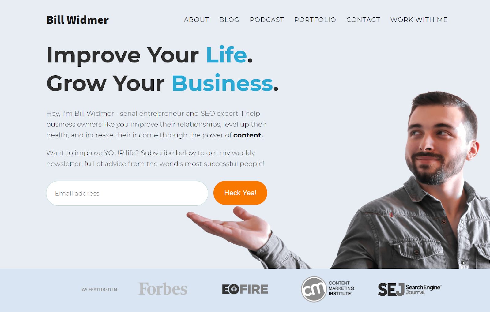
Bill used a custom image of himself gesturing to his value proposition.
It’s also relatively affordable, especially in today’s gig economy where talented photographers are widely available at very reasonable prices.
Landing Page Trend #9: Custom Illustrations
In the same vein as custom photography, custom illustrations are another popular landing page trend that allows you to skip stock photos and stock graphics in favor of something customized.
Custom illustrations come with added flexibility. You can demonstrate ideas and processes that can’t be captured with a camera, and you can customize your displays to fit the tone and feel of your brand.
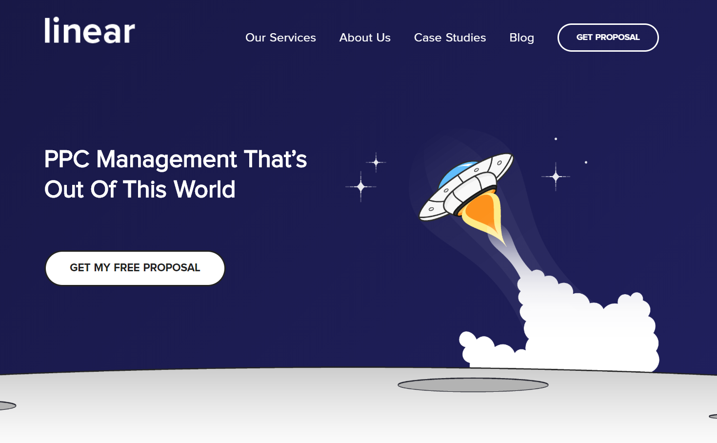
Custom Illustrations are kind of our thing here at Linear 😎
The downside is that making bad illustrations is a lot easier than taking bad photos. The threshold for “good” is much higher, and by extension, a bit more expensive. If you can find a great illustrator who fits your budget, that’s probably the best of both worlds.
Landing Page Trend #10: Impactful Visuals
Whether you go with a photo, graphic, illustration, or another display format, what’s really important isn’t the format, it’s the feeling.
You want the visuals to have an impact on the viewer. You want them to mean something. You want them to communicate something.
More and more businesses are starting to take their visuals seriously, and this is one of those trends that you need to jump on, or you’ll be left behind.
Take this example from puppyspot for example.
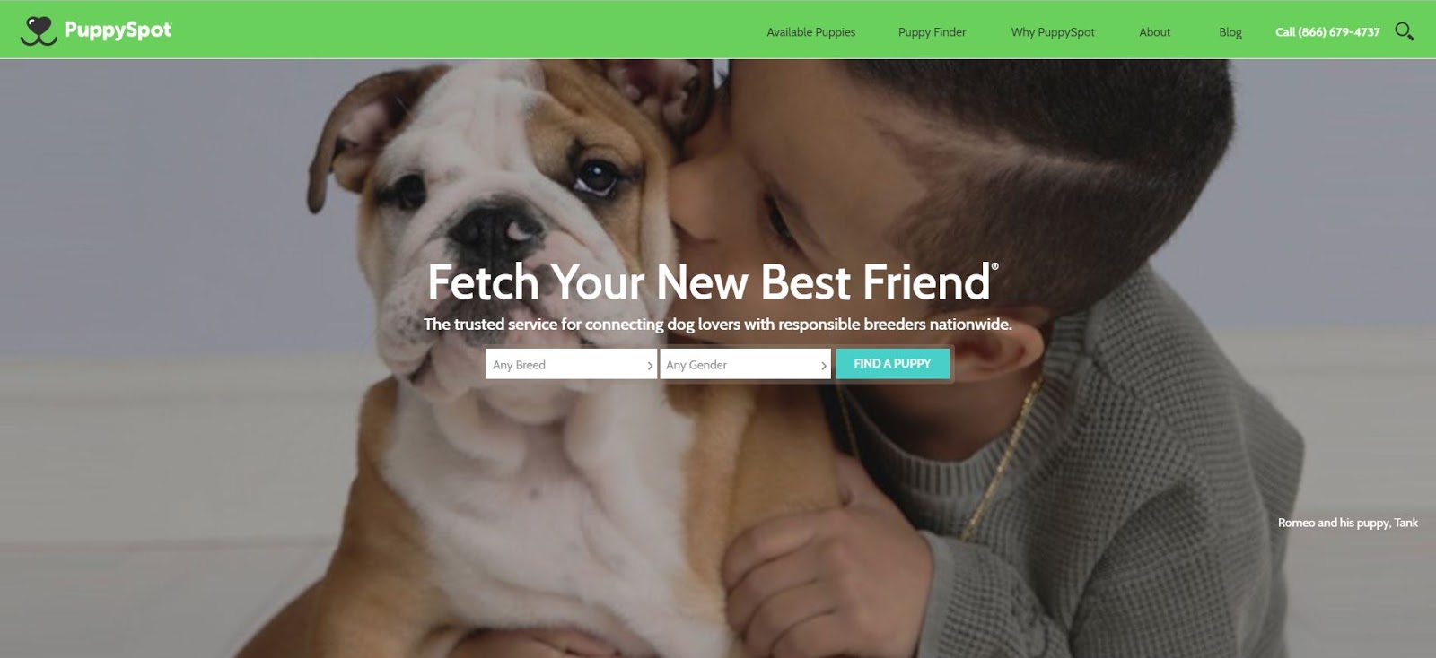
Let’s be honest there’s not many things in life more impactful than a puppy 🐶
Landing Page Trend #11: Flat Design
Good landing page design is clean, bold, and often minimalist. It focuses on the message rather than distracting visitors with flashy objects or features.
Since its inception, flat design has inherently incorporated these attributes, making it a go-to choice for any serious business aiming for real conversions and real revenue.
Flat design just means two-dimensional design, as you see below:
No shading, no 3rd dimension, no extras of any sort
As you can see, this design style is very simple, clear, and uncluttered.
It’s not the only modern design trend that works, but it’s probably the easiest to execute and the most reliable choice regardless of industry or niche. I put this together myself, as a non-designer with only a limited eye for aesthetics. And thanks to the simplicity of flat design, it’s a perfectly professional looking page, despite my shortcomings.
Landing Page Trend #12: Animated Videos
Animated videos are to regular videos what illustrations are to photographs. They allow more flexibility in helping visitors visualize the ideas and processes that drive your business and the value you provide.
With animated videos, you can do anything. This gives it a high capacity for brilliance and effectiveness as well as a high capacity for being absolute garbage. If you go the animated video route, make sure you are working with talented people, like the people who worked on this video for Mint.com.
Landing Page Trend #13: Animated Page Elements
Animated page elements are all about creating dynamic visual flow. Rather than simply scrolling down a still page, the animated elements can enhance the journey of the eyes, drawing focus to one section after another.

A beautiful example of animation in action ✨
When used strategically, these elements can improve the overall page experience. When used poorly, they are just annoying distractions. Less is usually more here, so either be really targeted with your animated inclusions… or really sparse.
Landing Page Trend #14: Interactive Content
Interactive content takes some of the goals of animated page elements and puts them on a big ‘ole dose of performance conversion enhancing drugs.
Interactive content attempts to grab the reader and insert them into the page narrative. It’s an ambitious goal and requires a technically proficient team to pull it off, but if you do, you can pull off an absolute unicorn of a goal: your visitors will never forget your landing page.

Catch that unicorn!
One of my favorite examples of interactive content comes from Huemor a New York-based web design firm.

When you move your cursor across the page the spaceman moves too 🚀
In this case, interactive content not only makes the page and company more memorable but showcases the companies skillset.
Landing Page Trend #15: Strategic Popups
Pop ups seem to seesaw between marketing darling and hated ex at least once per year.
There’s always a new case study to show how effective they are at lead capture, and there’s always a new case study talking about how the initial lead increase doesn’t translate to revenue.
Simple popup boxes used to be in vogue. Then it was exit intent. Now it seems to be full-screen popups that look more like a surprise landing page attack than a popup.

Full-screen pop-up, ATTACK!
The only thing we can say definitely about popups is that they are trending… and probably always will be.
Landing Page Trend #16: Parallax Scrolling
Parallax scrolling makes the background and foreground elements of a page move at different speeds. This creates an interesting dynamic effect that contrasts with the traditional scrolling experience.

Parallax in action
This is one of those page trends that probably won’t have any demonstrable effect on page results. It can be a pleasant change of pace if a few sites in your niche are using it, but otherwise, it’s just a simple preference choice.
Landing Page Trend #17: Call To Action
Every landing page should have a singular goal, and everything on that page should be focused on achieving that goal.
Your Call To Action is where this all comes to a head. In sales, they say you should always be closing. Your Call To Action is your close. It’s where you say, “Okay, enough talk. Go do this.”
Every landing page needs a Call To Action, so make sure yours has one, and make sure it’s powerful.

Strong value proposition still not gonna save ‘em from Disney & Amazon tho 🙁
Landing Page Trend #18: Creative Value Proposition
The standard value proposition format is a headline, followed by a subheadline, followed by a CTA.
There’s nothing wrong with this basic format, but businesses have become increasingly creative with their value propositions, bringing in more and more elements like video, social proof, tools, etc., like we can see in this example from Carrot.
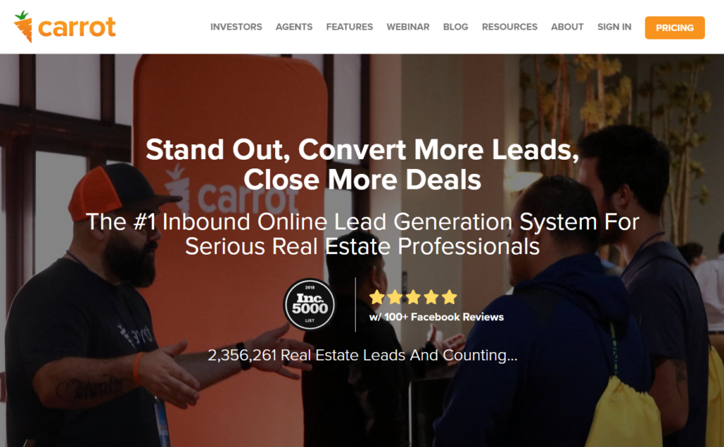
1 value proposition… 3 different types of social proof
To dive deeper into this complex world, check out this guide on how to write a value proposition.
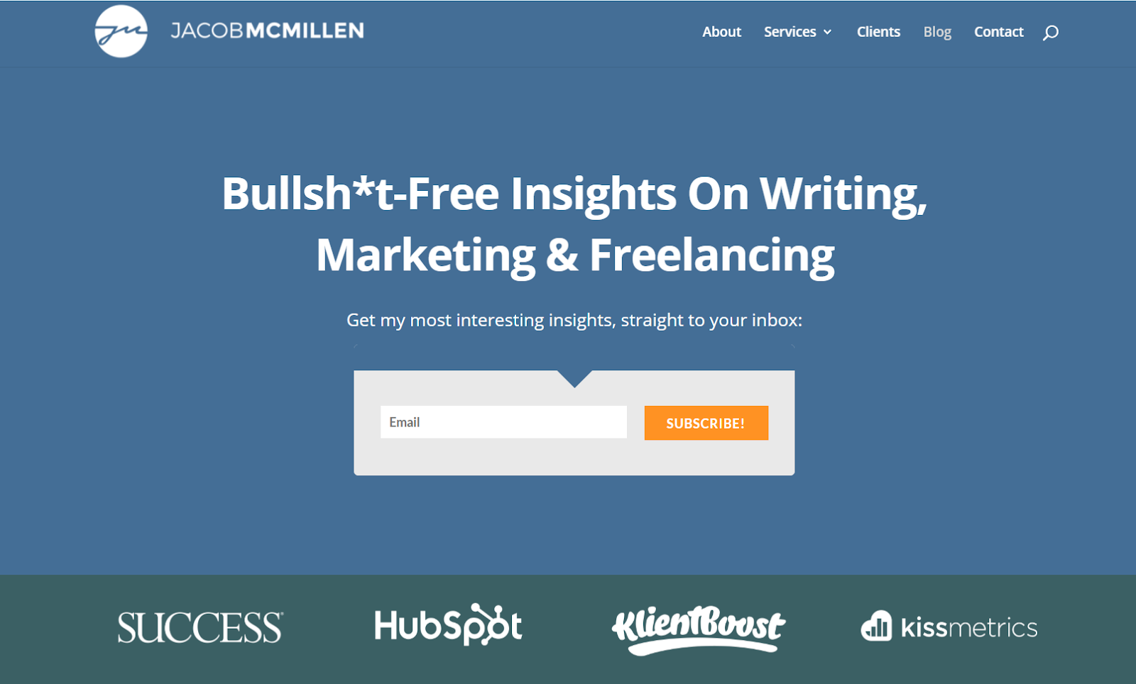
Landing Page Trend #19: This or That CTAs
As I mentioned earlier, we really want there to be one singular goal for our landing page.
That said, as segmentation has become more and more common, the intersection between singular CTAs and segmentation has become a bit complex. For example, what do you do if the same audience profile could potentially be split into two different funnels?
This is where a “this or that” CTA can be handy. You are essentially saying, “Either do this or do that.”
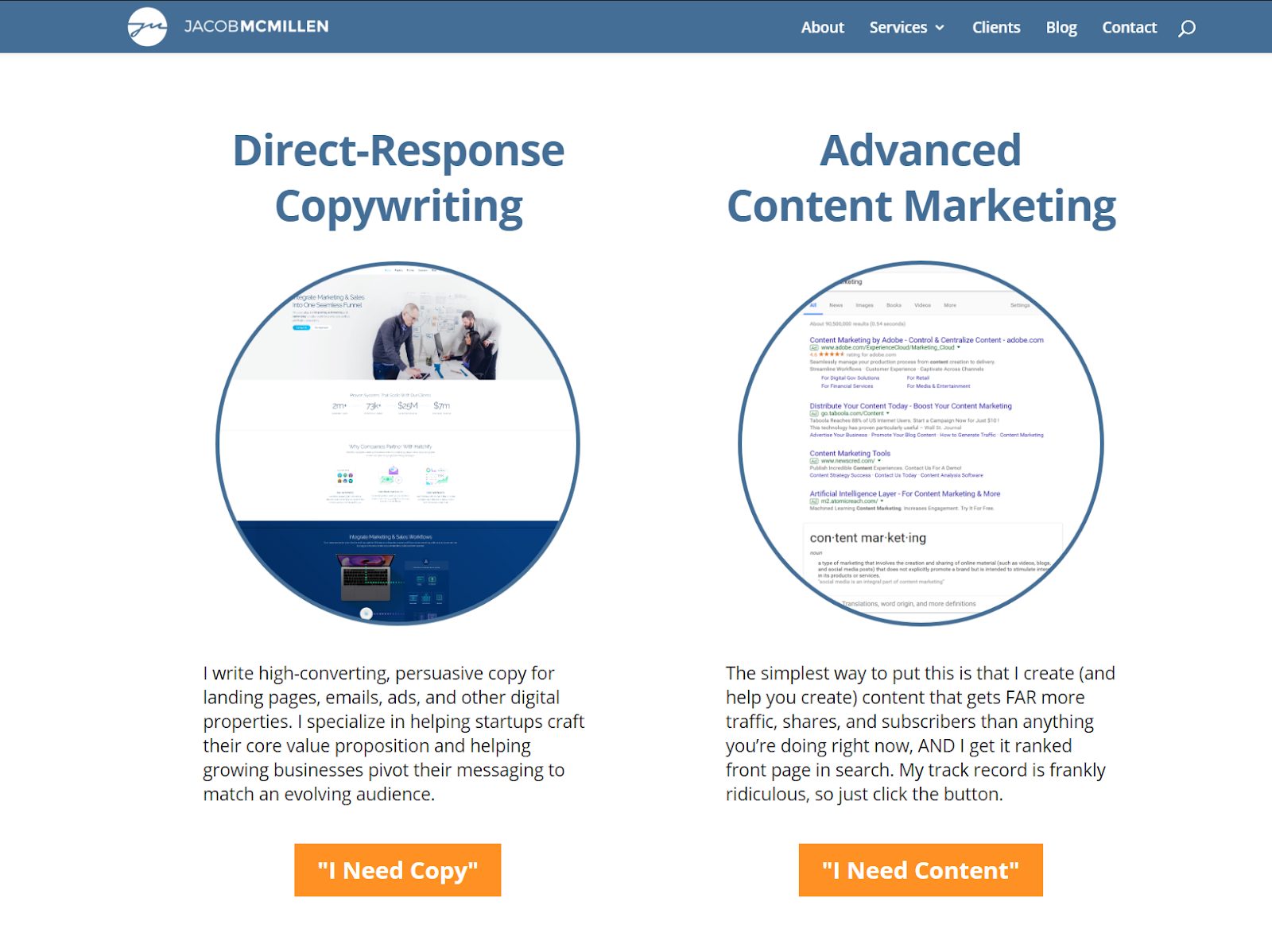
This one or that one ⚖
In the above page, for example, I don’t know why the people who landed on this page are interested in hiring me, so I’m giving them two choices… basically saying, “If you’re here for copywriting, click here. If you’re here for content marketing, click here.”
Landing Page Trend #20: Multi-Step Forms
When it comes to sales, information is everything. The more you know about a lead, the better equipped you are to tailor your offer to their unique needs. Multi-step forms are sort of a sneaky way to get more information without scaring the user away.
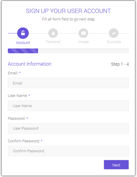
Imagine how long this would be if it wasn’t multi-step
Let’s say you want to collect 9 pieces of information. Displaying a 9-field form upfront my seem a bit daunting and influence the user to bounce. A 3-field form, on the other hand, appears quick and easy.
With a multi-step form, you can basically display a 3-field form to the user, and then just rotate through two additional steps with 3 fields each, giving you 9 fields worth of info without scaring the user away.
Landing Page Trend #21: Numbered Steps
One of the things you may have noticed is that many sites like to take you through their pitch in numbered steps.
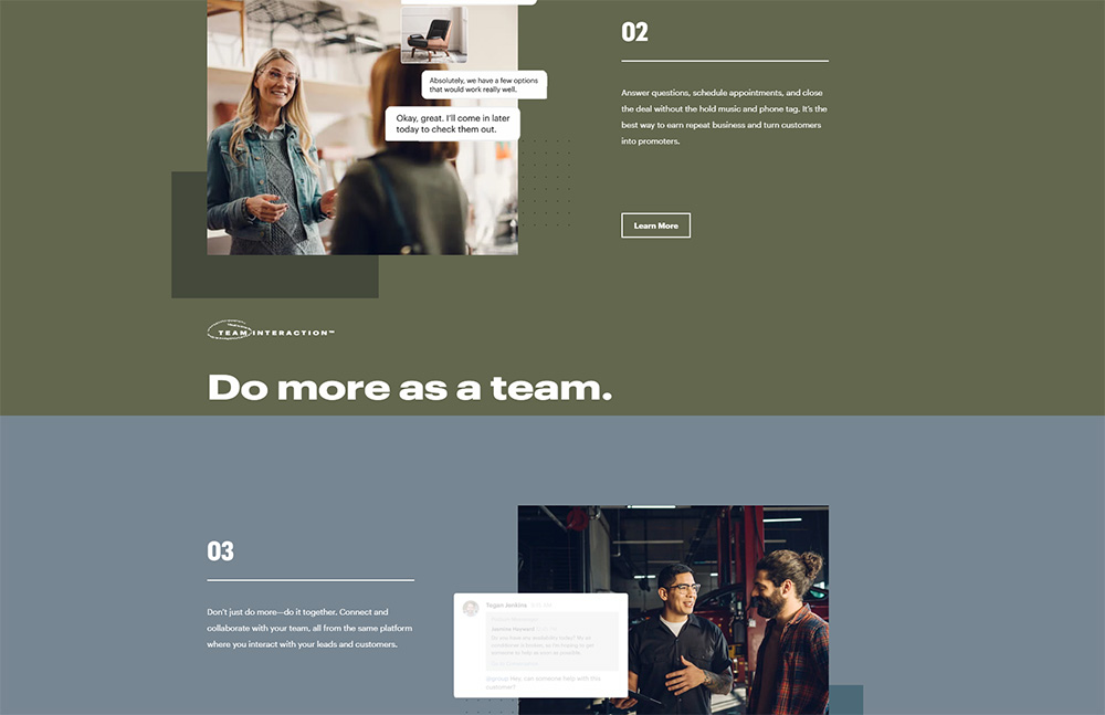
Podium uses numbered steps to showcase the benefits of using their software.
People really like to think in a linear flow – first this, then that, finally the other – and numbers make it easy to get an understanding of what’s being offered.
It’s not essential, and in many cases, the numbers could be removed with no real downside, but for some of your visitors, being able to contextualize each step within a numbered order can be helpful.
Landing Page Trend #22: Guided Tours
If you really want to take hand-holding to the next level, you can create a guided experience of your web page. This is very common for onboarding users to new software tools, where controls can be complex and retention relies on the customer figuring it out.

Guided tour example from Autopilot
The same concept can be applied to a landing page as well, but similar to autoplay videos, it tends to remove agency from the visitor, which isn’t always well-received.
If you feel the need to create a guided tour, it also probably means that your copy and UX flow don’t have enough clarity. A guided tour should never be needed. It’s more something you can experiment with if you are trying to achieve a specific user experience.
Landing Page Trend #23: Free Tools
As competition continues to increase, the battle to differentiate yourself is becoming more and more challenging. One strategy many businesses have been using to stand out from the crowd is to create free software tools that can be downloaded or used directly through their website.
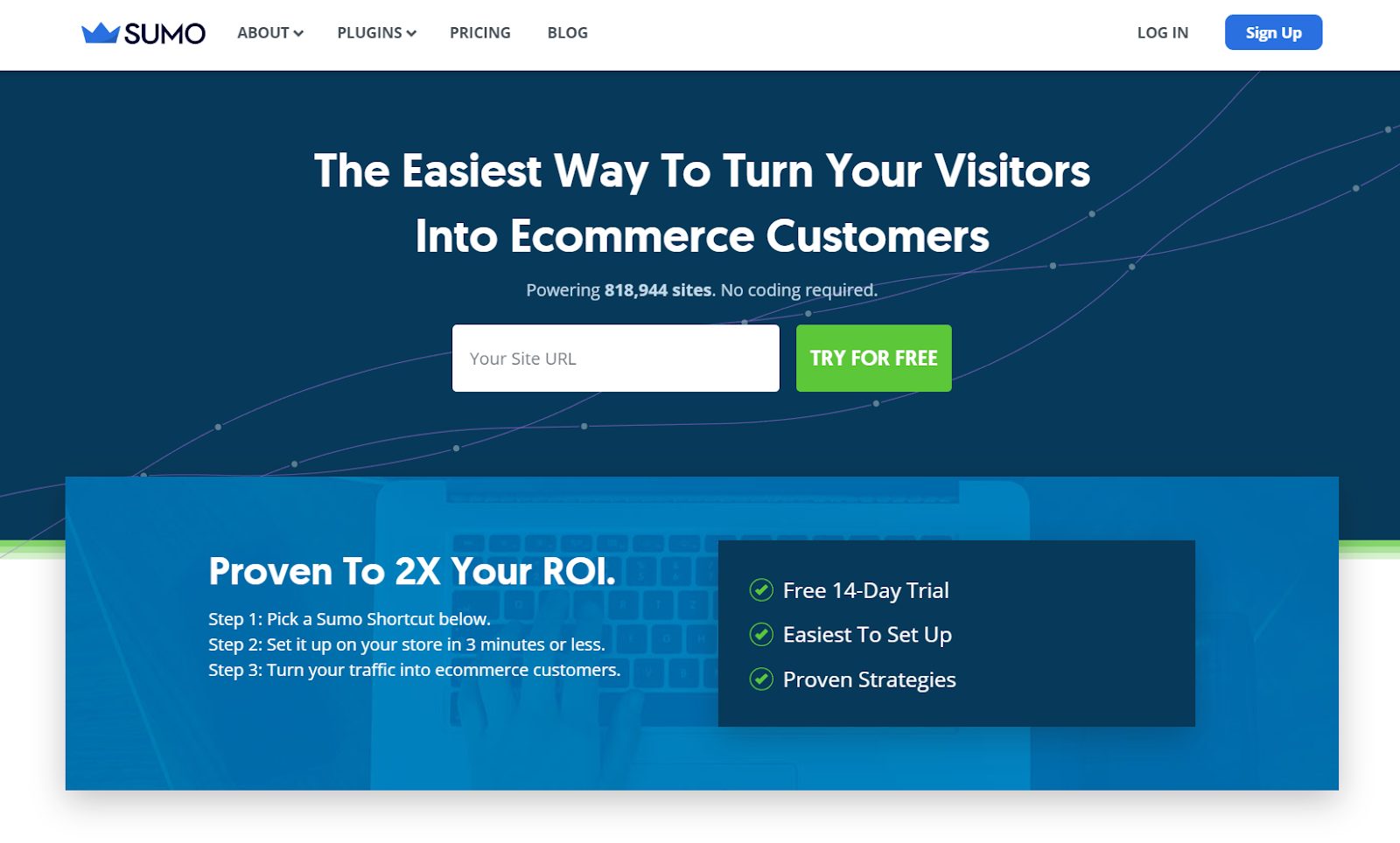
Sumo’s free tools are used on over 800k websites
If the function is helpful enough, tools can attract people back to your page over and over and over again. They can also be used to directly lead to lead capture processes or other types of funnels.
Most businesses aren’t willing to invest in putting a tool together, and that’s precisely what makes having a free tool so effective.
Landing Page Trend #24: Chat Bots
Chatbots are a great way to kickstart real conversations with website visitors. By simulating a live customer service agent, it encourages visitors to explain what they are looking for, allowing you to give them exactly that.
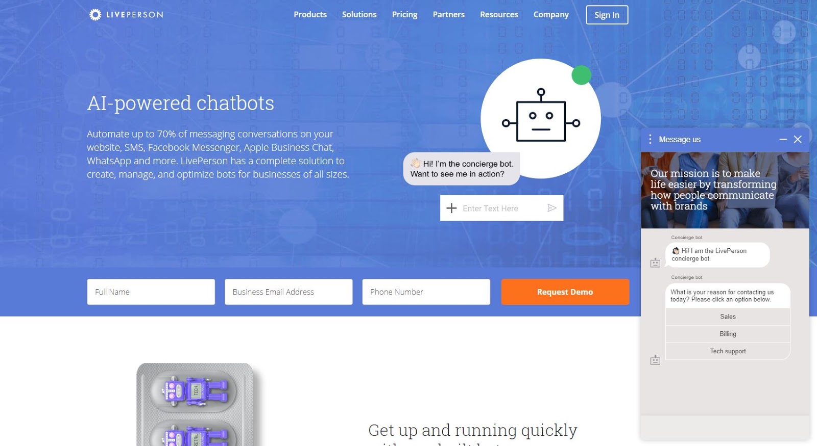
Chatbots in action 🤖
While more advanced chatbots can let you take the conversation further “hands-free”, it seems that most people using bots successfully are using them simply to trigger a real conversation with an actual staff member.
Landing Page Trend #25: Testimonials
There is nothing more powerful in sales than the recommendation of a friend, and as it turns out, the recommendation of a stranger has a similar effect, even if it’s just a bit less powerful.
And testimonials don’t have to be written, you can use videos to show visitors what your customers have to say about your product or service.
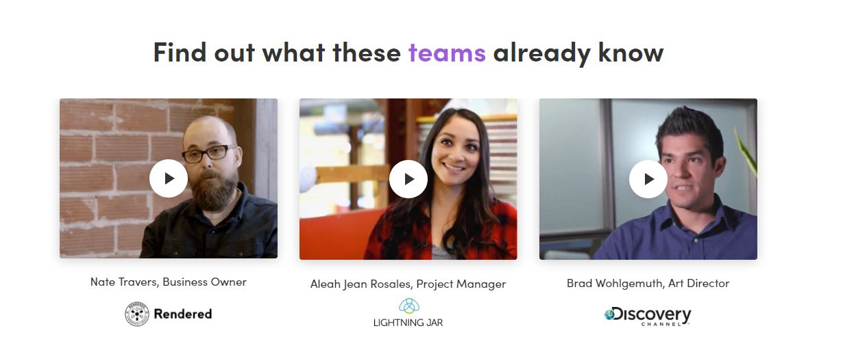
Monday uses video testimonials to show off their happy customers
Testimonials allow you to be really salesy without feeling salesy. After all, if your customers are hard selling you, can anyone blame you for sharing that publically?
A good testimonial will hit on the pain points that were solved and the benefits of solving them. It will also highlight your target audience by coming from someone who looks and sounds exactly like the people you are trying to sell to.
Landing Page Trend #26: Thank You Page Optimization
What happens after people respond to your Call To Action? If the answer is “not much”, you are missing out on a golden opportunity, particularly on lower investment conversions like email subscriptions.
These individuals have just said yes to you, and they are in a prime position to engage further with your business. You should identify a natural next step in that journey and optimize your thank you page to lead them further down the funnel.
For example, if someone has just downloaded your ebook, you might incentivize them to share the download link with their friends by offering them another free download in exchange for a share.
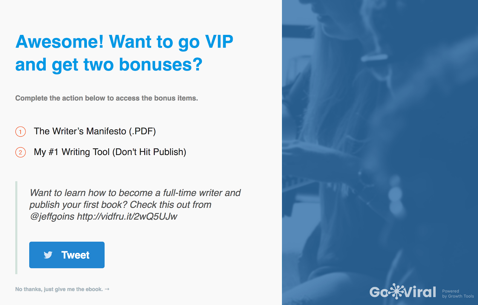
You can create this same landing page using free tool GoViral
Landing Page Trend #27: Brand Bars
A brand bar is a visual bar that displays several logos from prominent brands you have worked with in the past.
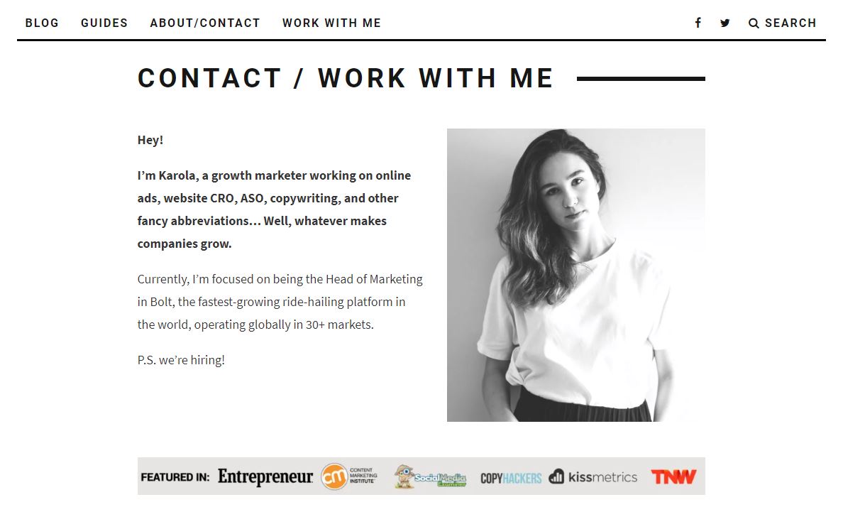
Karola’s site uses brand bars to show off all the awesome companies she’s worked with
The goal of a brand bar is to verify your own brand’s legitimacy using the trust or reputation of the displayed brands. You are basically saying, “We aren’t nobodies who are trying to trick our first customers into taking a chance on us. We’ve worked with these brands you’ve heard of, and that means we are probably legit.”
Like other forms of social proof, it won’t always make a difference, but it’s one of those things that can move the needle in someone’s mind and cause them to give your brand a try.
Landing Page Trend #28: More White Space
Design isn’t the point of a landing page. The point is the message, and the goal of your landing page design is to highlight and facilitate that message.
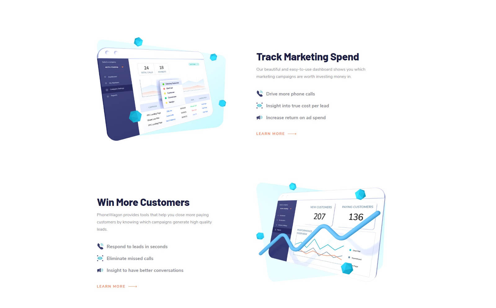
PhoneWagon makes great use of white space
This is why extensive white space has become such a popular design trend for landing pages. In the past, designers would often try to cram as much content onto a page as possible, so the transition into more and more white space has become a noticeable trend.
White space gives the page room to breathe. It is easy on the eyes and makes it easy for those eyes to find and flow with the main message of the page.
Landing Page Trend #29: Big Bold Typography
In a similar vein to more white space, the trend of bigger and bolder typography puts the visual emphasis exactly where you want it to be: the words… the message.
It’s hard to miss the message on a page with big bold letters framed by extensive white space… in fact, it’s the only thing you can focus on.
Pretty hard to miss this BIG BOLD MESSAGE 👀
On one hand, the danger of going with bolder typography is that everyone else is as well, and you don’t want your site looking exactly like every other site. But the truth is that most customers really don’t care if your site looks like other sites. They only really care about the value you are offering them, and if bold typography makes it easier for them to understand that value, there is really no downside.
Landing Page Trend #30: Subtle Motion
This is a subtle trend… hehe… but a trend nonetheless.
Designers are starting to use subtle motion to create an ambiance without being overly distracting in the process.
See this trend in action here:
The subtle fluttering of the plants in the wind creates the perfect ambiance
The goal is similar to that of animated page elements. It makes the page experience a bit more dynamic and a bit more engaging. It’s also pretty easy to do.
Use this trend when you are aiming for a specific feeling and want to impart it to visitors as they experience your page.
Landing Page Trend #31: Drop Shadows
As we’ve mentioned a few times in this post, we want our message to stand out and be highlighted by the page design and layout. At the same time, we also want to be using impactful visuals, including great background images.
But what happens when the perfect background visual makes the copywriting hard to read?
Well, you need some sort of design tool to make the copy more clearly stand out, and drop shadows are one of several tools that allow you to do just that. By using drop shadows, you can make text that might otherwise blend into the background really pop, ensuring the message is seen and read.
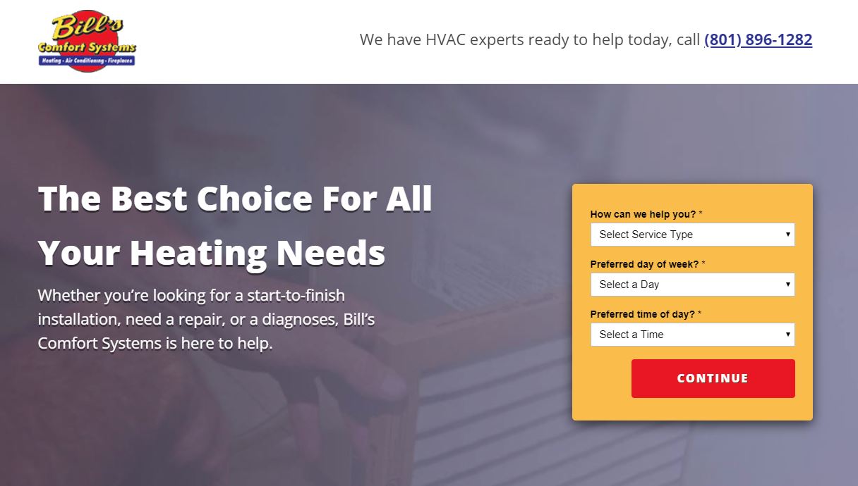
Bill’s Comfort Systems really makes their headline stand out with drop shadows.
Landing Page Trend #32: Short, Simple Headlines
Headlines are typically the most important pieces of copy on your page. Visitors will determine whether they read the following section based on the quality of the headline.
Accordingly, descriptive headlines were the norm for a long time. More recently, however, in keeping with the trend of clean, more minimalist design, it’s become the trend to try and condense headline copy into short, punchier headlines.
Only 3 words. Still doin’ work.
Doing this without sacrificing clarity is a bit of an art, as you risk leaving out important information, but if you can pull it off, your headlines and overall page will be cleaner and snappier.
Landing Page Trend #33: Conversational Copy
It’s become increasingly apparent to marketers and business owners that customers don’t like to be sold to. They just want to be communicated to like normal human beings.
Accordingly, we’ve seen a shift over the last decade of businesses going from more formal website copy to much more conversational copy designed to read like an in-person conversation.
There’s no way this wasn’t copied & pasted from an actual conversation
Perhaps surprisingly, writing in a conversational style is one of the hardest things for non-copywriters and even lower-tier copywriters to pull off. Most of us have been programmed from a young age to associate formal language with professionalism, and as a result, separating unnecessary formality from our writing doesn’t come easy.
The solution is either to hire a talented copywriter or accept that you probably aren’t going to produce something usable the first time. Take as many stabs as you need to shed the formal language and produce something conversational.
Landing Page Trend #34: Mobile Apps
We talked earlier about mobile-first design, but some businesses have tried to take things even further, encouraging people to use an app to continue engaging with the company rather than continue via their browser.
The only time this is worth testing is if two things are true:
- There is a significant, intuitive benefit to getting visitors over to your app
- The landing page’s singular goal is to drive app downloads.
If one of those two things is not true, don’t try this!
Industries that might benefit from having an app ☝️
If your business isn’t in one of these fields, you don’t need an app.
Landing Page Trend #35: Cards Layout
Landing page “cards” are a way of organizing page content within uniform boxed areas, resembling cards.
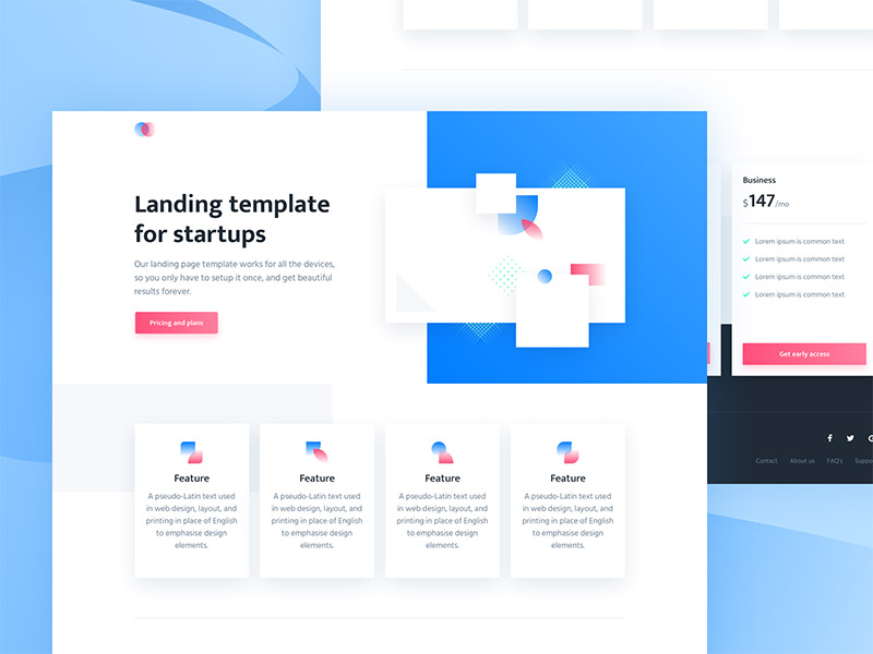
Website cards in action
This trend seems to be particularly popular as a feature on premium web design templates, rather than a go-to for bespoke designers. That said, it has its merits as a tool to differentiate, highlight, and organize content without sacrificing the essential white space we discussed earlier.
Next Steps
Thanks for checking out this guide.
Keep in mind that trends are no predictor of success for your own unique business. The only way to discover what will resonate with your target audience is to experiment and see for yourself. And as you’ve seen in this guide, there is no shortage of landing page ideas to test out.
Have you tried any of these out all already? Did they improve or hurt your landing page performance?
Let us know in the comments.

Jacob Mcmillen
Content Writer
Jacob McMillen is a website copywriter and marketing specialist. He enjoys pretending to think in his spare time and will absolutely steal your dignity on the basketball court. Connect with him on Twitter.
Leave us a comment.
Subscribe to our blog
Subscribe to our blog
Get weekly PPC & CRO advice sent straight to your inbox.