If you’ve ever built a B2B landing page that didn’t convert, you understand the struggle.
And starting from scratch is by far the hardest way to design a great landing page.
The best marketers and business owners I know don’t reinvent the wheel, they iterate. They observe the best offers, ads, and landing pages in their space and build a page using best practices from each of them. With a well-designed landing page in hand, they run tests and edit until it resonates with their own b2b audience.
So here are the 30 best B2B landing page examples we could find (with a lot of different types of offers). Use these to inspire your own!
1. Email Mastery — For Free Email Marketing Course
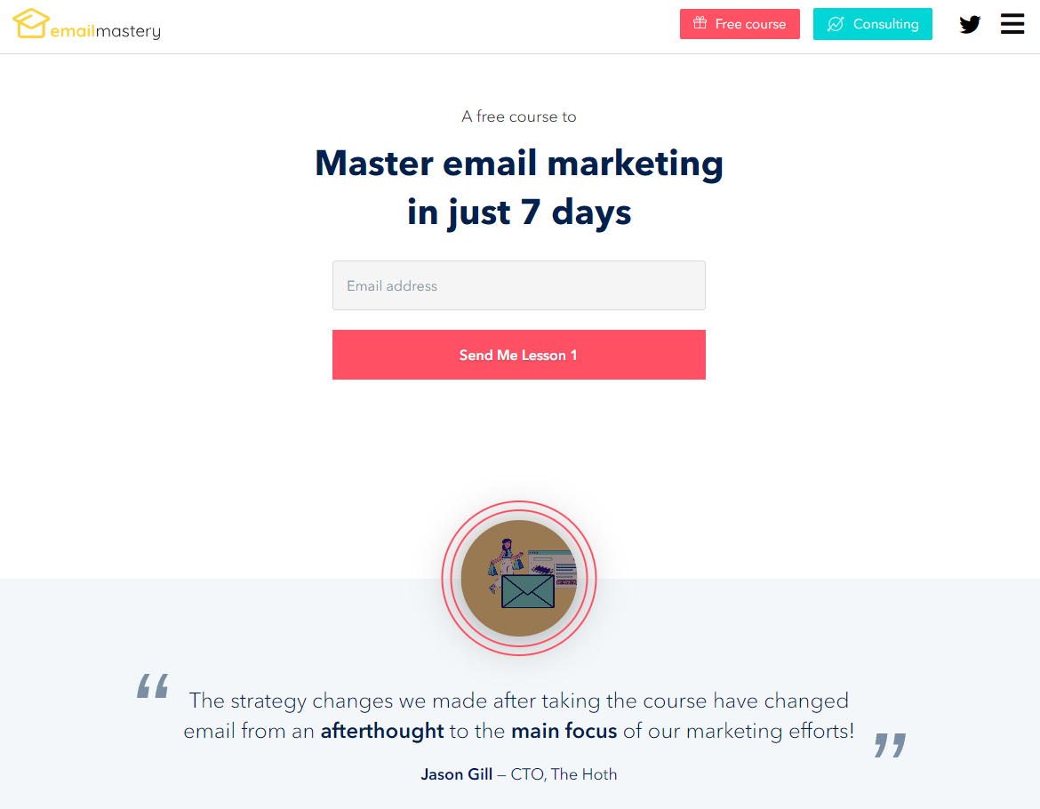
The Takeaway: Maximize perceived value (even if it’s free).
The promise of this course (“Master email in just 7 days”) is as compelling and to-the-point as its CTA (“Send Me Lesson 1”). If you’re going to give something away for free, then let people get right into it. More importantly, emphasize the value of the thing you’re giving away. People don’t want it just because it’s free. They want it because it’s valuable. Here’s a phrase we love on this landing page: “And, that’s what this course is… It’s two decades of experience boiled into 7 practical lessons.”
2. Linear Design — For Free Marketing Proposal
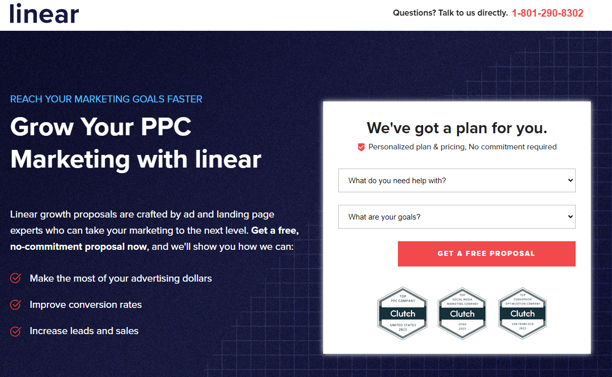
The Takeaway: Display proof of your expertise and killer reputation.
The last time you went to a new restaurant I’m willing to bet you checked the reviews online beforehand. Or maybe you stopped spontaneously to eat somewhere because all of their Tripadvisor or Yelp awards posted on the door. B2B marketing is the same. People (even business people) want to know you’re legit. And they want to know you have a reputation for getting the job done and doing it well. Our landing page does that with trust badges, testimonials, and review highlights.
3. Recart — For Software Demo
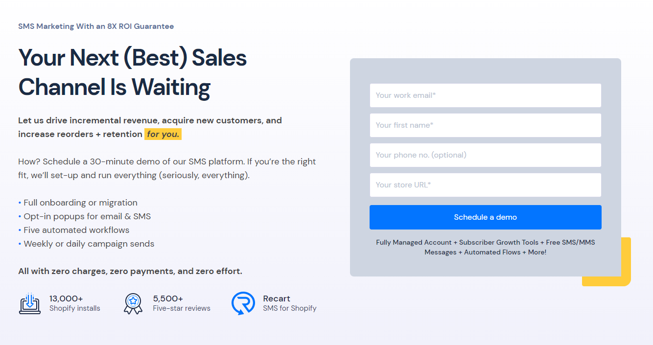
The Takeaway: Get rid of navigation and have a single CTA.
This landing page is simple and short (it barely has any scroll depth). But it works. The page promises to teach people everything they need to get started with Recart’s SMS marketing software through a simple demo. Most importantly, there’s no navigation and there’s only one thing for people to do: schedule a demo. The best landing pages are laser-focused on a single action item.
4. MailBerry — For Promoting a Waitlist
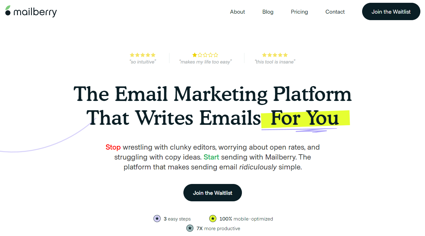
The Takeaway: Design to show your software in action.
Have you ever scrolled through a software landing page looking for screenshots or examples of gifs of the software actually in use? It’s hard to purchase something (or even sign up for a free trial) before you know what the tool looks like and how you’ll be able to use it in your business. That’s why we love this landing page. The design shows you exactly how you can use the software to simplify your email marketing efforts and then it says, “The best way to understand is to try it.” That’s great. If you’re going to invest in beautiful design, might as well use that design to emphasize your awesome tool.
5. REISift — For a Free 5-Day Challenge
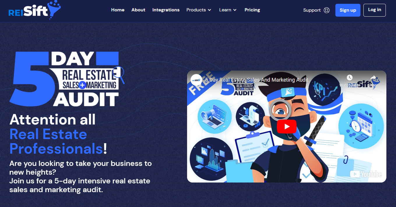
The Takeaway: Put a video at the top of your landing page (if you’re good in front of the camera).
This landing page does a lot of things well. It creates urgency by running the challenge periodically so that there’s always a countdown timer on the page. And it uses testimonials as trust signals. But what it does that the other landing pages we’ve looked at so far don’t… is include a sales video at the top straight from the founder of REISift, Tyler Austin, who is particularly compelling to his target market. If someone in particular is the face of your company, then post a sales video from them at the top of the landing page — according to HubSpot, 30% of top landing pages use video content.
6. PolishedGeek — For a Free Consultation
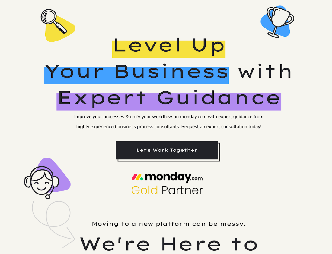
The Takeaway: Speak directly to your target market (and only your target market).
PolishedGeek helps businesses superpower their monday.com accounts for efficient and effective project management. That’s a pretty niche service. So they don’t target everyone — and they don’t try to target everyone with their landing page. They only target businesses looking to optimize their operations using monday.com. “Every business is unique,” their landing page explains, “which means there is no one-size-fits-all solution to moving to a new process management platform or a Work OS like monday.com… We’re here to help you find the right path to success with your monday.com system.”
7. Neil Patel — For a Lead Magnet Quiz
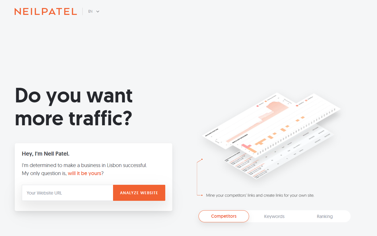
The Takeaway: Create a simple, relevant quiz to generate leads.
On Neil Patel’s landing page, you can analyze your website for free to figure out how much traffic it currently gets and how to get more. It also promises the following with a timed pop-up: “Answer 5 quick questions and I will give you a step-by-step 7-week action plan showing you exactly what you need to do to get more traffic.” Well, shoot. If you are part of Neil’s target market and you do need more website traffic, that’s a pretty compelling offer. Unsurprisingly, in a 2016 CMI survey, 81% of marketers agreed that interactive content (like quizzes) grabs attention better than static content.
8. Octane AI — For a Free Trial
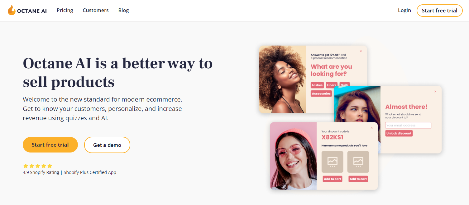
The Takeaway: Promote your excellent customer support.
Octane AI software makes it easy for businesses to learn about their customers and then personalize each buyer’s experience. We love the gifs that run on this landing page which actually show what their software is capable of creating (that’s a huge takeaway here). But for the sake of giving you something new and distinct from the other landing pages, notice this statement: “Need strategy or implementation help? Our team is here for you. You’re busy, we’re experts. Chat us, email us, zoom with us, heck we can even text.” For anyone who’s ever jumped through hoops to get help from sub-par customer support, that’s reassuring. So the lesson is this: if you offer better-than-usual customer support… make sure to point that out on your landing page! That alone is a huge selling point for many people.
9. Alloy — For a Playbook Lead Magnet
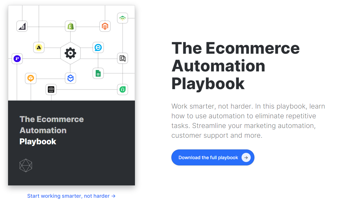
The Takeaway: Free, relevant lead magnets are effective for the start of your sales funnel.Alloy Automation offers businesses the ability to fully integrate their tech stack so they can automate data flows and actions. This lead magnet promotes a free e-book teaching their target market, go figure, about the benefits and uses of ecommerce automation. It’s 100% free. But it attracts the right people for the right reasons. And Alloy can then try to upsell the leads they generate through this simple playbook.
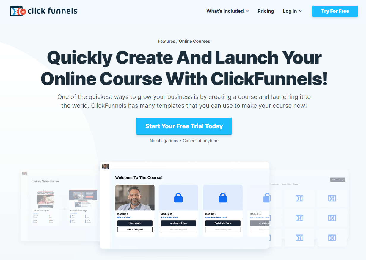
10. ClickFunnels 2.0 — For Feature Pages
The Takeaway: Treat your feature pages like landing pages.
ClickFunnels 2.0 is robust with over 16 different tools — including a course builder, membership sites, and a full-blown CRM. They have a feature page that’s basically a landing page for every single one of those tools, complete with screenshots, descriptions, testimonials, and a CTA to “Start Your Free Trial Today.” Some businesses don’t give their feature pages the attention they deserve. Don’t make that mistake. Treat your feature pages like landing pages or sales pages and you’ll get better results.
11. Mike Blankenship — For Professional Services
The Takeaway: Think carefully about the brand image you want to display.
Mike’s landing page promotes his professional freelance writing services to online businesses. And it’s clear that Mike wanted to display a certain vibe when you visit his landing page. The pictures are all high-quality and give off a professional-casual vibe. And the testimonials all over the page, as well as the wide display of brands he’s worked with, allow his past clients to do the selling for him. When you’re creating your landing page, think carefully about the image, feel, or vibe you want to create. After all, a picture is worth a thousand words.
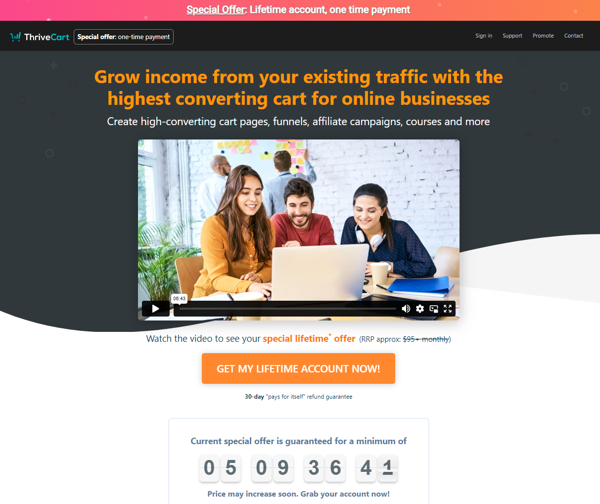
12. ThriveCart — For a Special Lifetime Offer
The Takeaway: Use urgency (and a really good deal) to drive action.
ThriveCart is software that allows you to build checkout experiences (with upsells and downsells) as well as simple landing pages for those products or services. What makes them unique, though, is that instead of using a monthly subscription model, they currently offer a lifetime account for a one-time payment of $495. That’s a pretty compelling offer if you’re like me and you hate adding subscriptions to your credit card. And they make the most of it by creating urgency on their landing page with a countdown timer and a notification that, “Price may increase soon. Grab your account now!” That’s effective. In one study by ConversionXL, adding urgency to a sales page increased the conversion rate by a whopping 332%.
13. Links That Rank — For Getting Simple Sales
The Takeaway: Use interactive elements on your landing page when it makes sense.
Links That Rank makes it simple to build white-hat backlinks to a website to improve your Google rankings. Their landing page does a great job of addressing the main concerns of their customers (primarily, that Google will punish them for buying backlinks). But my favorite part of their landing page is the interactive element at the top… it makes buying so easy. Just select how many links of varying domain authorities you want and click “Continue.” Then you can check out, indicate your URLs, and select your anchor text. If your product or service is relatively affordable and you make buying easy, you have a good chance of improving your conversion rate.
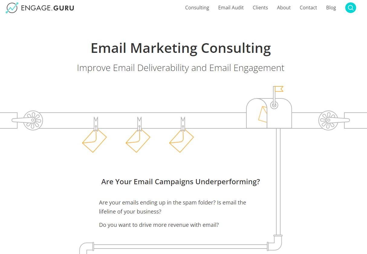
14. Engage.Guru — For Email Marketing Consulting
The Takeaway: Push on your target market’s pain points.
“Are your email campaigns underperforming?” reads the first line of copy on this landing page. The following two questions are similar: “Are your emails ending up in the spam folder? Is email the lifeline of your business?” This is all leading toward Alec Beglarian’s email marketing newsletter and consulting business. But starting with his target market’s existing concerns sets him up to provide solutions further down the page.
15. Brightbox for Business — For B2B Ecommerce
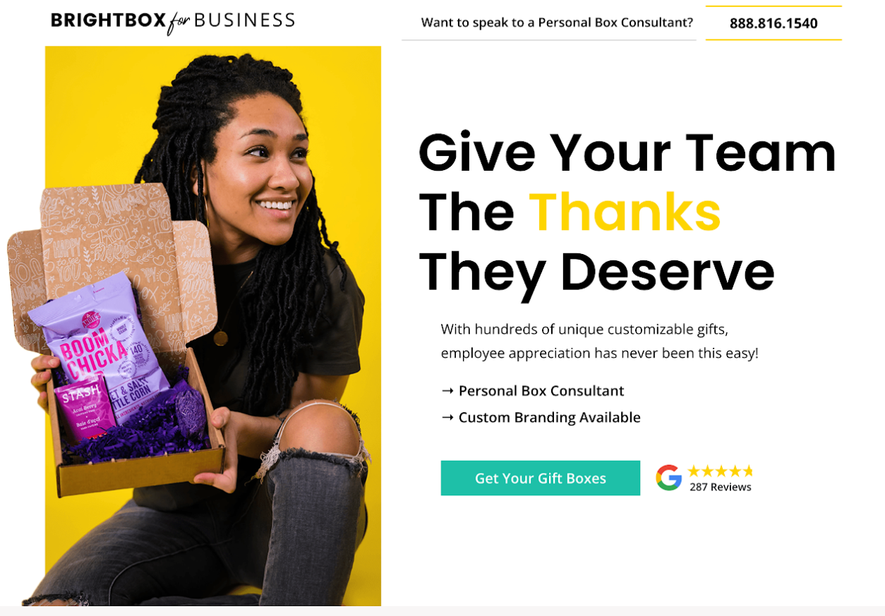
The Takeaway: Highlight the hidden benefits.
Brightbox For Business makes it easy for business owners or managers to reward their team with custom-branded gifts and packaging. Some warm-hearted business people might immediately see the benefits of sending gifts to their employees, but the landing page spells it out for everyone else: “Did you know that employee recognition can improve team productivity by over 31%? That’s why Brightbox offers a wide variety of boxes, gift items, and cards, so you can give your team the appreciation they deserve!”
16. AlchemyWorx — For Free Scorecard
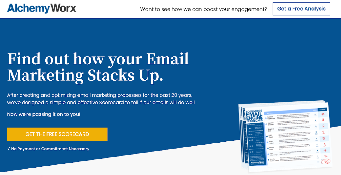
The Takeaway: Stay laser-focused on the thing you’re selling.
AlchemyWorx is an awesome service-based business that helps its clients improve their audience engagement and revenue generation. But on this page, all you’ll find is details about a free email marketing scorecard because that’s what they’re selling. The best landing pages stay laser-focused on the THING they’re trying to sell to the exclusion of everything else.
17. AlchemyWorx — For Free Acceleration Plan
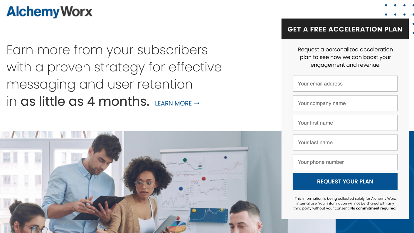
The Takeaway: Don’t shy away from using client logos to build rapport.
As we’ve talked about, social proof is super important. Most people won’t buy unless you can prove to them that you’ve got a great track-record of success. Just consider that 97% of consumers say online reviews impact their purchasing decisions (according to OptinMonster). And as a business owner or marketer, your best source of social proof is your past clients. You might consider including the logos for the clients you’ve worked with to improve rapport, just like AlchemyWorx does on this landing page.
18. Ordermark — For Sales Call CTA
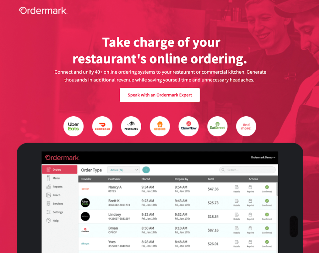
The Takeaway: Explain how it works (but simply and briefly)
I’ve talked to many business owners who struggle to simplify the messaging on their website. If you offer a complex or highly personalized service, it can be a real challenge to figure out exactly what it is that you offer. But even though Ordermark offers a pretty sophisticated platform for restaurant POS systems, they still manage to simplify the language on the page and explain what they offer in a clear-cut way. You can explain more about your product or service on the sales call… but on the landing page, try to keep things simple and specific.
19. Baby Bathwater Institute — For B2B Event Promotion
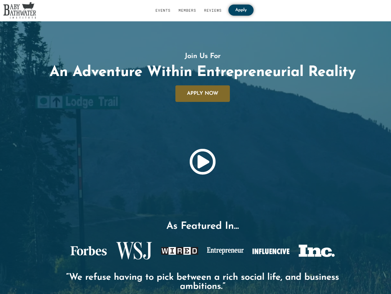
The Takeaway: Clearly understand your brand’s personality. And SHOW your brand’s personality.
Baby Bathwater Institute describes itself as a “tight knit community of over 200 carefully curated humans who happen to be entrepreneurs.” They are working hard to create business events that are actually personal, fun, and genuinely valuable. With that comes a no-BS attitude, which is displayed clearly in the copy on this landing page. For example: “Things we don’t give a damn about: How much money you make, if you are considered ‘a big deal’, who you know.” It’s good for your business to have attitude if that attitude attracts the right people… which in this case it does. But whether your attitude is personal, professional, or irreverent, you need to have a clear understanding of your brand personality before you can properly display it on your landing pages.
20. DotCom Secrets — For Business Book
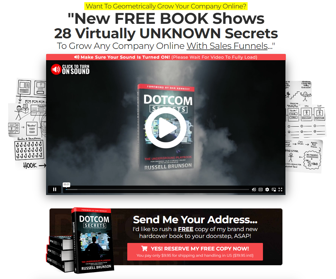
The Takeaway: Add bonuses to increase perceived value.
Russell Brunson is one of the best in the industry at using bonuses to increase his conversion rates by increasing the perceived value that his customers are getting when they take him up on an offer he’s made. Since the bonuses that he uses are typically discontinued offers that he’s run in the past, it’s even more likely that the people reading the page have wanted them since the first time they saw them — which means getting them for free makes the core offer that much more valuable. If you have bonuses you can add that help your people get the result they’re looking for in a simple, easier, or faster way, adding them next to your core offer is a great way to increase your conversion rates.
21. Neil Patel — For “Book a Call” Consulting CTA
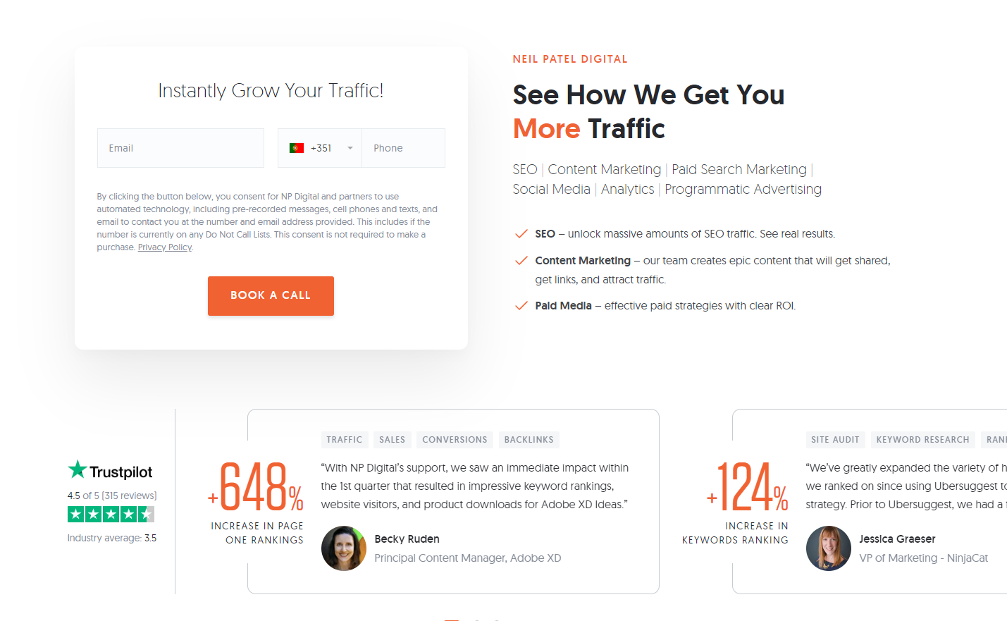
The Takeaway: If the offer is simple, keep the landing page simple.
Many times, keeping it as simple as possible is the key to getting the highest conversions possible, and Neil Patel’s personal consulting page is a great example. The headline focuses on exactly what his audience wants: more traffic. Then his bullet points focus on the different types of traffic he can help them increase. Finally, the call to action is a simple “Book A Call” with some social proof from other businesses he’s worked with and a rundown of what to expect when they take him up on his offer to get on a call together.
22. Jasper — For Free Software Usage CTA
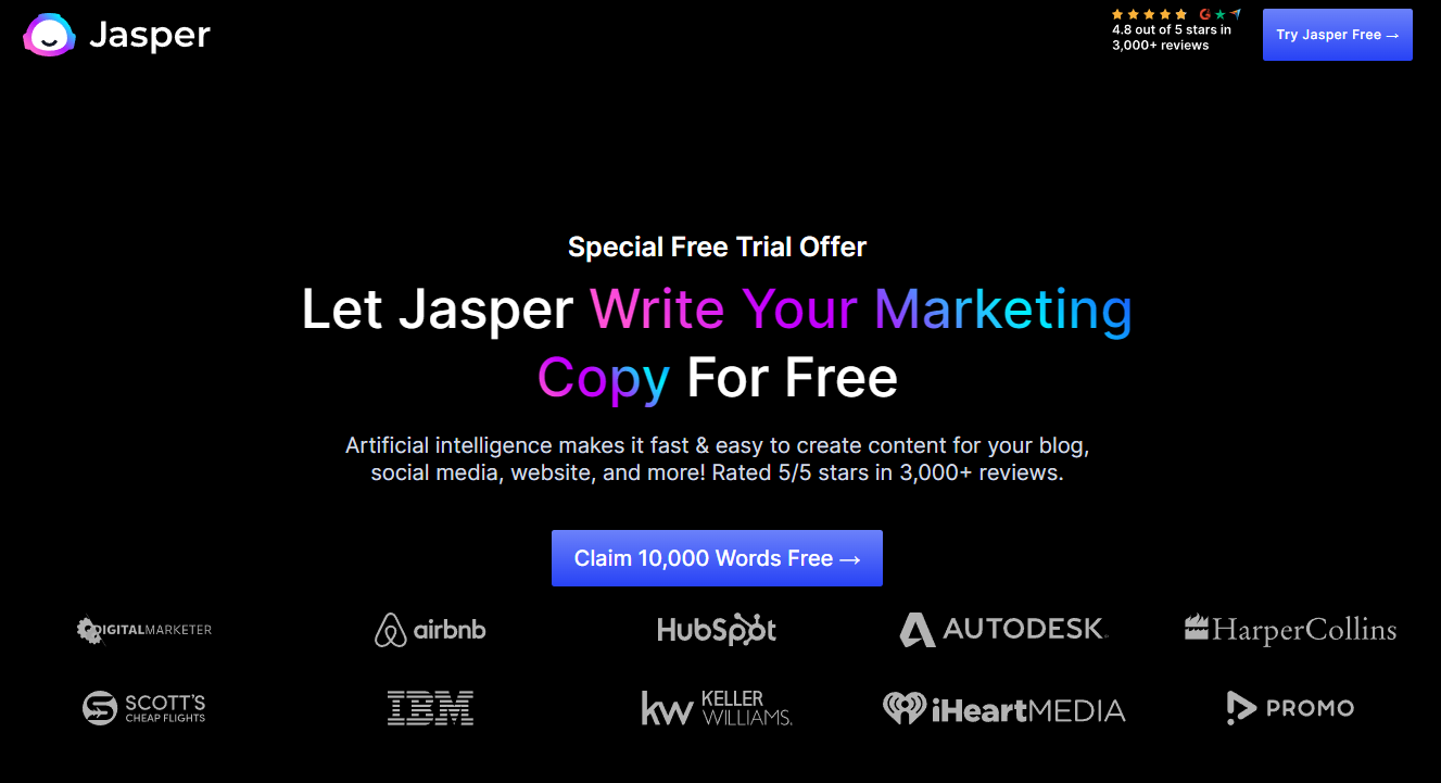
The Takeaway: Consider making your free trial about usage instead of about a certain amount of time.
The most common type of free trial is time-based. You get to try the software or service for free for something like 7 days, 14 days, or 30 days. The problem with that is it often requires you (the customer) to enter in your payment information and, if you don’t like it, you have to remember to cancel your subscription before you get charged. People know this. And it can dissuade some customers from signing up for a free trial in the first place. That’s why a usage-based free trial can be more appealing. People only get charged if and when they surpass a certain usage metric. If your software allows for this type of free trial, then it’s at least worth testing to see how it impacts conversion rate compared to a time-based free trial.
23. Evolve Men — For Free Coaching Assessment
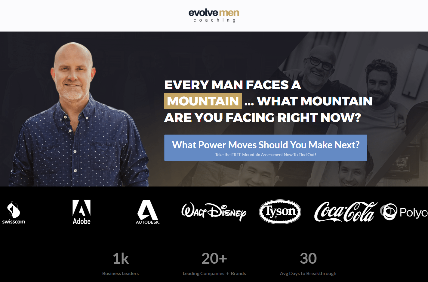
The Takeaway: Make the first step in your funnel super easy (for the right people).
One of the biggest mistakes people make with landing pages is trying to be everything to everyone and making their headlines generic instead of being super-targeted to the one perfect prospect who can’t say no to their offer. In the case of Evolve Men, they know their audience wants to make power moves and move mountains so they use callouts and calls to action that speak directly to those desires. To use this in your own landing pages, think about the one perfect person who couldn’t say no, and then cater your headline, subheadline, and call to action directly to them. It may decrease overall conversion rates but will dramatically increase the quality of the leads you get from those conversions.
24. Foundr — For Selling a Business Course
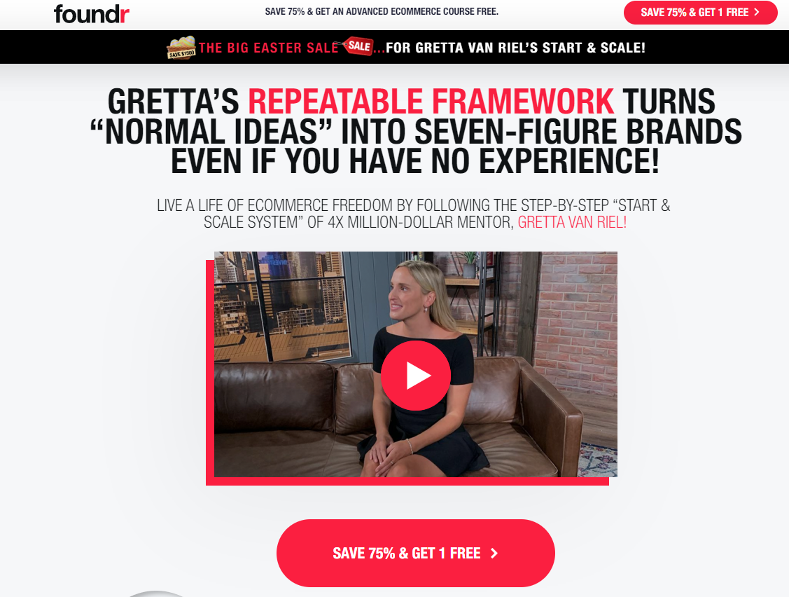
The Takeaway: Create a headline that speaks directly to your target market.
The headline on your landing page is the first thing people read when they visit it. It’s your one chance to put your best foot forward, to show them you understand who they are, and let them know why they should keep reading. In the case of Foundr, Gretta is speaking directly to people who have ideas and want to turn them into profitable businesses. Since she knows the people she can help the most typically don’t have experience turning those ideas into revenue, she speaks directly to them with her headline.
25. CXL — For Ecommerce Marketing Certification
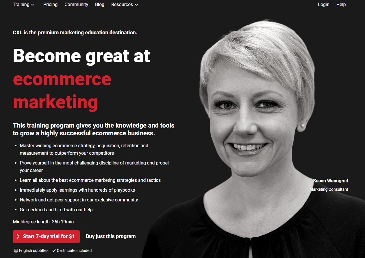
The Takeaway: Consider providing assets to help your customers convince their boss.
On this landing page, CXL offers a training program with certification included. There’s some great stuff on this page — including the mention of top 1% marketers and the detailed overview of what the course contains. But the thing that really caught my eye was this bit near the bottom of the page: “Need help convincing your boss? Click here for a pitch deck, swipe files and tips.” And you can click to get free access to assets they’ve created to help you convince your boss to buy their program for you. I think that’s genius. And I don’t know why more B2B landing pages don’t do something similar.
26. Jacob McMillen — For Free Freelance Writing Course
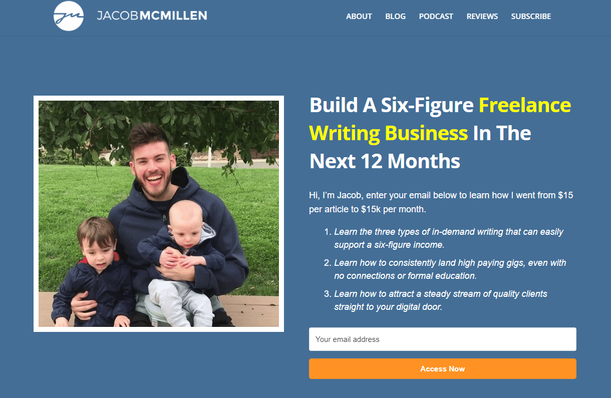
The Takeaway: If you’re a person, show your personal side.
We’re talking about B2B landing pages, but your business might be more represented by you than it is by some logo or brand name. Think about Russell Brunson and ClickFunnels. He’s the face of that business. The same is true with Jacob McMillen, who sells online courses for freelance writers. He is the business. Which is why this landing page feels so personal, even going so far to include a gif of him posing for a picture with his kiddos. The lesson is this: if your business is represented by a person, then show your personal side. At the end of the day, people connect with people.
27. Scale Your Product — For a $7 Checklist
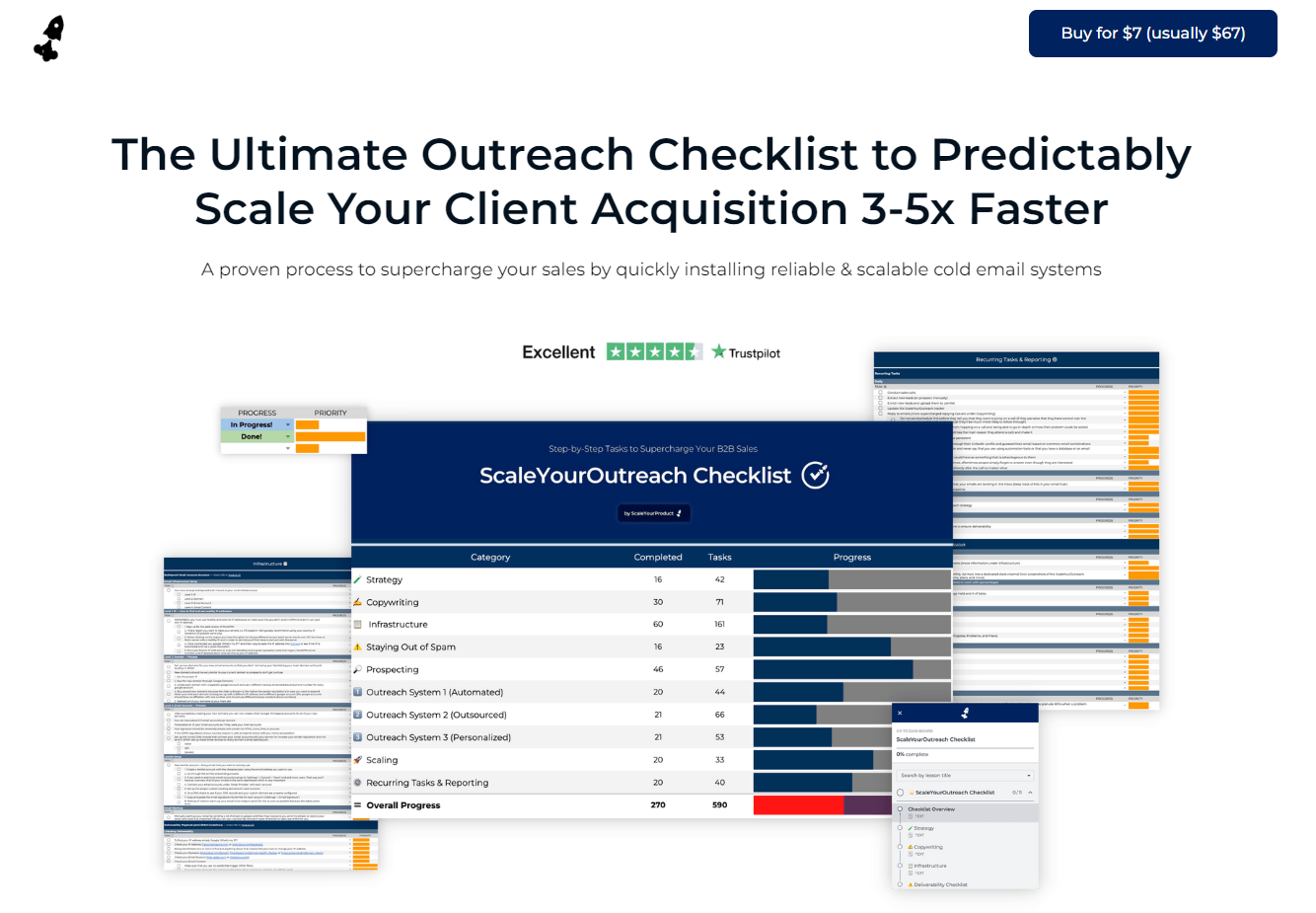
The Takeaway: Use real numbers to display your expertise.
Using numbers on your landing pages can help showcase how much you know about what your audience actually wants from you. Scale Your Product showcases a great example of this by using numbers like “5,000 startups that trust our system”, “3.6 million emails sent”, “5000 looms personalized”, “3000 meetings booked”, “2+ hours of no-fluff videos”, and “12+ plug&play spreadsheets” to show prospects exactly what they’re getting when they take the offer. Since they know their audience wants to automate and simplify their businesses, using numbers to show how they’ve helped other businesses with those same problems increases conversions.
28. Rachel Pedersen — For Accepting Applications
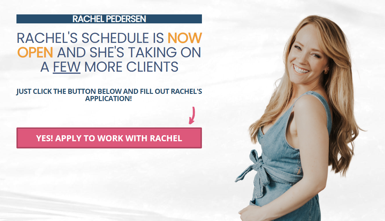
The Takeaway: Let your reputation sell itself (if you already have a reputation).
Rachel Pedersen’s landing page is another great example of what it means to let your reputation speak for itself. If you have cultivated an audience that connects with you on a personal level, you don’t have to do a ton of selling to convince them to take you up on an offer — the trust you’ve already built with them does the selling for you. She’s able to increase her conversions by limiting how much copy she’s using and how much she’s trying to sell. When it comes to warm audiences who know your reputation, less is usually more.
29. Ryan Dossey — For Call Scheduling
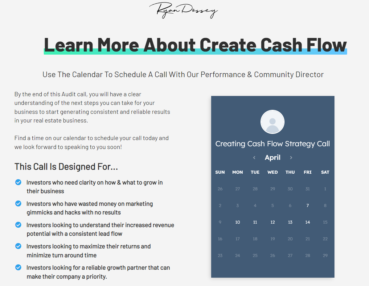
The Takeaway: Be explicit with WHO the thing you’re selling is for.
If you can put your audience’s frustrations and pain points in front of them and explain them in a way that they can’t even do, they can’t help but take notice. Ryan Dossey’s landing page is a great example of knowing exactly who it is that he wants to connect with, what they’re currently dealing with, and how to lay it out in a way that becomes irresistible to the right person. If you know your audience better than they know themselves, spelling out in great detail who this is for is a proven way to increase your conversion rates. On the flipside of that, laying out specifically who this isn’t for is another great way to increase the quality of your leads by repelling what would be bad fits from moving forward with your offer.
30. Hootsuite — For 30-Day Free Software Trial
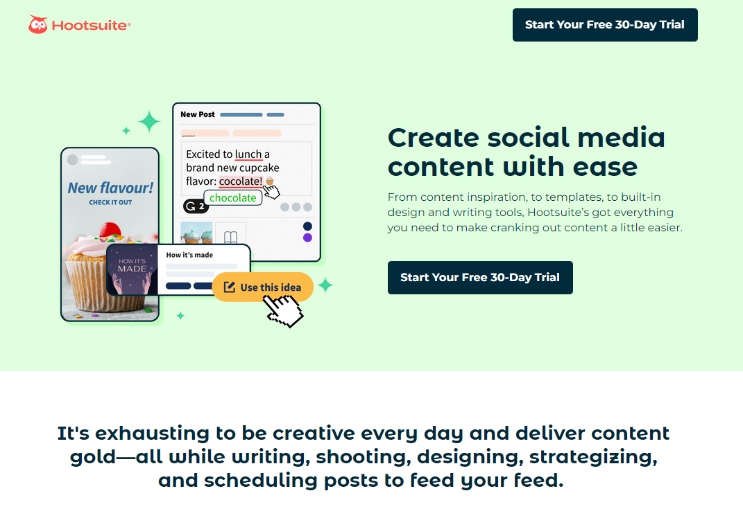
The Takeaway: Show that you understand the challenges your target market faces.
Just like Ryan Dossey lays out specifically who he’s looking for, Hootsuite breaks down the specific frustrations they’re trying to solve with their offer. You can see it in some of their subheadlines, like “It’s exhausting to be creative every day and deliver content gold — all while writing, shooting, designing, strategizing, and scheduling posts to your feed.” If you’ve walked a mile in your perfect prospect’s shoes, and can lay out what that looked and felt like, you’re speaking directly to the person that you can help the most — and your landing page becomes that much more effective.
Final Thoughts on B2B Landing Pages
Creating high-converting b2b landing pages is easier said than done.
But still, the easiest way is to study what’s working for businesses like yours — even your competitors — and create a solid foundation page that emulates best practices found in each.
Then test, test, test.
And iterate, iterate, iterate.
That’s the process that’s proven to work. And the most successful marketers never unplug themselves from the studying/testing/iterating cycle.
But if you’re still not getting the results you want, check out this article for a full rundown of reasons why your landing page might not be converting.

Luke Heinecke
Founder/CEO
Luke is in love with all things digital marketing. He’s obsessed with PPC, landing page design, and conversion rate optimization. Luke claims he “doesn’t even lift,” but he looks more like a professional bodybuilder than a PPC nerd. He says all he needs is a pair of glasses to fix that. We’ll let you be the judge.
Leave us a comment.
Subscribe to our blog
Subscribe to our blog
Get weekly PPC & CRO advice sent straight to your inbox.