Is there a sure-fire formula for the very best landing page? The quick answer is, no there isn’t. Every industry, and then every company within that industry is different. Your call to action, target audience, and desired response will all determine how your landing page is designed, and what gets the best results for you.
There are two basic purposes for a landing page. The first is that you may be building your list of leads, and finding out more about who the prospects are in your specific market. This can involve anything as simple as a “Learn More” button with a name and email collection form. Or the call to action can offer a freebie if they will sign up.
The second purpose is click-throughs, where a user is directed to create an account and make a purchase. This is often the purpose of offering a free trial, even if it is a no-obligation trial where the user does not enter any credit card information. Once they have created an account with your company, you have a lot of information about them.
The Myth of the “Best Elements” of a Landing Page
Should you use a long form or short form? What part of the call to action should be on the button? What apert should be below it? Where should the social proof go? Should you use video or photos, or both? What colors are the best?
The most important thing is your landing page inspires the user to take action on your offer. Certainly, a part of what makes it the best is the specific goals you have for that landing page. The truth is that both long and short forms work for different purposes. Short forms gather more leads, but potential lower quality ones since you don’t know as much about the prospect who filled it out. Longer forms tend to deter the “tire kickers” and get you better quality leads who are more likely to convert.
There are other factors, like using virtual phone numbers with the area code where the prospect clicked on the ad rather than a generic toll-free designation and options like Dynamic Keyword Insertion, which customizes the page for each individual user based on location or the platform where they clicked on your ad.
This doesn’t mean we can’t look at the key elements of a landing page in several examples and learn something from them. From calls to action to social proof and various forms, here are fifteen landing page designs to inspire you in 2019.
Elite Chiropractic
There are a couple of notable things this page does right immediately. The headline is itself a great call to action. Why would you be looking for a chiropractor? Most of the time it is because either you are currently in pain, or you have chronic pain. Either way, the prospect wants one thing: “Immediate Pain Relief”

Elite Chiropractic
The Good: Immediately there are a couple of ways for prospects to respond. For the prospect who wants to call, there is a phone number, easily readable, at the top of the page. For the patient who wants to simply make an appointment, there is a short form to get them started right next to the headline. Since car accidents are a frequent motivator for a prospect to seek chiropractic care, insurance companies who work with them are listed right away along with common health insurance plans.
Things to consider: It might certainly pay to do some A/B testing, where the photos are clearer in the middle of the page or the boxes containing the pain points are a different color. The addition of a map with locations and directions might also be useful near the bottom of the page, but it certainly isn’t essential.
Stanlick Chiropractic
Here is another page that does well right from the get-go, but even though they share the same industry as Elite Chiropractic they address the prospect in an entirely different way, by making an offer at the very top of the page. Restrictions are communicated clearly, and there are two options for how the prospect can respond.

Stanlick Chiropractic
The Good: Note the simplicity of this page. There is a single offer and a singular call to action. The option to click through, fill out a form or make a phone call are all available. The call to action is prefaced by a simple statement that inspires urgency, since “This deal won’t last forever.” There is also a great deal of clarity about what the deal includes, and sets prospect expectations right away. It is always best to set a customer’s expectations right from the start about what exactly they will receive.
Things to Consider: There could easily be a hero photo added here, like the chiropractor working with a patient, but that would have the effect of lengthening the page. The location of the form is really ideal after the explanation of the offer. A/B testing of photos of the various services included rather than just icons might be worth trying. In addition, some social proof below the form could round this page out nicely.
One Fitness Camp
This is another great example of a landing page, in part due to the promise that is made right up front: transform your life and body. The page addresses a pain point immediately: lasting results.
There are a few key elements that set this offer apart:
- An immediate and dramatic hero photo that also serves as social proof.
- Setting expectations, also with hero photos showing the program in action.
- Clear social proof followed by frequently asked questions.
Also take note of the simplicity of the page, and the clear direction of the prospect to the call to action.
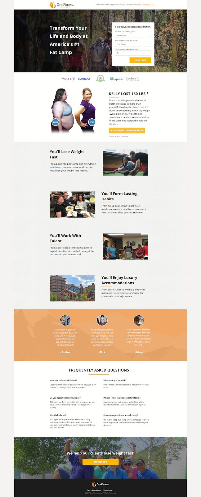
One Fitness Camp
The Good: In this case, the prospect is primarily interested in results. This is addressed immediately, but that does not mean other common concerns are neglected. The FAQ section offers answers but leaves enough open-ended so the prospect must call or fill out the form to learn more. The free consultation is a great hook at the start.
Things to consider: The final call to action and button could be stronger, to match the rest of the page. This is something that could be easily A/B tested to see which method gets the best responses. In addition, a short video of social proof with more before and after visuals and an additional indication of lasting results.
FIXIT Phone Repair
What is unique about this landing page for FIXIT? It is a beautiful example of one that asks a prospect to do one of two things: make a call or find a location. The reasons are simple. There is no need to build a list of leads in this case: if the customer is searching and has found this ad, it’s fairly likely their phone is already broken.
There’s also nothing the company can do for the prospect digitally except to set an appointment. Even Tim Cook hasn’t found a way to fix your iPhone screen through the interwebs, so eventually, this page will lead to an interaction by phone or a visit to one of their stores.

FixIT Mobile
The Good: This brief, to the point page offers an overview of the solution, the brands they service, a bucket load of social proof, and a compelling call to action all in one place. It’s extremely well done.
Things to consider: There is not too much that could be done to improve this page. A hero photo or even a photo of a broken screen would work well here.
Kite
You would expect a PPC company like Kite to have a great landing page of their own, and in this case, you would be correct. Addressing two pain points right up front, the landing page takes them head-on: hitting goals faster and optimizing based on ROI.
These are some of the first questions any CEO or marketing manager will ask when embarking on a PPC campaign. On top of that, this page has nearly every element needed for a great landing page that is well-designed.
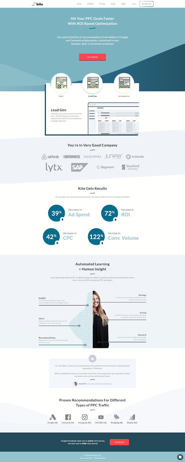
Kite
The Good: First, the landing page immediately tells the audience the type of business this product is for. Immediately following that are the companies they’ve worked with, validating their expertise. The follow on addresses yet another pain point for customers: artificial intelligence vs. human insight, and solves it by explaining that this company uses both. The proof of results inspires a click-through in response. Who doesn’t want reduced ad spend for a higher ROI?
Things to consider: This is another great example of a landing page, with little that could be changed aside from perhaps A/B testing some color and perhaps more direct social proof.
Unbounce
Who doesn’t want great landing pages and pop-ups that convert? Everyone wants them, but creating them can be time-consuming and frustrating, especially for small business owners. The offering here? Simplicity, just like Unbounce’s own page.
It starts with a promise, offers social proof of that promise, breaks down how it works, and then describes the benefits. It’s almost textbook design, something you would expect from a landing page design too.
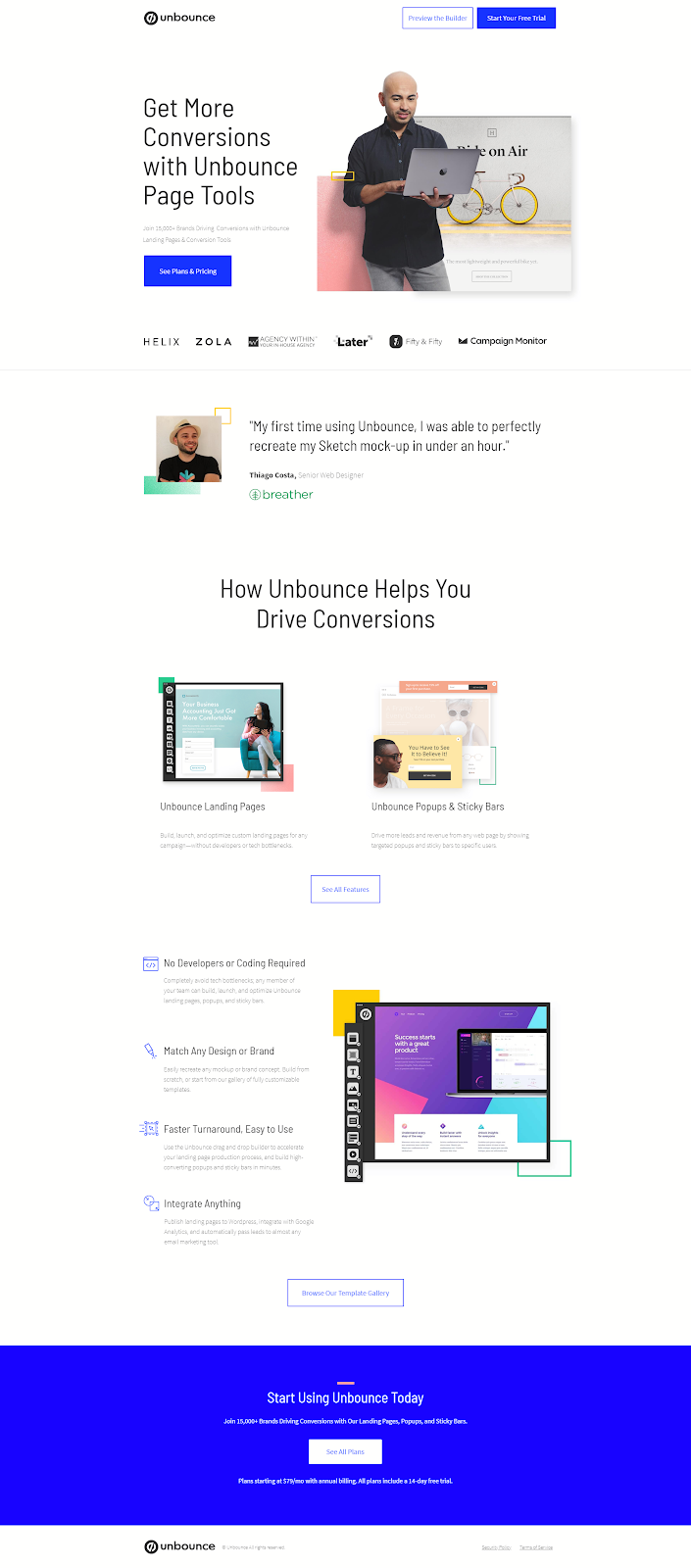
Unbounce
The Good: Again, simplicity. A single offer, a single call to action, and a host of good reasons for the prospect to convert. There also are some simple hero photos here, showing the results of the tool and the tool in action. The single testimonial is a powerful one.
Things to consider: The headline is good, but there certainly could be some room for A/B testing with some more clever language with a little more urgency. The only thing that would do is make a page that is already great potentially a little better.
Phone Wagon
You might wonder at first glance what Phone Wagon actually is, but if you are looking for a call tracking service as a marketing agency, this landing page tells you everything you need to know right upfront. The key is that it is straightforward, yet gives the prospect enough information about what can be a complex item for them to make a decision. When it comes down to how it works though, phone wagon is a simple, one-stop solution for some fantastic marketing tools.
This includes things like dynamic numbers, local and toll-free numbers that all include device portability and other advanced features that can help skyrocket conversion rates. In order to simplify the offer, the landing page promises training and clarity.
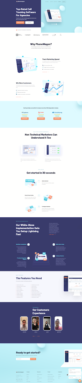
Phone Wagon
The Good: The message and the path to conversion is clear. Social proof is offered, as is a link to many more reviews. Look carefully at the three right up front in the middle of the page. Each illustrates a different sized business in a different niche, a clear message that this tool can work for anyone and any sized business. There is a lot of information, well presented in a small space.
Things to consider: This is one place where another opportunity to click through might work in about the middle of the page, before the setup and implementation section. That way, if I have already decided this is a good idea for my business, I don’t have to scroll up or down to respond. All in all a brilliant page.
Hotjar
One of the most amazing tools out there, Hotjar lets you see what users are really doing on your website, which gives you data to make decisions about changes you should make. It works for everyone in your organization, from customer service evaluations to UX and design teams.
However, like Phone Wagon, this can be a complex tool. This landing page nails the simplification of an explanation, but great social proof from real users in the form of success stories.

Hotjar
The Good: Finding out what people actually do when they are on your website has an incredible appeal to a lot of people in a company, which is how Hotjar hits such a wide audience. Your marketing manager, product manager, and UX and design team all want the data Hotjar can provide. This page does a good job of pointing all those things out.
Things to Consider: There are some good shots of the tools in action, but there could be a better photo rather than the cartoon, of the three people, gathered around the computer. Also, A/B testing of different headlines with different fonts might give better results, as it could stand out more at the top of the page.
Asana
Asana is well known as a project management software for large and small businesses alike. Their landing page is simple and straightforward with a call to action right at the top. Why does this work? Because Asana doesn’t need to take a lot of time to explain what work management software is in detail to most users
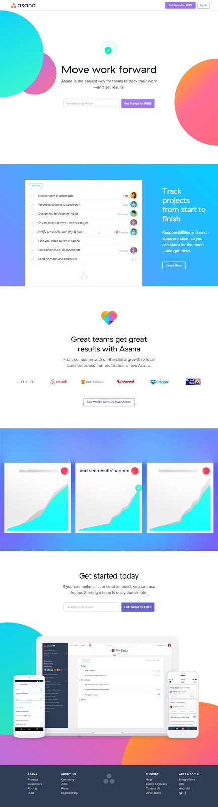
Asana
The Good: A simple call to action with a one-line form that offers a free trial. Both the offer and what Asana is are clearly stated up front. But even for those who need a little more, there is a list of companies who use the tool, and an example of results followed by another call to action.
Things to consider: There is a lot of social proof out there for Asana, and using some of it here might be a great idea. Instead of a list of companies who use it, or in addition to that list, a carousel of real people’s reviews might serve this page well. It would take a great page that is both elegant and simple to the next level.
Airtable
A nearly direct competitor to Asana, Airtable also does a great job with a simple landing page, but appealing to a different demographic simply by the use of a different headline and definitely different images.
Where Asana is designed to appeal to the organizer, Airtable is instead designed to appeal to the creatives on your team. The hook is that they can “create, your way.” Although a very similar product in many ways, this landing page works to set the product apart from the competition.
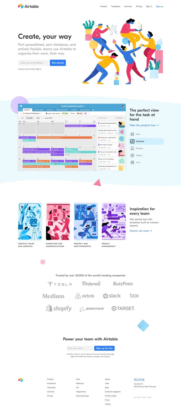
Airtable
The Good: Instead of focusing on tasks and getting work done, Airtable focuses on making work fun and inspiring your team. The call to action is compelling because it offers a different message. The look of the page almost has a party type theme, and a “fun” appeal.
Things to Consider: Again, missing here is some real social proof in the form of user reviews. And this landing page has one other drawback. For a startup or a more creative driven business, it has a lot of appeal, and that appears to be their niche. That does leave out a whole group of businesses who might not see the same “party” theme appealing.
Bench
What’s the initial promise from Bench here? Your own bookkeeping team. What’s the brilliance of the hook? Immediately you’re introduced to a real person with a name and a team to go with it. It has an instant appeal, as bookkeeping can be very personal, and outsourcing to someone you don’t know and trust can be a hard pill to swallow.
The possessive “your” is used a lot on this page, giving you ownership when you choose to use Bench and their services. It’s a brilliant way to solidify the call to action.
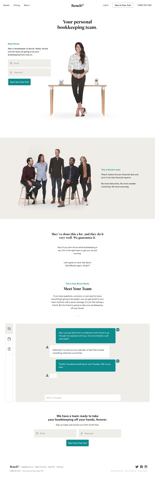
Bench
The Good: The call to action is clear and right upfront. We don’t need a lot of explanation about what bookkeeping is, but we do need to trust those who do it for us. This landing page works right away to build that trust by promising experience and skill. A small dis on Quickbooks offers empathy for the target audience.
Things to consider: What’s missing here? Social proof and reviews. What else? Color. The page overall is pretty bland and gives a pretty accountant like feel. That’s okay, but it’s hard enough to get excited about bookkeeping without a subdued color page. The addition of those things would make this good page even better.
Wix
Wix is a simple web building platform for over 40 million web users who don’t want to dive into WordPress or more complicated platforms. Instead, they want a simple drag and drop experience. Wix has some great landing pages, including this one for creating, well, landing pages.
It’s simple, with stunning visuals and a clear call to action with little else. It works incredibly well for a company who is known for what they display here: simplicity.

Wix
The Good: The big hook for Wix in nearly any product they offer is that getting started is free, similar to the WordPress model. Of course, branded domains, premium plugins, and access to more templates and features are extra, but the simple CTA is accurate, and the Start Now is compelling. The simple examples shown encompass a variety of images and businesses.
Things to consider: This is one of the simplest landing pages in the list, but it’s hard to argue in favor of making it more complex. Because of the brand recognition Wix has, this is a near perfect, simple as you get landing page example.
Master Class
The beauty of Master Class is that nearly every landing page for every different kind of class on the site is the same. Each tells you what you get, who you learn from, what each class is about, the cost, and some social proof with at least a star rating.
The principle of the pages is a simple one, and the CTA is bold and upfront, and a video gives you an idea of exactly what classes might be like.
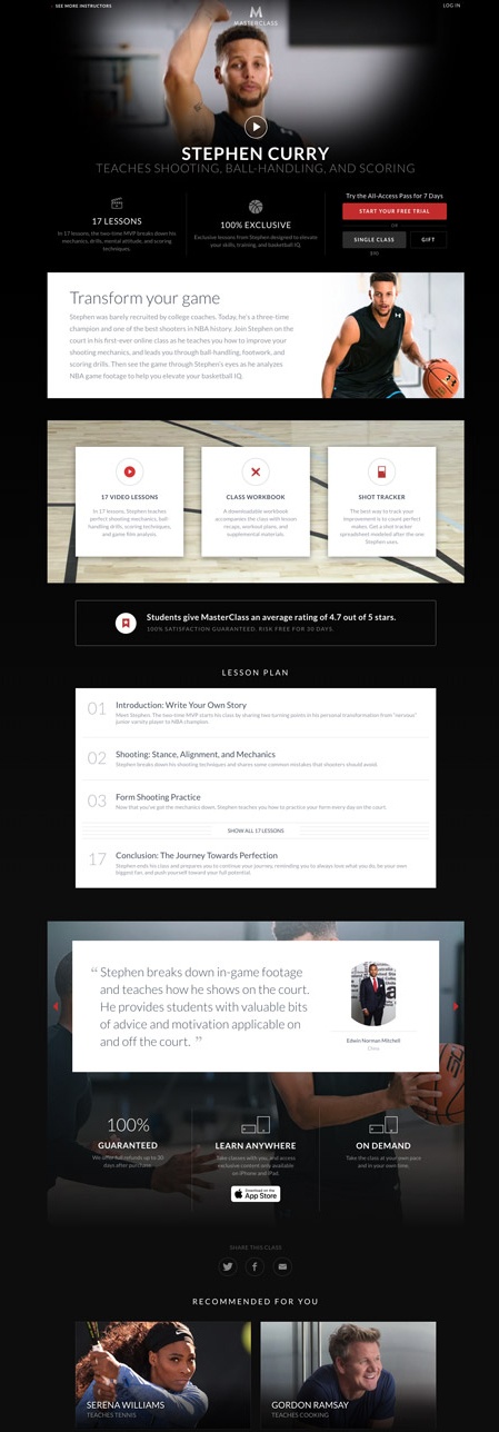
Masterclass
The Good: Simple, elegant pages use video to entice the user to click. Options are clearly shown for the CTA. The vibe of the landing page is that the user will have fun while learning. The “exclusive” nature of the offer implies an elite status to the material. The dark theme exudes professionalism.
Things to consider: The only thing that might make these pages better is a little better explanation of what all-access means, although once a user clicks through that question is answered. Again, as in many of these landing page examples, simplicity is the key to a well-converting page.
Playology
If you love your dogs, and like we do, spend a lot of money on dog toys, you know that finding ones that keep your dog’s attention and last are hard to find. Playology addresses this pain point for dog owners right upfront.
The landing page offers a simple gateway to both more information and shopping online. One of the primary pain points of owners is addressed right up front: keeping dogs more engaged. The call to action is simple: “Shop Now.” The coupon offer captures leads for future marketing.

Playology
The Good: Again, a simple page with a simple offer. Some landing pages are more dynamic that others, but they all center around the science of scent, and use words that immediately engage dog owners. There isn’t much here other than that, but that lack of information combined with curiosity makes it almost impossible not to click.
Things to consider: All of the landing pages that Playology offers have additional navigation to one extent or another, no matter where you click. All of them lead deeper into their website and an opportunity to order online or find a store near you. It works for them, but it’s important to keep in mind that too much navigation can be a bad thing outside of the eCommerce world.
Uber Driver Recruiting
Who was your last Uber driver? How old were they, and was driving an exclusive gig for them, or something they did part-time? If you travel often, you likely have seen a gamut of Uber drivers because the job appeals to a wide variety of people.
Their landing page reflects this desire for diversity, and offers a pretty equal opportunity to pretty much anyone out there. The tagline “earn money on your schedule” illustrates exactly why. So do the sections below the simple sign-up form.
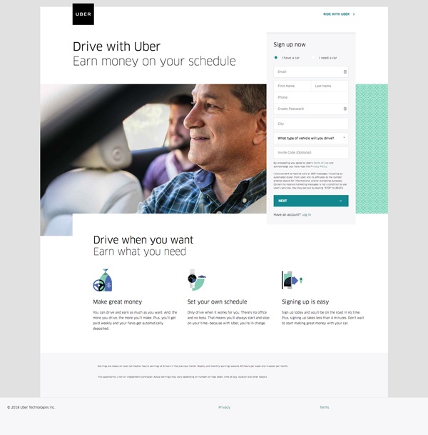
Uber
The Good: This is a great landing page with a simple message, a hero photo of a driver in action, and a call to action that is easy to follow. The message is reiterated and expanded upon, but there’s really not much else to be said.
Things to consider: Two simple things that could be added are missing here. The first is some social proof, which could consist of a couple of simple driver testimonials. The second is something in the button that tells me how many steps to expect instead of just the word “Next.” This could be intentional, as a multi-step process could discourage click-through rates, but it might pay off to let the prospect know how long it takes to sign up other than the words “no time” in the description toward the bottom.
Patreon
This is one of my favorite landing pages because it is simple and subtle. Instead of asking you to take some kind of action and being direct, Patreon offers the prospect and opportunity to be a “supporter of the arts.” This is much more appealing than saying “give some money to our cause.”
Right away, the image tells you what the platform is about: there is an artist working, but in the background, you can also see guitars, hinting that this is about more than just the cartoonist or digital artist creating with his tablet.

Patreon
The Good: The offer to support the creators you love inspires the prospect to search for those creators. Simple curiosity about who might be on the platform drives the click. The images all support this idea, as do the categories visible in the footer. The CTA of “join us” is an invitation to a community that is difficult to pass up.
Things to consider: For those who don’t know what Patreon is, a quick pop-up actually swoops in and tells them. There could be a small section of text to do the same thing, and again, some social proof from either supporters or those who get support through the platform might make a difference. Again, it’s hard to argue with simplicity when it inspires curiosity.
There are a lot of great and not so great landing pages out there. Some are better than others. This is just a sample of those who did it right that might inspire you. Look at other landing pages in your industry, and see what they are doing right and what you can emulate. Remember, there are no best landing pages, but there are best practices that can make yours the best they can be.

Luke Heinecke
Founder/CEO
Luke is in love with all things digital marketing. He’s obsessed with PPC, landing page design, and conversion rate optimization. Luke claims he “doesn’t even lift,” but he looks more like a professional bodybuilder than a PPC nerd. He says all he needs is a pair of glasses to fix that. We’ll let you be the judge.
Leave us a comment.
Subscribe to our blog
Subscribe to our blog
Get weekly PPC & CRO advice sent straight to your inbox.