Whoever said looks aren’t everything was clearly not a landing page designer.
Like it or not, looks matter, and they play a huge role in how your landing page performs. However, this doesn’t mean your landing page has to be beautiful to get good results. Although aesthetically pleasing design can be helpful, it takes a back seat to more important factors.
The sections and elements that are included in your landing page layout play a much bigger role in conversion rates than pure beauty. If your landing page layout doesn’t inspire visitors to take action, it won’t matter how pretty the page is your conversion rates will still suffer. So I guess you could say beauty is in the eye of the beholder.
But enough cliches for now, there’s a lot of ground to cover if you want to create a top-notch landing page.
The Science Behind Landing Page Layout
You don’t always need to reinvent the wheel to design a high performing landing page. In fact, it can be quite the opposite because there’s a lot of science behind conversion rate optimization. This means including certain commonly used sections will almost always improve your conversion rates. However, it doesn’t mean that the same landing page layout will consistently outperform others.
The most common landing page sections to include are:
- The Hero Section
- Social Proof Section
- Feature Section
- How It Works Section
- Footer Section
Your industry, business type (B2B or B2C), and product or service offer will all have an impact on what sections you need to include. Below we’ll give you more insight into each section so you can decide what sections will be best for your page.
The Hero Section
The first thing users see when they visit your landing page is your Hero Section. It will always appear above the fold and contain some of the most important information on your landing page. To break it all down, let’s take a look at the hero section of Bill’s Comfort Systems landing page.
Before we dive into things, I’ll give you some background on Bill’s Comfort Systems. Bill’s Comfort Systems is a heating, and air conditioning company focused on keeping you and your family comfortable no matter what the temperature is outside.
Now that you know a little bit about Bill’s Comfort Systems, we can talk about each component of their hero section and the purpose it serves.
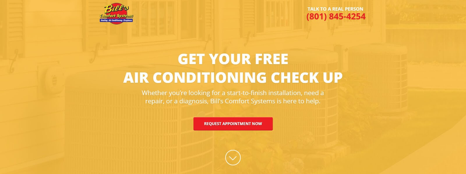
Check out that hero section 👀
Your hero section will usually include some if not all of the following elements:
- Main Headline
- Sub Headline
- Call To Action (CTA)
- Hero Shot
Main Headline
Your main headline is often the largest, most visible text on your landing page. To be effective, it should quickly describe the offer and present a unique value proposition.
You can use the headline in the picture above as an example.
“Get Your Free Air Conditioning Check Up”
This headline describes the offer and the unique value proposition; it’s simple but effective. Moreover, it fits into a certain category of headlines called value-based headlines. But this isn’t the only type of headline you can use. There are a few different headline types you can test to find out what works best for your landing page.
1. Ask A Question
This type of headline addresses the problem that your customers are already facing or asks a question they never even knew they should ask.
For example, if you were to test a question-based headline, it might look something like this.
“Is Your Air Conditioner Broken?”
2. Be The Best
Customers know they have a lot of choices when it comes to making a purchase. The comparison or difference based headline points out why they should choose you instead of your competitors.
A great example that shows customers why you’re the best might look something like this.
“The Fastest Air Conditioning Repairs In Utah”
3. Inspire An Emotion
Emotion is a powerful force, and your landing page needs all the force you can muster to convert visitors. Try to pair your product or service with the positive emotion people will feel if they convert or point out what they stand to lose by not converting.
Here’s an example of how to put emotion to use in your headline.
“Keep Your Family Cool This Summer”
4. Give Value Upfront
Value not price is often the determining factor in any purchase, and that’s what makes this type of headline so effective. Focus on what makes your offer valuable and be specific about what, how, when, and where.
You can use the example below to get a better idea of how to apply this tactic to your headlines.
“A Free Air Conditioning Check Up Can Save You Thousands”
5. Grab Attention / Use Humor:
Don’t be afraid to stand out from the crowd. You can use tone and humor to draw attention to your headline and break the ice with your customers.
An example of an amusing headline for Bill’s Comfort systems is:
“Don’t Sweat A Broken AC This Summer!”
Sub Headline
The sub-headline typically appears just below the main headline, is usually smaller in font size, and often longer. An ideal sub headline expands on the main headline and offers more details or incentive.
For instance, the sub-headline is shown in our example and offers more details about how Bill’s Comfort Systems can help customers by mentioning “start-to-finish installations,” “repair” and “diagnosis.”
CTA (Call To Action)
Your CTA is the text displayed on your button. It should tell visitors what you want them to do and represent your conversion goal. When creating your own CTA be concise and ask customers to take a specific action. After all your CTA represents the overall goal of your landing page.
In the hero section example above the CTA is “Request Appointment Now”, but there’s also a second CTA in the top right corner “Talk To A Real Person”. Since our client wants both calls and emails, this is okay, but generally speaking, a single CTA often performs best.
After testing hundreds of landing pages for our clients, we’ve identified that some CTAs work better than others. So we created a few formulas to help you create your own high performing CTA.
Here’s a few of them for you to try out:
- Try Now
- Try (Product/Service) Now
- Try (Product/Service) Free For (Length of Trial)
- Get Started
- Get Started Today
- Get (Feature/Benefit) Now
- Get My Free (Offer, Consultation, etc.)
- Buy Now
- Buy My (Product) Now
- Reserve Appointment
- Reserve My Appointment
These are only a few of the many different CTAs you could use on your landing page or should I say test. See the real benefit of using landing pages in the first place is the added ability to test out different ideas and see what performs best. So when it comes to increasing your landing page performance you should start by testing different CTAs. We’ve seen some of the biggest performance increases from simple CTA changes.
Hero Image
Your hero image is the primary image/background image displayed within your hero section. It should be related to your product or service and if possible include directional cues that draw visitors eyes towards your CTA.
As you can tell, the hero section is home to some of the most important landing page elements like your headline and CTA. Which means your hero section can either make or break your landing page performance.
Bonus Tip: The elements inside your hero section will have the biggest effect on your landing page performance. Try A/B testing them first for the quickest improvements.
The Feature Section
You could easily rename this section the “Why Choose Us” section because its objective is to explain why visitors should choose your company. So now’s your chance to elaborate on your unique value proposition and convince visitors that you’re the best option. Let’s take a look at the feature section for Bill’s Comfort Systems as an example.

Features and benefits
Notice that they haven’t highlighted their services. Instead, they talk about the specific benefits customers will enjoy like fast service, expert technicians, and free estimates.
Another important element in this section is the description text under each feature. The description allows you to expand on each benefit and clarify your message.
Oh and don’t forget those cute little icons they say more than you might think and help break up walls of text. Remember people don’t like to read so the more you can say with icons or pictures the better.
Your landing page should focus on answering the question: what is our unique selling proposition (USP)? You may want to create a phrase or two that addresses this question and reiterate it throughout the landing page. Consistency and uniformity of messaging is key to conversion.
Our Services Section
The services section allows you the opportunity to show customers what services you offer and explain how each service can help. This section can help clear up any questions visitors might have about what it is that you do.
Similar to the other sections on this landing page you’ll notice that all of the copy is written in the second person. Additionally, each service item has an icon next to it to help grab the users attention and increase their overall understanding of the offer.
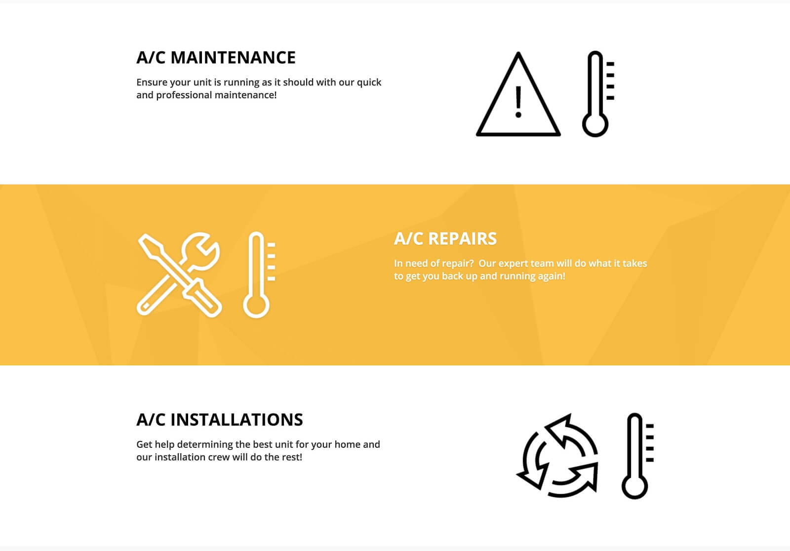
Show visitors what services you offer
You might have also noticed that the service sections above follow a “Z” pattern darting from left to right and back to the left again. The reason it’s so common to see this pattern in landing page layouts is that it tends to be the natural way people view landing pages.
The Testimonial Section
An essential part of social proof includes having positive customer reviews in your landing page layout. However, that doesn’t mean every five-star review is a good match for your landing page.
The best testimonial sections include images of your customers next to a detailed quote. Because studies have shown that looking at human faces increases trust and makes the claims feel more genuine including a photo is especially important.
When it comes to the quote itself, try to pick one that gives a precise example of the problem the customer faced and how your company solved it.
In the example below, the testimonial on the far left is the most powerful because it describes her experience in detail. Specifically, she says, “they came out the same day,” and “Two days later they had our new system installed.”
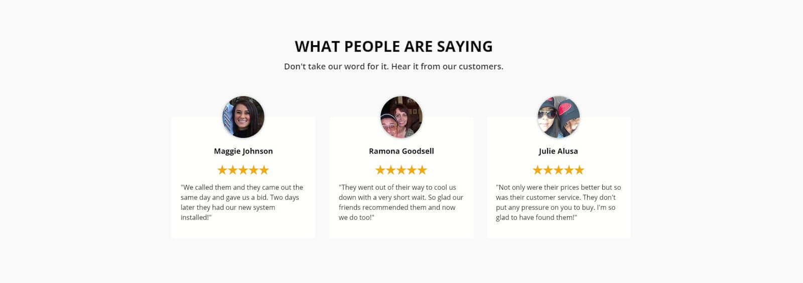
Testimonials reduce anxiety and build trust
You’ll also notice that this section uses five gold stars under each customer name illustrating the rating they gave Bill’s Comfort Systems. This is another example of how icons and images can be used in your landing page to convey a message quickly. One glance at the five gold stars and visitors are safe to assume these customers were pleased without ever reading their review.
Social Proof Section
Having customer testimonials on your landing page is an absolute must, but they aren’t the only way to add social proof. You can spice up your landing page with awards, client logos, third-party review feeds, and even logos of well-known brands that you service.
Showcasing the brands that Bill’s Comfort Systems offers adds social proof through association with well-known brands. It also clears up any doubt prospective customers may have about their ability to work with different brands of air conditioning units.

Showing off well-known or “trusted” brands that you carry informs visitors and helps build rapport
There are countless ways to add social proof to your landing page, and they don’t always need a section of their own. So get creative and try to sprinkle social proof subtly throughout your entire landing page layout.
Footer Section
Finally, you have the footer section. This section is your last chance to convert visitors so swing for the fences and make sure you include your call to action. Additionally, you should use the same CTA that you used in your hero section.

Footer sections are a good place to remind the customer what you want them to do with a CTA
There’s less hype around the footer section compared to the hero section, but they’re actually very similar. Like your hero section, your footer section should be focused on one goal, conversions.
What works for you hero section works for your footer section. That doesn’t mean copy and paste, but they do share some of the same elements. This means you can apply similar principles to design a high performing footer section.
Even though you might have to zoom in or put on your reading glasses to see the section above its important that you include it in all of your landing pages. Yep, you read that right the first time out of all the sections we’ve covered this is one of the few that you always need to include. It could be considered part of the footer section, but we like to call it the copyright section.

Copyright sections should include links to your website’s terms & conditions and privacy policy.
It’s important to include because it shows visitors (possibly your competitors) that you claim the copyright to your landing page’s content. More importantly, it should include links to your privacy policy and terms and conditions pages on your website. Google Ads technically requires these links and they’ll pay special attention to this if you’re in the medical industry or another privacy sensitive field.
You can dress the copyright section up by adding your logo, but you don’t want to draw attention away from the more important elements in your footer section.
Breaking Down Elite Chiropractic’s Landing Page
We knew one example of a landing page layout wouldn’t be enough so we’ll spend the rest of this article breaking down a second landing page for one of our clients Elite Chiropractic.
To give you a quick background, Elite Chiropractic is a multi-location chiropractic clinic focused on restoring patients to health and proper function.
The Hero Section
We’ve already explained the different elements of the hero section earlier in this article. So instead we’re going to talk about how you can and should A/B test different elements in your hero section.
Here are two different versions of Elite Chiropractic’s landing page.
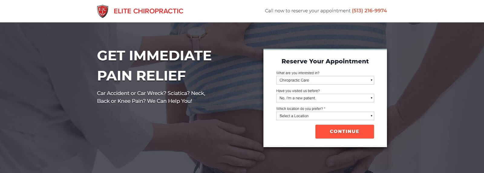
CTA #1
In the first variant seen above, we used a vague call to action “Continue” as opposed to a more specific CTA like the one seen in the second variant. However, this small change is the only difference between these two landing pages. And with good reason, if we make too many changes at once, we won’t be able to identify which change leads to an increase or decrease in performance.

CTA #2
Our second variant uses a very specific CTA “Reserve Now.”
To test which will capture a higher conversion rate we ran these two pages side by side until we had gathered enough data to pick a winner.
Can you guess which page won?
If you guessed the first one then pat yourself on the back. The first variant won by a landslide outperforming the more specific CTA by 300%. This is no coincidence either, at Linear we’ve noticed that vague CTA’s tend to perform better for lead generation landing pages.
The About Our Location Section
Elite Chiropractic is a local business, so it made sense to include a section about the location along with some dynamic text replacement. This allowed us to automatically show the location closest to where potential customers are searching without creating multiple landing pages.

Tip: About sections are a good place to use dynamic text replacement.
You can use a landing page builder like Instapage to add dynamic text to your landing pages. This can boost conversion rates and save you a lot of time and work creating a landing page for each location.
Why Elite Chiropractic Sections
Although it’s not labeled “Why Elite Chiropractic”, these sections explain why you should visit their practice. You should make these sections skimmable with the most important details in the bold easy to read headline text. This makes it easy for readers to get the most important information quickly and should significantly improve your conversion rates.

This section should explain why your services are better than your competitors
Images of your product or service like the one in this example help illustrate what customers can expect much more effectively than text alone.
Bonus Tip: When possible, take candid pictures yourself instead of using stock photos. We’ve found this is especially impactful for healthcare and local service businesses. Pictures of your staff and location will make your page feel more personal and friendly even if they are less than perfect.
The Customer Testimonials Section
Okay, I know what you’re thinking. That’s a lot of text, didn’t you tell us to keep it short and sweet?
Although landing pages with less text usually perform better, there are some exceptions to that rule.
You can use A/B testing to find out if visitors prefer longer testimonials or shorter more condensed testimonials. After your test, you’ll know which is best for your page, but you should never assume what will work best. Instead, think of your assumption more like a hypothesis. You might think that one variant will outperform another and that’s okay, chances are you’re right, but you’ll never know for sure until you put it to the test.
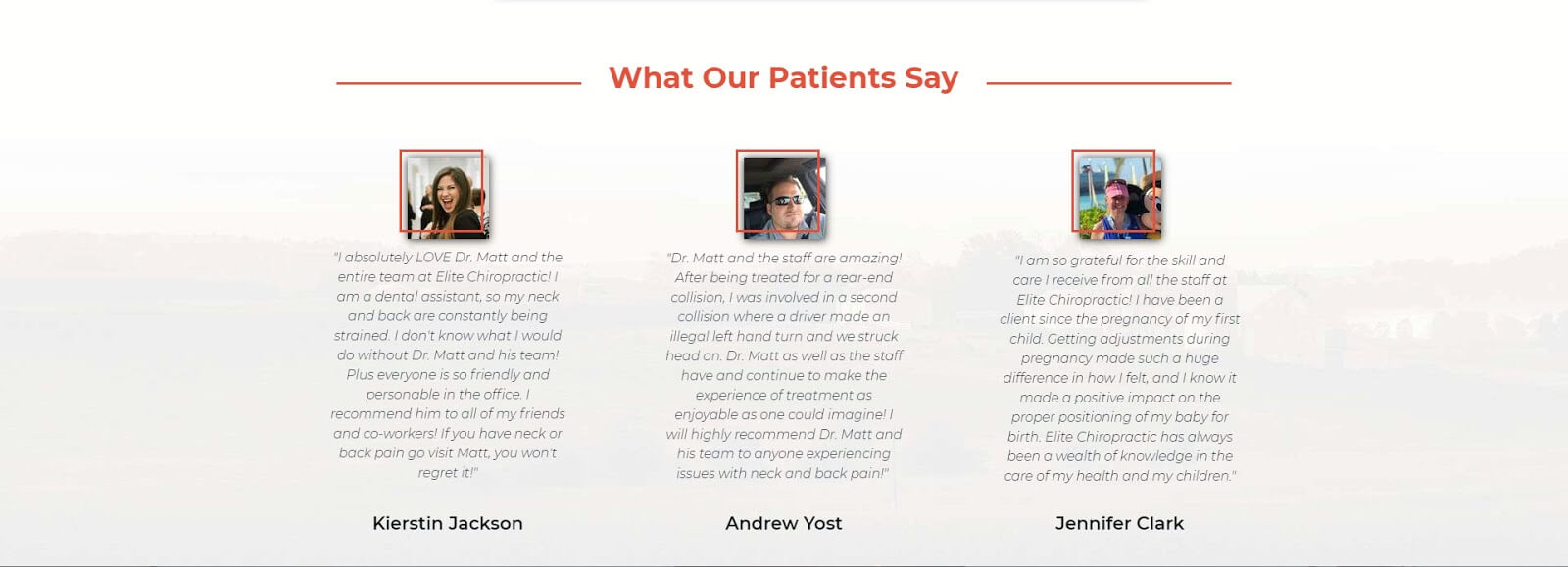
People believe what other people like them have to say – more than they believe what you have to say about yourself
And that’s exactly what we did for Elite Chiropractic, and it turns out visitors liked the longer testimonials better. This small change increased full scroll conversions by 110%. A worthwhile test no doubt.
The Footer Section
The footer section for Elite Chiropractic ends very similarly to how it begins and that’s what you want. Using the same call to action in your footer and hero section will keep visitors focused on a single goal or what we like to call a 1:1 Attention Ratio.
Attention Ratio is the number of things you can do on a single landing page versus the number of things you want customers to do. This ratio is also one of the first things we check for when a landing page isn’t converting. The tighter you keep this ratio the better your conversion rates will be.

Footer headlines should summarize what customers can expect when hiring you or buying your product.
Finally, take note of the headline used in the footer section for Elite Chiropractic. It reuses the word “Pain” and communicates the same message seen in the hero section of the page. This helps reinforce visitors expectations and adds emotion.
Conclusion On Landing Page Layout
The first rule to landing page layout is there are no rules to landing page layout.

It’s a tough lesson to learn…
Okay, I’m joking, kind of…
There are best practices and a lot of great testing ideas so you don’t have to start from scratch every time. The point I’m trying to make here is that each page is unique and will require a different toolset to maximize performance. So it’s important not to get stuck on the same tactics if they aren’t working. Instead, you should prioritize the most important elements of your page and work on those first.
Your landing page copy is the most crucial aspect of your page, and if we were to narrow it down even further, your main headline and CTA are the two most important elements on your page. So spend some time developing and testing these items first before moving on to other sections of your landing page.
Next in line comes your social proof. Make sure you have reviews and testimonials from real people and pictures whenever possible.
Finally, when in doubt, test it out! You never know how something will perform until you test it. I’ll leave you with a few testing ideas to help you get started.
- CTA – Test different call to action text, button color, and placement.
- Main Headline – Test different types of headlines from asking a question to inspiring emotion or offering a discount.
- Forms – Try using long forms vs. short forms and single step vs. multi-step forms.
- Social Proof – Test reviews with photos vs without and long vs short testimonials.
- Landing Page Layout – Test page length and try adding new sections, removing sections, and changing the order that they are arranged.
We’d love to hear about your experience with landing page layouts, so be sure to leave us a comment below.
Luke Heinecke
Founder/CEO
Luke is in love with all things digital marketing. He’s obsessed with PPC, landing page design, and conversion rate optimization. Luke claims he “doesn’t even lift,” but he looks more like a professional bodybuilder than a PPC nerd. He says all he needs is a pair of glasses to fix that. We’ll let you be the judge.
Leave us a comment.
Subscribe to our blog
Subscribe to our blog
Get weekly PPC & CRO advice sent straight to your inbox.