Any business with a digital presence relies on website traffic to make sales, create leads, or grow subscriptions. That traffic is expensive. So it makes sense to ask, “where are the ‘cracks’? What’s causing potential customers to leave our site without converting?” A CRO audit (also known as a conversion audit) answers that question.
Then, it helps you collect the data required to improve conversion rates.
You can use this guide as a CRO audit template. We define each step, explain why it’s important, and show you how to collect this data yourself.
TLDR: want to improve conversion rates? Get a CRO audit first. Navigate our process below:
Why Conduct a CRO Audit?
Part 1: Make sure you need CRO
Part 2: Establish measurable goals & tracking accuracy
Part 3: Identify your best customers (Audience Analysis)
Part 4: Expose what drives or stops conversions (Behavior Analysis)
Part 5: Find your most valuable traffic sources (Traffic Channel Analysis)
Part 6: Flag what’s broken and irritating (Technical Analysis)
Part 7: Spot missing, mismatched, & muddy elements (Heuristic Analysis)
Part 8: Rank & organize optimization opportunities
BONUS: Follow an ongoing CRO process (Research & Data Collection)
Why Conduct a Conversion Audit?
Why conduct a conversion audit instead of just testing page variants until you find a winner?
While testing is an element of CRO, blindly applying “CRO best practices” doesn’t always work. That’s like doing surgery before taking X-rays!
Successful optimizers understand the leaks in their conversion funnel before ‘operating’ on a website.
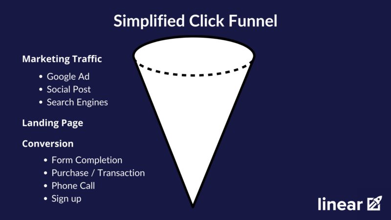
In reality, funnels are more complex and can include dozens of interactions before a conversion.
A CRO audit can help you identify the holes in your conversion funnel.
Conversion audits show you the difference between what you think your conversion funnel looks like…

Versus what it actually looks like…

Chaos.
A conversion audit might not paint a pretty picture, and that’s okay. However, it will show you what problems are hurting your conversion rates and help you decide how to fix them.
The data you gather during a CRO Audit will inform all your future marketing decisions. In addition, it will help you consistently improve traffic quality and conversion rates.
Sold? 😉 Great. Let’s jump into our audit process 👇
Part 1: Evaluate Need
🎯 Your main objective: Answer, “do we need CRO?”
Before you jump into a CRO audit, you have to know if or when CRO is right for your business.
We use a few qualifying questions to determine if a client would benefit from conversion optimization.
1. Do you have enough website traffic to warrant CRO?
There’s not a perfect number, and there are some industry differences. However, as a general rule-of-thumb, 10,000+ monthly visitors is a good starting point. If you only have a few thousand visitors per month, you may want to focus on traffic generation first or in tandem with CRO efforts.
The exception to this rule would be highly niche industries that will never reach high traffic volumes.
2. What are your conversion goals?
Conversion goals are dependent on business type and industry. That said, you can generally separate them into three different categories.
Lead Generation
Lead generation companies would focus their audit on improving lead cost, volume, and quality. The most common conversions in this scenario are:
- Form submissions
- Phone calls
- Cost Per Lead
SaaS
Software as a service businesses are unique because there are often multiple conversions leading up to a sale. The most common SaaS conversion types are:
- Demos
- Free trials
- Paid sign-ups
- App Downloads
eCommerce
All businesses that sell products and collect payments online fall in this category.
eCommerce businesses have the upper hand when it comes to tracking. So if this is you, you’re in luck — it’ll be much easier to identify the impact of conversion rate improvements.
Although there are a lot of eCommerce conversion metrics, these are the most crucial:
- Transactions/Purchases
- Shopping cart abandonment
- Checkout abandonment
- Average order values
- Customer Lifetime values
3. Have you calculated the ROI of conversion improvements?
Let’s imagine your website averages 100,000 monthly site visitors, and your current conversion rate is hovering around 2%.
That means you’re averaging about 2000 conversions a month.
If these conversions average $150 in revenue generated, your website generates $300,000 in monthly sales.
But what happens if you increase your conversion rates by .25%?
Well, in this scenario, you’d increase monthly revenue by about 11% ($37,500). Every month!
That’s an extra $390,000 per year.
For this reason, conversion rate optimization has the highest measurable return on investment when compared to other marketing tactics. Hiring a conversion rate optimization agency can average a 7:1 return on investment.
If these questions check out for you, you’re ready to move onto the next step of the CRO audit.
Part 2: Establish Goals
🎯 Your main objective: Establish measurable goals
You’ll never know if you’re making a business impact unless you set specific, measurable goals for yourself.
Ideally, these goals include both macro conversions and micro conversions.
Macro conversions are the big end-goals we associate with driving measurable value for a business. Micro conversions include all the little actions users complete that guide them towards a macro conversion. For example, adding items to a cart could be a micro conversion for making a sale (the macro conversion).
Other ideas for tracking micro-conversions include:
- Downloading an eBook
- Partial form completions
- Subscribing to your newsletter
- App install
- Landing page views (pricing & other key pages)
- Time on site
- Pages per visit
- Number of sessions
- Video views
Remember: Your goals will be ultra-specific to your company! So instead of tracking everything at once, take a look at your specific funnel. Then, choose only those things that make the most sense for your business.
But what metrics make the most sense for your business?
Ironically conversion rates in and of themselves aren’t always the most valuable. No one can cash a check on conv/rates alone. Rather conv/rates influence other metrics like:
- Cost per lead
- Cost per acquisition
- Return on ad spend (ROAS)
- Conversion Volume
Higher conversion rates mean more conversions per dollar spent. 🤑
Ensure Tracking Accuracy
The goals you’re trying to achieve won’t matter unless you’re tracking them accurately.
Make sure your analytics software is tracking the goals you outlined in part one of your conversion audit. This check will help you discern between reliable and unreliable data.
If you spot tracking issues, make a note in your audit to correct later on.
If you’re using Google Analytics, you can view the goals you’re tracking as conversions in the admin panel.
A goal measures how often users complete a specific action (i.e., conversion) on your website. You define which actions trigger goals and are recorded in your analytics reporting. Google Analytics gives you 4 types of goals to choose from:
- Destinations (E.g., a Thank You page loads)
- Duration (E.g., someone spends more than 5 minutes on your Services page)
- Pages/Screens per session (E.g., a user loads 7 pages in a session)
- Event (an action you’ve defined as an Event is completed; e.g., a click, a share, a scroll %)
So if you don’t already have goal or conversion tracking set up on your site, get on that! (Or, nicely ask your agency if that’s a service they’ll complete for you).
Until then, you can access Google’s resources on creating and managing goals, ways to track conversions, conversion tracking setup, and more.
For now, let’s move on. For parts 3 through 6 of this conversion audit example, I’ll walk you through the basics of how to complete a CRO audit with Google Analytics.
Hint: we’re going to live in the Reports column for a bit.
Part 3: Audience Analysis
🎯 Your main objective: Identify your best customers
Audience Analysis isn’t as fancy as it sounds. It’s just a way to help you identify your most valuable customers.
Why is this key so early on in a conversion audit? Well, if you can identify your highest value customers, you can start doubling down on your efforts to bring these people to your website.
Audience analysis helps you create more specific personas. In other words, you can customize ads and landing pages to speak directly to the people making a difference in your business.
For example, if your best customers are males aged 45-54, you might want to test a hero image with a male who fits that description.
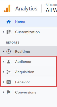
To figure out who your best customers are, start by opening Google Analytics and clicking on the Audience tab.
Reviewing Demographic Data
Audience demographics include age, gender, and income breakdowns.
Age
First up, let’s take a look at your audience’s age.
From the Audience tab, click the Demographics breakdown, then Age.
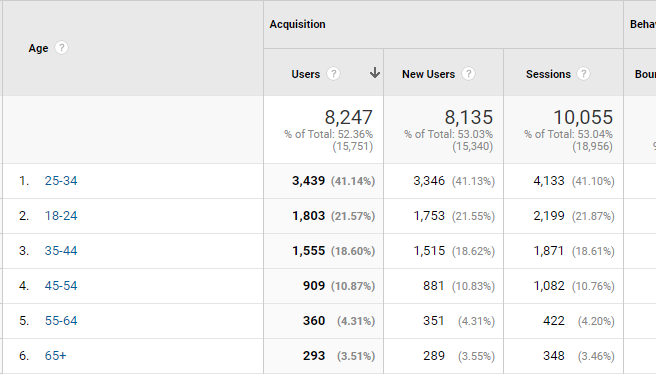
Google Analytics Age Breakdown
This report helps you compare the age breakdown of your site traffic with behavior and conversion data.
Pay special attention to the conversion rate column on this and other reports. For example, are there any age groups you note have an above-average conversion rate? Are there groups outside of your target demographic that are performing well? Answer those types of questions, and make recommendations (like shifting your budget or redesigning a page) based on this data.
Gender
The Gender report is pretty similar to age. Click the Gender tab of the same Demographics section in Audiences.
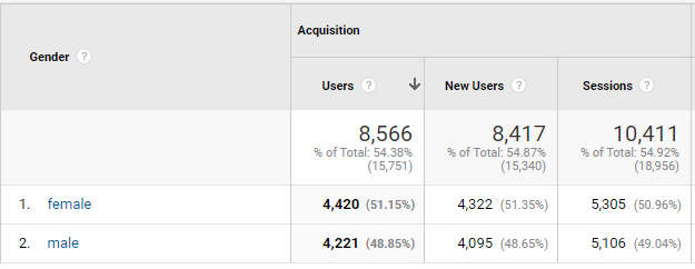
Google Analytics Gender Breakdown
It displays the same information as the Age report, except against your audience’s gender breakdown. If one group converts better than the other, you may want to segment your campaigns and landing pages to cater to the higher converting group.
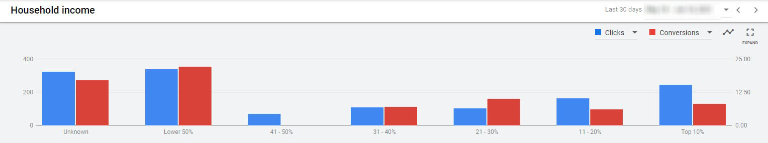
Household Income (Google Ads)
Finally, let’s examine household income. Move over to Google Ads to view this data.
Reviewing Affinity Categories & In-Market Segments
To view this data, click on the Audience tab. Then select Interests and Affinity Categories or In-Market Segments.
Affinity and In-market audience reports answer the question, “what is my audience into, and what are they searching to buy?”
For example, I searched for camping spots in Idaho and watched YouTube videos on how to set up my new 23-Zero Roof Top Tent. You better believe I got bucketed into an affinity audience for outdoor enthusiasts.
Google Analytics Affinity Category Report
Similarly, let’s say your business needed a SaaS solution. You’d probably read blogs comparing product features, click a few “free demo” buttons, and search for price comparisons. This kind of behavior might place you in the In-Market category for Software/Business & Productivity Software.
Google Analytics In-Market Segments Report
But let’s get back to what you can analyze about your traffic’s interests.
In both Affinity and In-Market reports, you’ll see (probably quite a few) interest groups that describe your audience. The report includes data like new users or how each of these segments behaves and converts.
But these are just numbers. So, what insights can we deduce from this data?
Here are a few ideas from past CRO audits:
- Do more of what works: if one segment converts better than the others, target them more often.
- Fix what doesn’t: is there an In-Market group flopping when they should be doing well? You’ll want to do a little research into why.
- Say an In-Market group visits >3 pages while they’re on your site but doesn’t convert. It could mean it’s time to retarget that group with more mid-funnel marketing materials. Or, take a peek at your website flow to make sure users are finding what they’re looking for.
- Use testimonials with pictures (or videos) from other people with the same interests. For example, if your best customers are fashionistas and one of your testimonials speaks to that, then use it!
- Test images, headlines, and copy that speaks to your customer’s interests. If your customers are travel enthusiasts, use pictures of people using your product while traveling or highlight related benefits.
- Test promotions customized to your audience. For example, if your visitors are bargain shoppers, a relevant promotion might be free shipping or a flash sale. You could also try adding/removing pricing info or test out a lowest price guarantee.
You now have a nice picture of who your audience is and what they like. But where are they?
Understand the Geographic Breakdown
To see where your traffic is located, hit the Audience tab in GA, then Geo and Location.
Geographic Breakdown
Pretty basic — the geographic breakdown tells you where most of your traffic is coming from. You can get a more granular view by toggling from Country to State and State to City.
While simple, the geo breakdown answers two key questions:
- Where do your highest value customers live?
- What locations aren’t converting?
Let’s say you discover your highest value customers live in California. Now you can take steps to capture and convert even more of these customers.
For example, you could create ad campaigns that only target California and send them to landing pages with local California phone numbers. Bonus points if you use pictures of California and testimonials from native Californians on your landing pages.
On the other hand, you might notice that you never get conversions from people in Utah. In this case, you might want to do some more research — there might be a simple fix.
Part 4: Behavior Analysis
🎯 Your main objective: Expose what drives or stops conversions
Now that you know who your users are, why aren’t they converting as much as you’d like them to?
That’s the question we’re going to help you answer with your CRO audit using behavioral analysis.
Review Landing Page Conversions
First, you’ll want to review landing page conversions. Hop over to the Behavior tab in GA. Then select Site Content and Landing Pages.
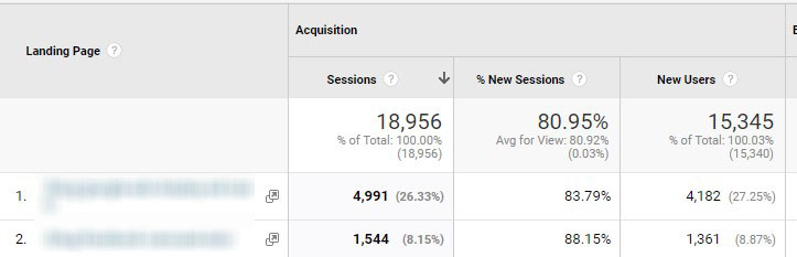
Landing Page Conversions report
This report helps you prioritize your efforts by identifying:
- High-traffic pages
- High bounce rate pages
- Top-converting pages
- Lowest converting pages
New vs Returning
To look at the ratio between new and returning visitors, follow this path in GA: Audience > Behavior > New vs Returning.
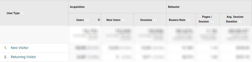
New vs. Returning users report
What you’ll want to observe here:
- The ratio between new and returning visitors. Is there a big difference?
- Conversions. Which group converts at a higher rate?
When returning visitors convert well, you can spend more on retargeting campaigns. Retargeting captures new users and gives them a reason to return to your site for more (hopefully, to convert!)
You may also want to incentivize first-time visitors. This could be a coupon code, discount, or special offer welcoming them to your site.
Engagement
Now to answer the question: how engaged are my users on my site? Let’s go to the GA Audience tab, Behavior, and Engagement.
Follow the drill and take a look at:
Time on Page…
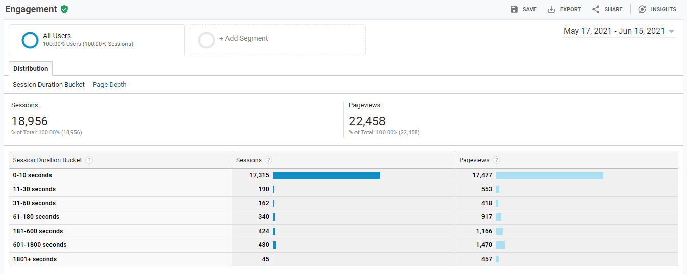
Time on Page Report
…and Page Depth
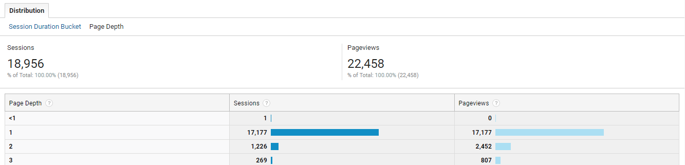
Page Depth Report
These reports give you information about how long users stay on the page and the number of pages visited during a session.
Pro Tip: Use Google Analytics to create goals that track engaged users. You can create goals to segment users who:
- Spend more than 10 Seconds on your website
- View more than 3 Pages
- Visit key pages on your website
These are called micro conversions, and you can use them to create powerful retargeting audiences.
Behavior Flow
Another key report to keep an eye on is behavior flow. Behavior Flow is a data map that illustrates the journey users take on your site. This includes the pages they land on and navigate to (or drop off on).
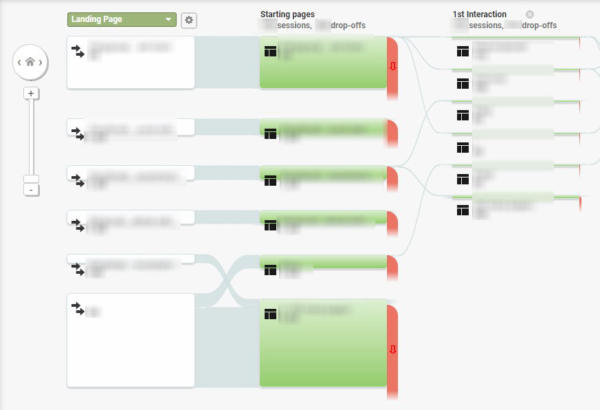
Google Analytics Landing Page Behavior Flow
A couple of questions you’ll want to answer using this report:
- Which pages have the highest drop-off rates?
- Does paid traffic behave differently than organic traffic?
By examining the pages with the highest drop-off rates, you can narrow down which areas of your site need improvement. Maybe you need to clarify a CTA, add a link, or declutter your most problematic pages.
Review Top Exit Pages
Navigate to the Top Exit Pages report by going to the GA reports column, Behavior > Site Content > Exit pages. Like the behavior flow, the Top Exit Pages report will tell you which pages cause the most users to say “peace.”
Checkout Behavior (eCommerce)
We’re going to drop another report here for all our eCommerce friends out there.
Understanding your user’s checkout behavior can help you generate tons of ideas to improve your conversion rates.
What does this report do? It tells you how successfully your users can navigate your checkout process. It includes data like:
- How many steps you have in the checkout process
- The volume of users that made it to each checkout step
- Process abandonment at each step
- The number of users that entered key steps (like clicking add to cart)
Pro Tip: Create segments of these users to illustrate key issues like cart abandonment at specific transitions. For example, users who left your site between adding their contact information and billing.
Part 5: Traffic Channel Analysis
🎯 Your main objective: Find your most valuable traffic sources
Now that we know what is driving or limiting your conversions let’s talk about where that traffic comes from.
Traffic channel analysis will answer:
- What channels bring you the most traffic?
- What channels are the most effective (traffic, conversions, or revenue generated)?
Traffic Source & Medium
How to get there: in GA, click Acquisition > All Traffic > Source/Medium.
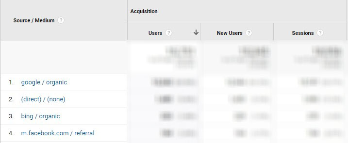
Google Analytics Source / Medium Report
This report gives you an overview of where your traffic originates. This data can help you identify which traffic channels are the most valuable and which ones need help.
Social Media Conversions
This is very similar to the traffic report above, except you’ll only look at social media channels. Navigate to this report in the Acquisition tab by clicking Social and Conversions.
For small to midsize businesses, this part of a CRO audit can be especially useful. Your marketing team only has so many resources. The social media conversions report can help you decide:
- The channels that are working (do more and optimize this)
- Ones that aren’t (spend less or fix the problems)
I like to take it one step further and add Landing Page as a secondary dimension. This allows you to see the top landing pages for each platform.
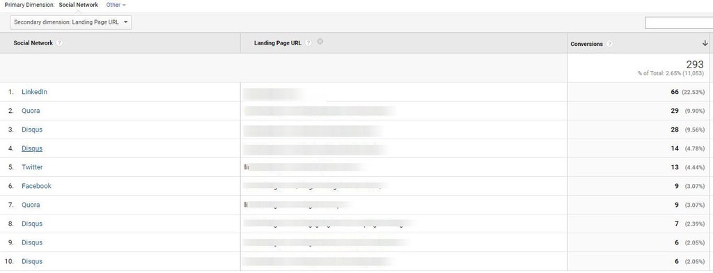
You can use this information to prioritize landing page improvements and even test channel-specific content.
Part 6: Technical Analysis
🎯 Your main objective: Flag what’s broken and irritating
As much as we’d like it to be otherwise, user’s don’t owe us their time. Like, at all.
So when something is broken or slow, don’t expect your traffic to sit around and wait for you to figure it out. Users will happily find what they need elsewhere (i.e., your competitors).
So, before your audience puts you on mute, ask: are some of your pages taking too long to load? Is your mobile experience rubbish? Technical analysis will help you make sure you’re not missing something basic.
Page Timings
First up? Check your page timings.
Basically, how long do your web pages take to load?
You can find this data in Google Analytics and PageSpeed Insights.
In Google Analytics, click Behavior, Site Speed, then Page Timings.
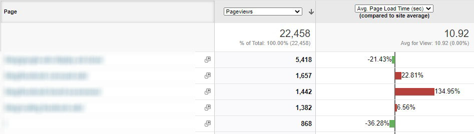
Google Analytics Page Load Speed
You have around 2 seconds before users get bored waiting and bounce, so get on this one ASAP.
Note: Load time is vital to organic traffic / SEO since Google’s 2021 algorithm update factors in Page Experience. Page timings will be crucial for Web Vitals, a set of benchmarks that measure users’ experience on a page.
Mobile Breakdown
It’s easy to forget that users have many screens and “surfaces” they can use to interact with you. And unfortunately, sometimes, companies neglect to build a mobile-first experience.
So when you look at your mobile conversions overview, keep an eye out for low conversions. It could be indicative of a poor mobile experience.
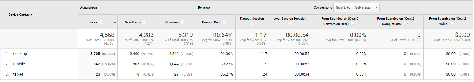
Mobile overview in Google Analytics
You can navigate to the mobile overview report in GA by clicking on Audience, Mobile, Overview.
Browser Breakdown
Next, let’s get a browser breakdown in GA. Click the Technology dropdown in the Audience tab. Choose Browser & OS.
The main thing to look for here is to compare Chrome vs. Safari. Identify if there are browser compatibility issues that prevent the site from functioning.
6.2: Take a Breather
Seriously, congrats for making it this far!
Take a quick breather and remember:

😅
Also, we’re out of the woods with Google Analytics! Let’s keep rolling and dig into your website.
Part 7: Heuristics Analysis
🎯 Your main objective: Spot the 3 M’s: missing, mismatched, and muddy.
Note: If we’re 100% honest with you, your main objective could be finding someone with experience. Expert CRO analysts will be better at this than newbies.
For now, we’ll give you a sneak peek into the process.
First, what is a heuristic analysis?
A heuristic is a mental shortcut — we all have them. Heuristic Analysis is the process CROs use to peel back the layers of user behavior and motivation quickly. For example, to understand the snap judgments users make about your website or business.
Luckily, this analysis method is super quick.

*sarcasm*
So when we do a heuristic analysis, we want to ask ourselves: does my website pass the vibe check for my most valuable audiences? And if not, why didn’t they (consciously or subconsciously) click or convert?
The potential solutions you come up with respond directly to the user’s experience and motivate them to interact with you more positively. You’ll get better at spotting these opportunities with experience.
Message Match
The goal of message match is to align the experience users get on your page with the expectations they form from your traffic source.
We often frame message match in terms of how well an ad lines up with your landing page.
Message match lets users know your site is relevant to their needs. Improving consistency between your site and traffic sources will increase click-through and conversion rates much more than by changing ad text or landing pages alone.
When examining your funnel for message match, keep an eye out for inconsistent or irrelevant elements or transitions.
For example, your ad:
- What language does it use in the headline and description?
- What search terms are your users inputting in Google or another search engine?
- If it’s on the display network, what does the ad look like?
- Where does this ad rank on the page?
Compared to the landing page:
- How consistent are each of the page elements to each other?
- Example: images, pop-ups, CTAs, the headlines, etc.
- Do page elements deliver what you promise in the ad? Does the tone or brand align?
Message match flops will typically show up in your bounce rate. If the message doesn’t match, users will decide to leave immediately.
Literal vs Implied Message Match
Message match is more than the literal message. The implied message is just as important. Don’t believe me? Please compare:

Professional. Engaged. Expertful.

Chilling. Demonic. Gleeful.
Yep. Same Elmo, different vibes.
So when you make message match recommendations in your CRO audit, it’s more than copying the words in the ad headline to the landing page copy. It’s also about unifying how words, images, and page elements make people feel.

Ahh, the feeling when everything makes sense.
The importance of unifying your message is also why you need data from previous sections of your audit. Instead of assembling pages or ads based on a random feeling or aesthetic, you can model them for who you know your audience is.
So, in summary:
- Identify conflicting explicit and implicit messages in ads and landing pages
- Chop up your landing page, and compare the elements
- Match page elements with the emotions of your audience
- Make sure landing pages keep the promises of your ads
Pro tip: Message match is just one of many reasons why you should use CRO in tandem with PPC. Your traffic source is closely tied to optimization.
Clarity
This is the part of your conversion audit that you flag sources of confusion. Are there elements that could make them a little disoriented or unsure of where to click next? Do any steps take too much time or seem inconvenient?
Quickly rate:
- Legibility and size of headlines, subheaders, and text
- Size and color of CTA buttons
- Spelling and grammar issues
- ‘Stop points’ or visual pillars for users to rest their eyes on
- Degree of design or text clutter
These improvements will also include suggestions for increasing simplicity, whether re-designing an infographic or cutting out non-critical information.
Credibility Signals
It’s a dark, twisted world out there, and your users know it.

I’m exaggerating a bit, but here’s the truth: you have to earn your audience’s trust.
Lucky you, there are a plethora of subtle ways to say “you can trust me!” on your website.
Some quick ideas:
- Social proof (customer quotes, video testimonials)
- Featured in section — well-known publications
- Partner Logo’s if they’re more well known than your company
- Industry Awards/Recognition
- Contact information — office address and phone number
- Pictures of your office and team members
- Live Purchase notifications — “Greg just bought X.”
- Number of customers
- Case Studies
Another way to make your audience feel safe is through design.
Here are elements that could make your audience think you’re a little sketchy (flag these in your conversion audit):
- Busy, cramped elements, text, etc. (a lack of negative space)
- Lack of headings, clarity
- Missing visual elements
The next time you’re brainstorming, think about the last page you’ve landed on and bounced away, thinking, “I definitely have a virus now.” There was probably a reason why.
Attention Ratio
Essentially, is your page a corn maze or an Apple store?
You need to help your users out a little; make it easy for them to know where they should look or click.
Recommendations may include eliminating elements like:
- Items that look clickable but aren’t
- Distracting image elements, like a bright red stop sign in the hero image that distracts from the CTA button
- An orange CTA…when everything else on the page is also orange
- Anything else distracting or unnecessary
Remember simple works.
Unique Value Proposition
Your unique value proposition should be communicated clearly from the page’s headline. If it’s not, that alone is a red flag and something you should fix. Again, if you’ve done a good job on your audit and developed solid personas, this part will be a lot easier.
Your value proposition should be more than touting features and benefits. It should answer the core, and often emotion-based, questions your users have, like:
- What problem does the product or service solve?
- How does it solve the problem?
- Why buy from your company instead of the competition?
- How will their experience with you succeed where they’ve failed in the past?
Get in their heads, and assure them through a unique value proposition that they’re making the right decision buying from you.
Part 8: Prioritize Optimization Efforts
🎯 Your main objective: Rank and organize ideas for improvement
Now that you’ve completed all the conversion audit steps above, you’ll be swimming in improvement opportunities! But where to start?
And no, while we love your enthusiasm, we don’t recommend the “jump right in!” approach.
You’ll soon look like this…

So many CRO changes, so little time!
…and you’ll find that implementing these ‘improvements’ lacks the impact you hoped for.
So while this isn’t technically part of a CRO audit, it’s still important. Organizing and ranking your hypotheses will save you time and mistakes in the long run.
First: Identify the pages, pop-ups, or other assets that have the most traffic.
Second: Organize those pages in order of value. For example, a sales page that generates direct revenue vs a blog article.
Third: Using your CRO audit, attach 4-10 potential changes under each page. Choose the ideas you believe could drive higher conversion rates.
Now you’re ready to rank these ideas. Let’s briefly explore one method you can use to help your best, most impactful ideas rise to the top: the ICE technique.
The Ice Technique
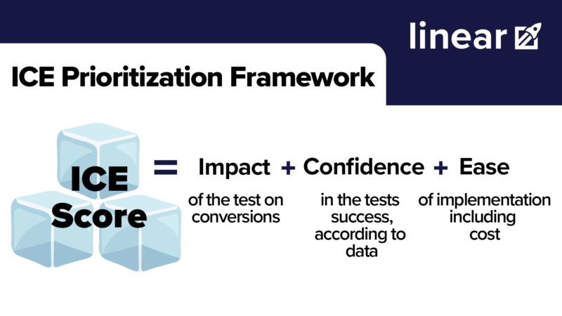
ICE = Impact + Confidence + Ease
The beauty of the ICE technique is that it helps you ask the most critical questions quickly. In particular:
- Impact: How much will this help our overall conversion goal?
- Confidence: Based on the data I’ve collected, will this test succeed?
- Ease: How easy (and inexpensive) is this test to implement?
For each criterion, give each test a score between 1 and 5. A score of 1 indicates low impact, low confidence, and high difficulty. Assign a 5 if a test is very impactful, high confidence, and high ease. The sum of those 3 criteria, or the total “Priority Score,” can fall between 3-15 points.
Once you’ve calculated the priority score for each test, you can quickly sort your ideas. The highest scored tests on the highest value pages represent the most potential value for your business.
For example, this ICE sheet that we recently made for a client:
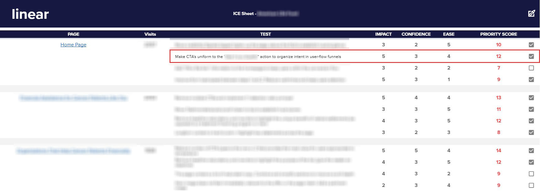
Partially blurred for client privacy.
Their home page generated the most value, so that page sits right at the top of the ICE sheet. When we looked at possible tests on that page, we noticed that unifying the CTA message would be very impactful and relatively easy to implement.
So, is ICE scoring the most rigorous prioritization technique? No. But it’ll quickly transition you from ideation to actual testing.
Note: while easy, this process is also subjective. For example, what kind of data needs to be collected for you to give a 5 for Confidence? Scoring standards will help you scale and replicate this process.
There’s a lot more we could cover on ranking and managing your CRO ideas, but it’s beyond the scope of this article. We’re working on a comprehensive post that covers these efforts in full. Stay tuned. 🤩
BONUS: Continuously Collect Data
🎯 Your main objective: Follow an ongoing CRO process
A CRO audit like the one we just outlined is a great starting place. It should help you identify gaps in your conversion funnel. You’re well on your way to an efficient, cost-effective, and organized CRO process.
However, data collection is ongoing. Why? Because CRO audits don’t predict what will work. They merely guess what will work with as much confidence as possible. And those hypotheses can be disproven.
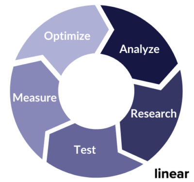
The CRO process
Ultimately, you’ll need to pair a conversion audit with continuous research and testing. Think of it as checking in with your audience and letting them tell you exactly what they want.
These are just a few tools that can help you better understand customer behavior and inform new testing ideas.
Heat Mapping
What’s heat mapping? Well, it’s a data visualization technique. More specifically, heat mapping is a way to collect information about how users interact with a page. They illustrate the location and frequency of interactions using different colors and hues.
Google Analytics can tell you what is happening. Heat Mapping can help you understand why it’s happening.
The heat mapping examples below are screenshots from heat mapping tests we conducted using Hotjar.
Click Maps:
Click maps collect data on — you guessed it — clicks. When users click on a page, it will show up as a color. The color will deepen from blue (fewer clicks) to red (lots of clicks), so you can quickly assess what parts of your page users are interacting with.

Clicks centered on ‘Blog’ and ‘Team’
Click maps are helpful when you’re trying to collect data on-page elements like buttons, drop-downs, or other interactive features.
Mouse Movement Maps:
Mouse movement maps are another subset of heat maps. Instead of only collecting data when a user clicks, movement maps record the movement of a cursor on the page.

Mouse movement map
One application of mouse movement maps is to track what areas of a page draw the users’ eyes and what copy is being read.
Scroll Maps:
Scroll maps are the third type of heat map. Consider the mobile scroll map below:

Mobile Scroll Map
With scroll maps, we can quickly and visually observe how much of a webpage gets interacted with.
For example, it’s pretty typical that you’ll get the most user drop-off after the fold. The top fold is the part of the page you see when a page first loads; it doesn’t require any scrolling to see that content. You can test new elements or change the copy to encourage users to travel past this point.
User Recording
User recordings record a user as they navigate your site. Think of it like recording someone’s screen or looking over their shoulder while they browse (not in a secret, creepy way, though!)

User Recording
When conducting a user recording, observe which buttons they press (or don’t). Also, note how long they scroll before abandoning the page and what elements they interact with most.
User Surveys
User surveys are another tool to collect additional research to support your ideas before you test and implement them.
While you can use them as elements to collect information about the effectiveness of your content or help pages like below:

You can also implement pop-ups at specific stages of your content funnel to ask users directly why they are/are not moving to the next step.
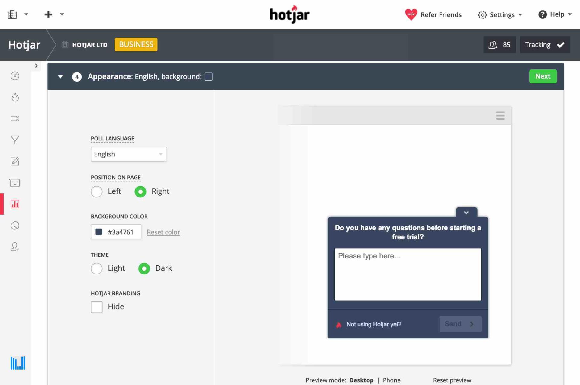
Source Hotjar.com
Some user survey question types could include:
- Long answer
- Short answer
- Email form
- Yes/no buttons
- Checkbox
- Rating scales or stars system
- Smiley face (😊😐☹️)
A third option that you could implement off-site is to use something like Google Surveys. You can pay Google to disseminate a survey without requiring a user to be on your page.
Warning: CROs are subject to a problem all researchers deal with: confounding variables. In other words, sneaky, unexpected elements that muck up the results of your test.
A big offender when it comes to surveys is social desirability bias. With this bias, a survey participant will answer what they believe is acceptable rather than accurate. Don’t believe me? Include “how often do you pick your nose…” in a survey, and I promise no one is going to tell you the truth.
Don’t despair, though. There are ways to limit bias. For example, you could ask users to select a preference from two options rather than rating a single one. Another method is to remind users that their answers are 100% anonymous. The best way to maintain quality for CRO tests is to combine qualitative and quantitative testing methods.
Welp, now that you’ve made me re-experience my undergrad “Psychological Methods and Testing” course, 😭 let’s wrap this audit up!
Conclusion — Tying it all together
So now that you have a CRO audit checklist…
- See if you need CRO
- Set up goal tracking
- Audience Analysis
- Behavior Analysis
- Traffic Channel Analysis
- Technical Analysis
- Heuristic Analysis
- Prioritize using ICE
- Continue to research and collect data
…what will you do with it?
While essential to collect data from Google Analytics and key web pages, it’s just the first step of the CRO process. It’s the ideas and insights you synthesize, research, and test that will make an impact on your organization. And the conversion opportunities are endless!
And if this is you:

That’s okay. We don’t expect you to be a CRO expert.
Don’t be afraid to leave a question in the comments! And for more in-depth help, request a free proposal.

Ariana Killpack
Director of Content
Ariana prides herself on always learning everything there is to know about pay-per-click advertising and conversion rate optimization, which is why she can create such excellent content. When she’s not writing fantastic content, you can find her hiking, swimming, or baking bread.
Leave us a comment.
Subscribe to our blog
Subscribe to our blog
Get weekly PPC & CRO advice sent straight to your inbox.